Compose with Components
This article teaches you how to decompose a user interface into a tree of components and how to connect those components so that data and actions flow through the tree. The focus is conceptual — you learn to think in components rather than implement them in detail. For implementation specifics, see the Component Internals Reference. For practical how-to guides on building, styling, and packaging your own components, see the Components guides.
What Is a Component?
Vaadin UIs are built from components. Think of them as building blocks: individually simple, but capable of forming complex interfaces when combined. Each component is a server-side Java object paired with a client-side HTML element.
The most basic components correspond to plain HTML elements — Div, Span, H1, and Paragraph (see Write HTML). On top of these, Vaadin provides layout components for arranging UIs in rows, columns, and grids, plus a rich set of ready-made components for common needs like buttons, text fields, grids, and dialogs. See the Components documentation for details.
You also create your own components. Some are one-off parts of a specific view. Others are reusable across the application. Both kinds follow the same principles covered in this article.
Views
A view is a component that forms a logical whole of the user interface. A page shows one view at a time, and the view typically occupies most of the page. See the Add a View guide to learn how to create one.
Views are entry points, not reusable building blocks. You don’t extend or embed a view inside another view. For simple screens, you can build everything directly inside the view class. For complex screens, delegate to smaller components — the next section shows how.
Decomposing a View
The key skill in component-based UI development is looking at a design and identifying which parts should become separate components. The goal is to break a large, complex view into smaller, manageable pieces.
The following example walks through a page from an HR application, splitting it step by step into a tree of components.
The Full Page
Here is the full page as the user sees it:
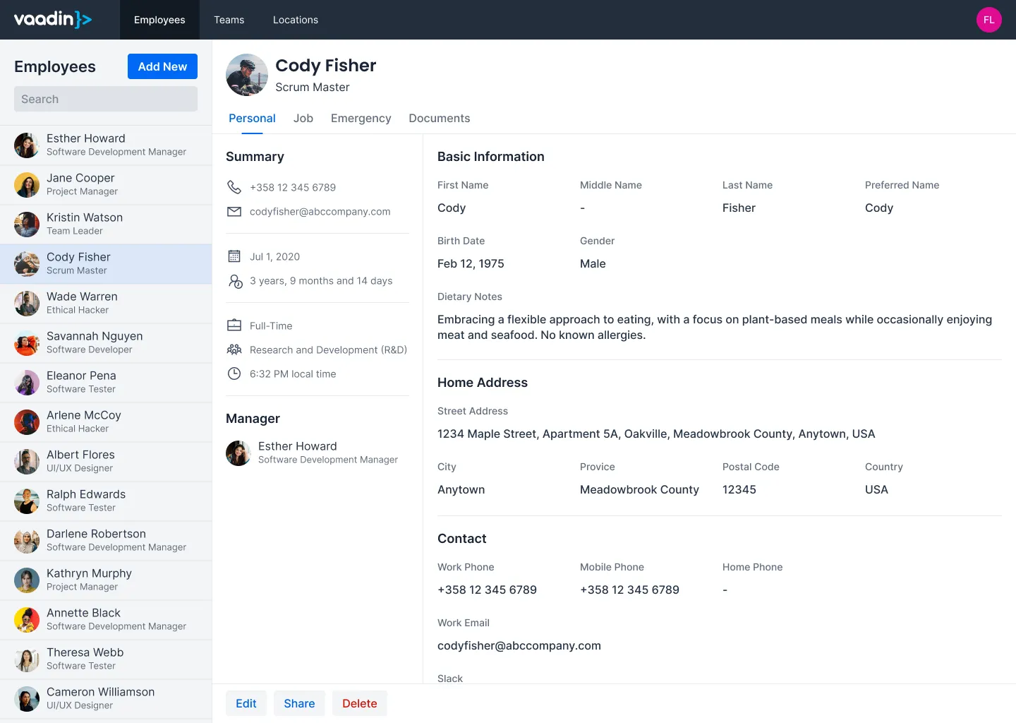
Three regions stand out: a navigation bar across the top, a list on the left, and a detail panel on the right. But not all of these belong to the view.
Router Layout vs. View
The navigation bar is shared across every view in the application. It belongs to the router layout, not the view itself:

What the view actually renders is the content area below:
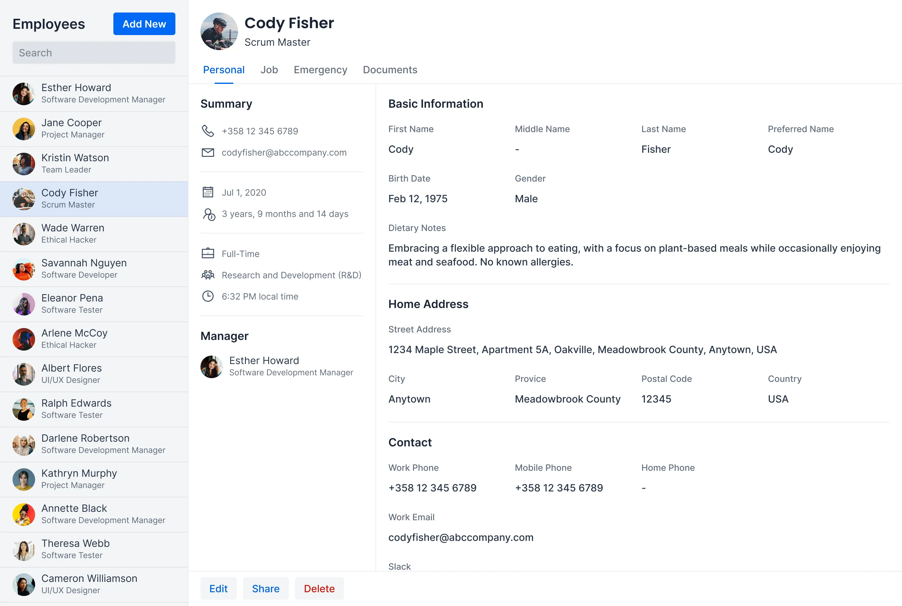
You can express this in code as a view with two child components:
Source code
Java
@Route("employees")
public class EmployeesView extends Div {
    private final EmployeeMaster master = new EmployeeMaster();
    private final EmployeeDetail detail = new EmployeeDetail();

    public EmployeesView() {
        add(master, detail);
    }
}
Splitting the View
The master and detail panels have distinct responsibilities, so each becomes its own class.
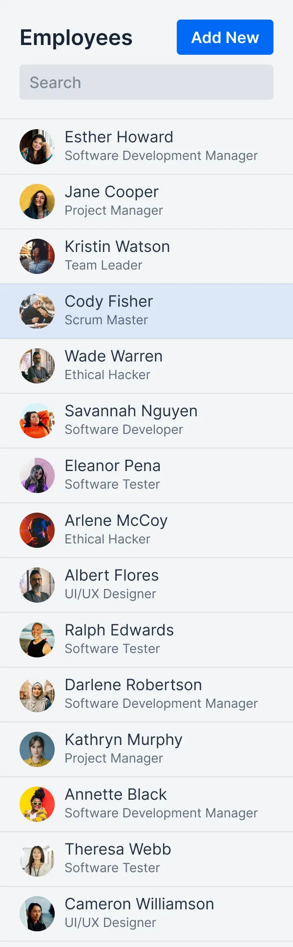
The master panel shows a searchable list of employees:
The detail panel shows everything about the selected employee:
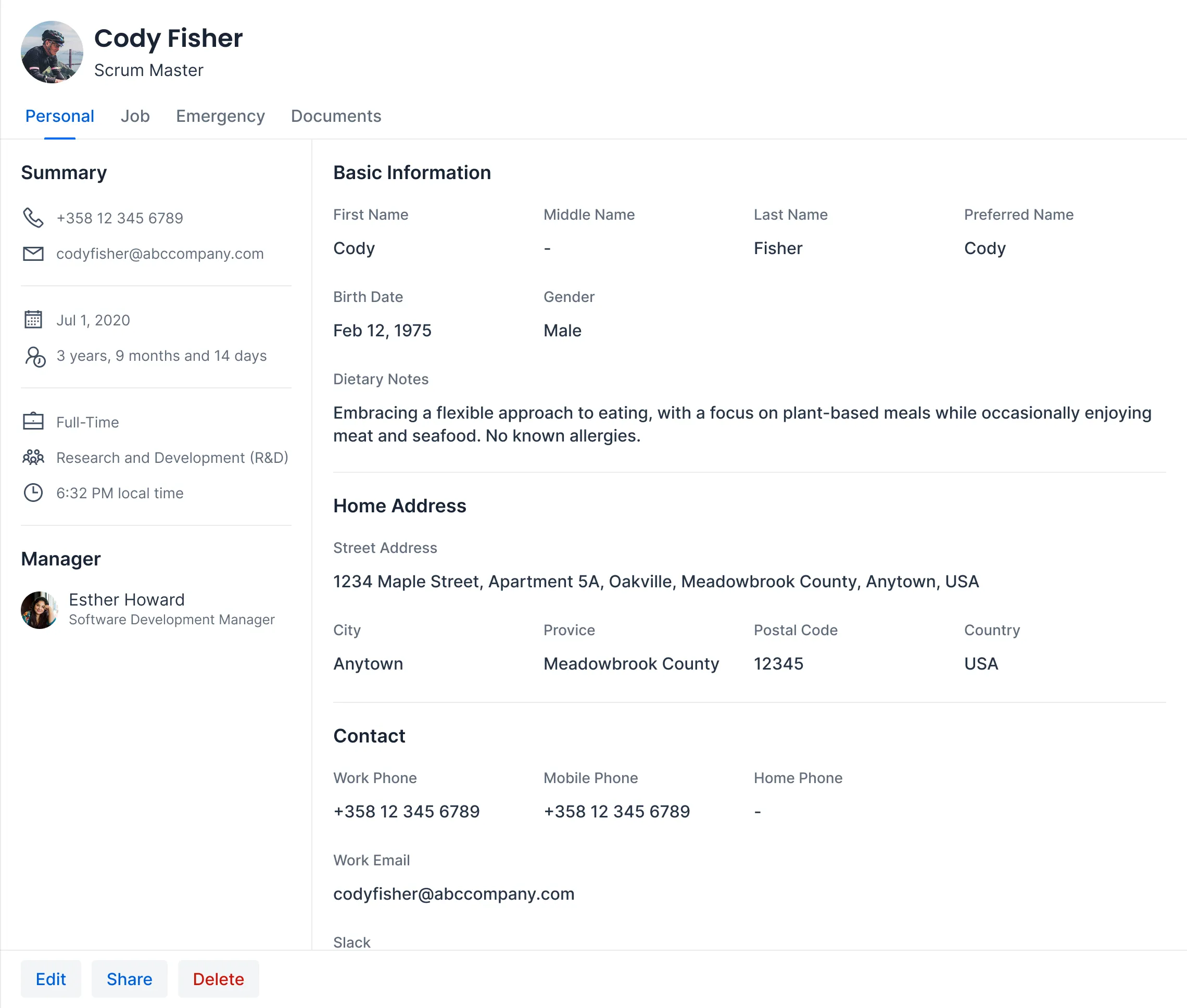
The detail panel is large enough to warrant further splitting. It has a clear header, content area, and footer:
Source code
Java
public class EmployeeDetail extends Div {
    private final DetailHeader header = new DetailHeader();
    private final DetailContent content = new DetailContent();
    private final DetailFooter footer = new DetailFooter();

    public EmployeeDetail() {
        add(header, content, footer);
    }
}
Breaking Down the Detail Panel
Each part of the detail panel becomes its own class. The header shows the employee’s name, photo, and navigation tabs:

The content area displays contact information and other details:
The footer contains action buttons:

These components are not reusable — they exist only inside EmployeeDetail. Separating them into classes keeps each one focused and easier to maintain.
Identifying Reusable Components
Looking at the full page again, two patterns repeat across different areas.
The first is a person card. It appears in the master list, the detail header, and the detail content area (for the manager):

The second is an icon item, used in the summary section of the detail content:
Reusable components accept data through their constructor or setters. They know nothing about employees — they work with generic inputs like names, titles, and icons:
Source code
Java
public class PersonCard extends Div {
    public PersonCard(String name, String title, String avatarUrl) {
        // Build the card layout from name, title, and avatar
    }
}
Source code
Java
public class IconItem extends Div {
    public IconItem(VaadinIcon icon, String label) {
        // Build the item layout from icon and label
    }
}
The Component Tree
After the decomposition exercise, these are the components that make up the page:
Source code
MainLayout (router layout)
└── EmployeesView
    ├── EmployeeMaster
    │   └── PersonCard (reusable)
    └── EmployeeDetail
        ├── DetailHeader
        │   └── PersonCard (reusable)
        ├── DetailContent
        │   ├── PersonCard (reusable, for manager)
        │   └── IconItem (reusable, for summary items)
        └── DetailFooter
Each line is a Java class you create. Reusable components appear at multiple levels of the tree. One-off components like DetailHeader and DetailFooter exist to keep each class focused.
These custom components also contain built-in Vaadin components internally. For example, EmployeeMaster uses a Grid to display the list, DetailHeader uses Tabs for navigation, and DetailFooter uses Button components for its actions. Built-in components don’t need to appear in the tree — they are implementation details inside each class.
This tree is not exhaustive, either. Implementing the view is likely to reveal further components. For instance, EmployeeDetail has multiple tabs, and each tab’s content would become at least its own component. Decomposition is an ongoing process, not a one-time exercise.
|
Tip
| You don’t need to identify every component upfront. Start with the view and its immediate children. Split further when a component grows too large or when you spot repeated patterns. |
Component Communication
Components in a tree need to communicate. Data flows in two directions: the view pushes data down to its children, and children push user actions up to the view. The view maintains state and calls application services. Child components stay simple and business-logic-agnostic.
Passing Data to Components
Parent components pass data down to their children. Vaadin offers two mechanisms for this.
Setters
Setters are the most straightforward approach. The parent calls a setter on the child whenever data changes:
Source code
Java
public class EmployeeDetail extends Div {
    private final DetailHeader header = new DetailHeader();
    private final DetailContent content = new DetailContent();

    public void setEmployee(Employee employee) { 1
        header.setEmployee(employee);
        content.setEmployee(employee);
    }
}-
The view calls this method when the user selects an employee.
In the view, call the setter in response to a user action:
Source code
Java
public class EmployeesView extends Div {
    private final EmployeeMaster master = new EmployeeMaster();
    private final EmployeeDetail detail = new EmployeeDetail();

    public EmployeesView() {
        add(master, detail);

        master.addEmployeeSelectedListener(event -> {
            detail.setEmployee(event.getEmployee());
        });
    }
}
Setters are explicit, easy to follow, and work well when updates are triggered by specific events.
Signals
Signals are a reactive alternative. Instead of calling setters explicitly, you define a signal and bind components to it. When the signal value changes, all bound components update automatically:
Source code
Java
public class EmployeesView extends Div {
    private final ValueSignal<String> employeeName = new ValueSignal<>("");

    public EmployeesView() {
        // ...
        Span nameLabel = new Span();
        nameLabel.bindText(employeeName); 1
    }
}-
The label updates automatically whenever
employeeNamechanges.
Signals are useful when multiple components depend on the same piece of state. See Signals for details.
Reacting to User Actions
Child components inform their parent about user interactions. Vaadin offers two mechanisms for this.
Events
Events are the standard Vaadin pattern. You define an event class, add a listener method to the component, and fire the event when something happens:
Source code
Java
public class EmployeeMaster extends Div {

    public static class EmployeeSelectedEvent
            extends ComponentEvent<EmployeeMaster> {
        private final Employee employee;

        public EmployeeSelectedEvent(EmployeeMaster source,
                Employee employee) {
            super(source, false);
            this.employee = employee;
        }

        public Employee getEmployee() {
            return employee;
        }
    }

    public Registration addEmployeeSelectedListener(
            ComponentEventListener<EmployeeSelectedEvent> listener) {
        return addListener(EmployeeSelectedEvent.class, listener);
    }
}
Events are type-safe, provide a Registration handle for removing the listener, and are the right choice for reusable components. See Events for details.
Callbacks
Callbacks are a simpler alternative. The component accepts a functional interface — typically Runnable or Consumer<T> — and calls it when the user interacts:
Source code
Java
public class DetailFooter extends Div {
    public DetailFooter(Runnable onEdit, Runnable onDelete) {
        Button editButton = new Button("Edit", event -> onEdit.run());
        Button deleteButton = new Button("Delete", event -> onDelete.run());
        add(editButton, deleteButton);
    }
}
The view provides the implementations:
Source code
Java
DetailFooter footer = new DetailFooter(
    () -> openEditor(currentEmployee),
    () -> deleteEmployee(currentEmployee)
);
Callbacks are lightweight — no event class needed. Use Runnable for no-argument actions and Consumer<T> when passing data. They work well for one-off components where defining a full event class would be overkill.
Choosing a Pattern
-
Setters: Simplest way to push data down. Use by default.
-
Signals: Reduce boilerplate when multiple components share the same state.
-
Events: Standard Vaadin pattern for child-to-parent communication. Use for reusable components.
-
Callbacks: Lighter than events. Use for one-off components.
|
Tip
| You can mix patterns in the same view. For example, use signals for shared state, setters for one-off updates, events for a reusable component, and callbacks for simple action buttons. |