Aura App Layout
Style properties related to customizing the App Layout component specifically with the Aura theme.
Aura offers customization options how the App Layout component renders the main content area.
|
Note
|
Always use a unit when setting these property values to zero
These properties are used in CSS calc() functions and require a unit when setting the value to zero, e.g., 0px.
|
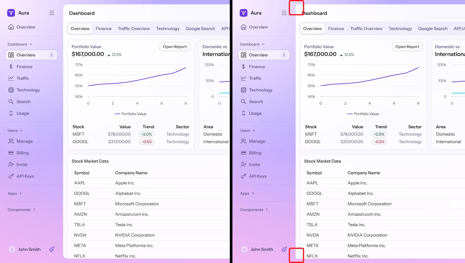
Inset
--aura-app-layout-inset-
A length value that defines how much the navigation and content areas are inset within the browser viewport. You can set it to zero if you want to maximize the space that is available for the UI.
The inset is set to zero automatically once the browser viewport is below 800px width or 600px height.
Example 1. Customizing the App Layout inset
Source code
CSS
html {
  --aura-app-layout-inset: 0px;
}
By default, the navigation and content is slightly inset from the edge of the browser viewport. When the inset is zero, the navigation and content areas take all the space within the browser viewport.
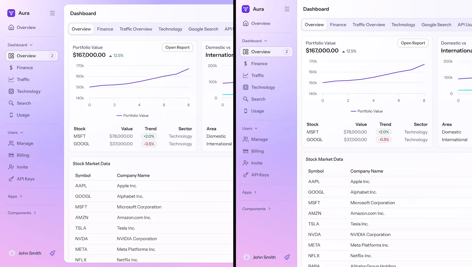
Border
--aura-app-layout-radius-
Sets the border radius of the content area within the App Layout component. Effective only if
--aura-app-layout-insetis not zero. Default is the base style L size border radius. --aura-app-layout-border-width-
The border width around the App Layout content area.
Example 2. Customizing the App Layout border radius
Source code
CSS
html {
  --aura-app-layout-radius: 5px;
}