Bubble Charts
Bubble charts are a special type of scatter chart for representing three-dimensional data points with different point sizes. Scatter charts can serve the same purpose, but bubble charts make it easier to define the size of a point by its third (Z) dimension, instead of the radius property. The bubble size is scaled automatically, similarly as for other dimensions. The default point style is also more bubbly.
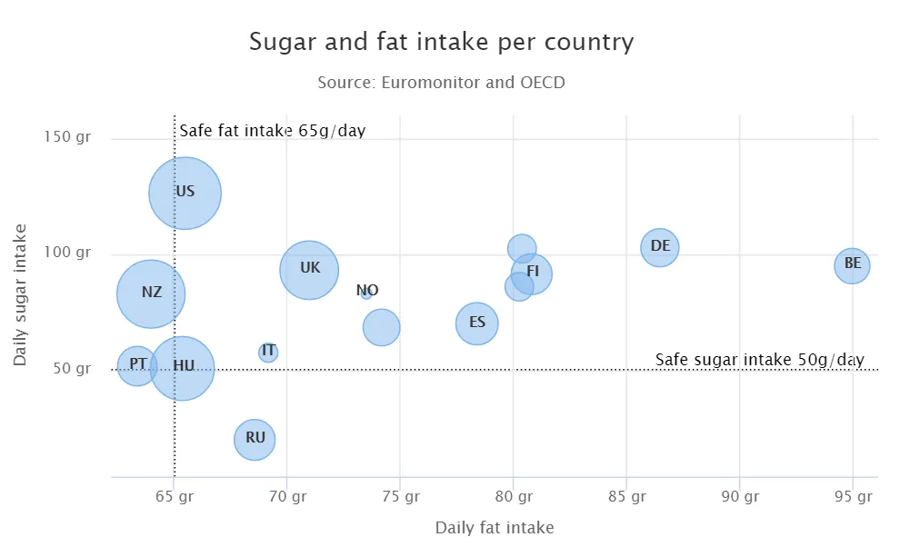
The chart type of a bubble chart is ChartType.BUBBLE. Its options can be configured in a PlotOptionsBubble object, which has a single, chart-specific property, displayNegative, which controls whether bubbles with negative values are displayed at all.
More typically, you want to configure the bubble marker. The bubble tooltip is configured in the basic configuration. The Z coordinate value is available in the formatter JavaScript with the this.point.z reference.
The bubble radius is scaled linearly between a minimum and maximum radius. If you would rather scale by the area of the bubble, you can approximate this by taking the square root of the Z values.
Source code
Java
// Create a bubble chart
Chart chart = new Chart(ChartType.BUBBLE);

// Modify the default configuration a bit
Configuration conf = chart.getConfiguration();
conf.setTitle("Sugar and fat intake per country");
conf.setSubTitle("Source: <a href=\"https://www.euromonitor.com/\">Euromonitor</a> and <a href=\"https://data.oecd.org/\">OECD</a>");
conf.getLegend().setEnabled(false); // Disable legend
conf.getTooltip().setHeaderFormat("{point.country}");
conf.getTooltip().setPointFormat("Obesity (adults): {point.z}%");

PlotOptionsBubble plotOptions = new PlotOptionsBubble();
DataLabels chartLabels = new DataLabels();
chartLabels.setEnabled(true);
chartLabels.setFormat("{point.name}");
plotOptions.setDataLabels(chartLabels);
conf.setPlotOptions(plotOptions);

public static class MyDataSeriesItem extends DataSeriesItem3d {
  private String country;

  public MyDataSeriesItem(Number x, Number y, Number z, String name, String country) {
    super(x, y, z);
    setName(name);
    this.country = country;
  }

  public String getCountry() {
    return country;
  }
}

DataSeries series = new DataSeries("Countries");
series.add(new MyDataSeriesItem(95.0, 95.0, 13.8, "BE", "Belgium"));
series.add(new MyDataSeriesItem(86.5, 102.9, 14.7, "DE", "Germany"));
series.add(new MyDataSeriesItem(80.8, 91.5, 15.8, "FI", "Finland"));
...

conf.addSeries(series);

// Set the category labels on the axis correspondingly
XAxis xaxis = new XAxis();
xaxis.setTitle("Daily fat intake");
xaxis.getLabels().setFormat("{value} gr");
PlotLine xPlotLine = new PlotLine();
xPlotLine.setValue(65);
Label xLabel = new Label("Safe fat intake 65g/day");
xLabel.setRotation(0);
xLabel.setY(15);
xPlotLine.setLabel(xLabel);
xaxis.setPlotLines(xPlotLine);
conf.addxAxis(xaxis);

// Set the Y axis title
YAxis yaxis = new YAxis();
yaxis.setMax(160);
yaxis.setTitle("Daily sugar intake");
yaxis.getLabels().setFormat("{value} gr");
yaxis.setStartOnTick(false);
yaxis.setEndOnTick(false);
PlotLine yPlotLine = new PlotLine();
yPlotLine.setValue(50);
Label yLabel = new Label("Safe sugar intake 50g/day");
yLabel.setX(-10);
yLabel.setAlign(HorizontalAlign.RIGHT);
yPlotLine.setLabel(yLabel);
yaxis.setPlotLines(yPlotLine);
conf.addyAxis(yaxis);