Vaadin Docs
Develop Web Apps with Java
Build scalable user interfaces with Java, using the integrated frameworks, tooling, and components of Vaadin.
Getting Help
Vaadin Community
If you’re stuck or need feedback on your implementation, the Vaadin forum is the perfect place to ask questions, share ideas, and connect with other developers.
Components
Grid
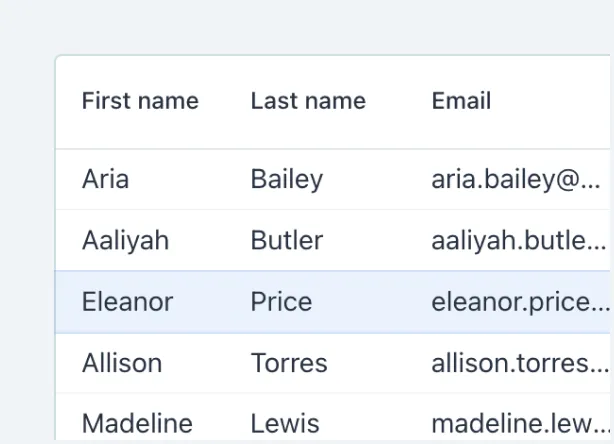
Vaadin Grid is a component for displaying tabular data, including various enhancements to grid renderings.
Combo Box
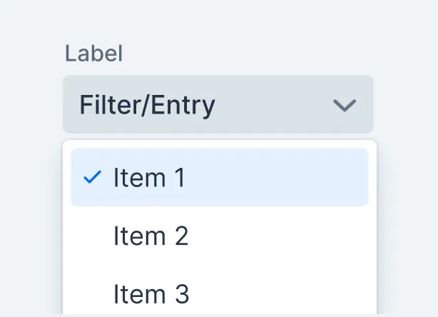
Combo Box allows the user to choose a value from a filterable list of options presented in an overlay.
Date Picker
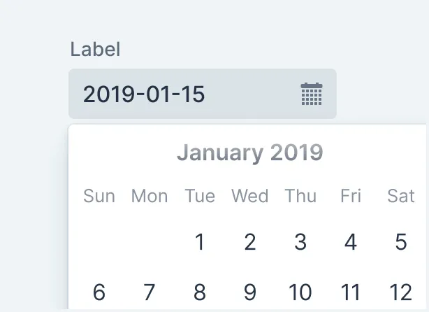
Date Picker is an input field that allows the user to enter a date by typing or by selecting from a calendar overlay.
Button
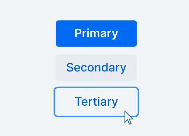
The Button component allows users to perform actions. It comes in several different style variants and supports icons as well as text labels.
Acceleration Kits
Azure Cloud Kit
Create scalable, highly-available, easily upgradable Vaadin applications, and deploy them to Azure Cloud.
Kubernetes Kit
Deploy your Vaadin application to Kubernetes, enabling scalability, high availability, and rolling updates.
Observability Kit
Get insights into Flow applications at runtime and in production by monitoring application health, detecting unhandled errors and performance issues, and observing user behavior.
SSO Kit
Integrate your Vaadin application with third-party identity providers, and give users single sign-on capabilities.