Charts – Basic Use
- Basic Chart Configuration
- Plot Options
- Chart Data Series
- Axis Configuration
- Displaying Multiple Series
- Mixed Type Charts
The Chart class is a regular component which you can add to a layout. You can give the chart type in the constructor or set it later in the chart model.
Source code
Java
Chart chart = new Chart(ChartType.COLUMN);

//or

Chart chart = new Chart();
chart.getConfiguration().getChart().setType(ChartType.COLUMN);
...
layout.add(chart);
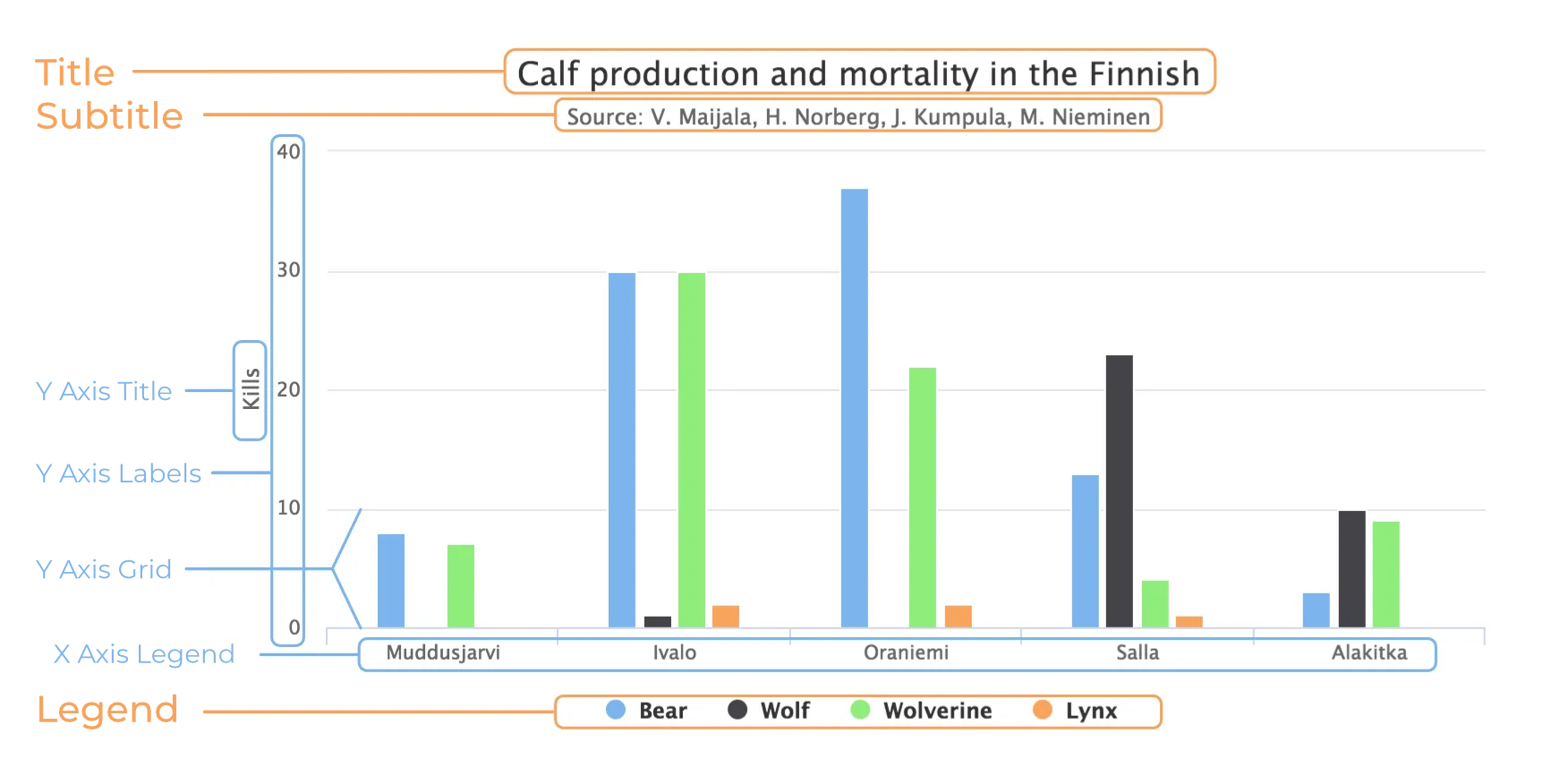
The chart types are described in "Chart Types". The main parts of a chart are illustrated in Chart Elements. Styling a chart is discussed in "Chart Styling"

To actually display something in a chart, you typically need to configure the following aspects:
-
Basic chart configuration
-
Plot options for the chart type
-
One or more data series to display
-
Axes
The plot options can be configured for each data series individually, or for different chart types in mixed-type charts.
Basic Chart Configuration
After creating a chart, you need to configure it further. As a minimum, you need to specify the data series to be displayed in the configuration.
Most methods available in the Chart object handle its basic component properties.
All the chart-specific properties are in a separate Configuration object, which you can access with the getConfiguration() method.
Source code
Java
Configuration conf = chart.getConfiguration();
conf.setTitle("Reindeer Kills by Predators");
conf.setSubTitle("Kills Grouped by Counties");
The configuration properties are described in more detail in "Chart Configuration".
Plot Options
Many chart settings can be configured in the plot options of the chart or data series. Some options are chart-type specific, as described later for each chart type, while many are shared.
For example, for line charts, you could disable point markers, as follows:
Source code
Java
// Disable markers from lines
PlotOptionsLine plotOptions = new PlotOptionsLine();
plotOptions.setMarker(new Marker(false));
conf.setPlotOptions(plotOptions);
You can set the plot options for the entire chart or for each data series separately, allowing also mixed-type charts, as described in Mixed Type Charts.
The shared plot options are described in "Plot Options".
Chart Data Series
The data displayed in a chart is stored in the chart configuration as a list of Series objects.
A new data series is added in a chart with the addSeries() method.
Source code
Java
ListSeries series = new ListSeries("Diameter");
series.setData(4900,  12100,  12800,
               6800,  143000, 125000,
               51100, 49500);
conf.addSeries(series);
The data can be specified with many different series types: DataSeries, ListSeries, HeatSeries and TreeSeries.
Data point features, such as name and data labels, can be defined in the versatile DataSeries, which contains DataSeriesItem items.
Special chart types, such as box plots and 3D scatter charts require using their own special data point type.
The data series configuration is described in more detail in "Chart Data".
Axis Configuration
One of the commonest tasks for charts is customizing the axes. As a minimum, you usually want to set the axis titles. You would also typically specify labels for data values in the axes.
When an axis is categorical, rather than numeric, you can define category labels for the items. They must be in the same order and the same number as you have values in your data series.
Source code
Java
XAxis xaxis = new XAxis();
xaxis.setCategories("Mercury", "Venus",   "Earth",
                    "Mars",    "Jupiter", "Saturn",
                    "Uranus",  "Neptune");
xaxis.setTitle("Planet");
conf.addxAxis(xaxis);
Formatting of numeric labels can be done with JavaScript expressions, for example as follows:
Source code
Java
// Set the Y axis title
YAxis yaxis = new YAxis();
yaxis.setTitle("Diameter");
yaxis.getLabels().setFormatter(
  "function() {return Math.floor(this.value/1000) + \'Mm\';}");
yaxis.getLabels().setStep(2);
conf.addyAxis(yaxis);
Displaying Multiple Series
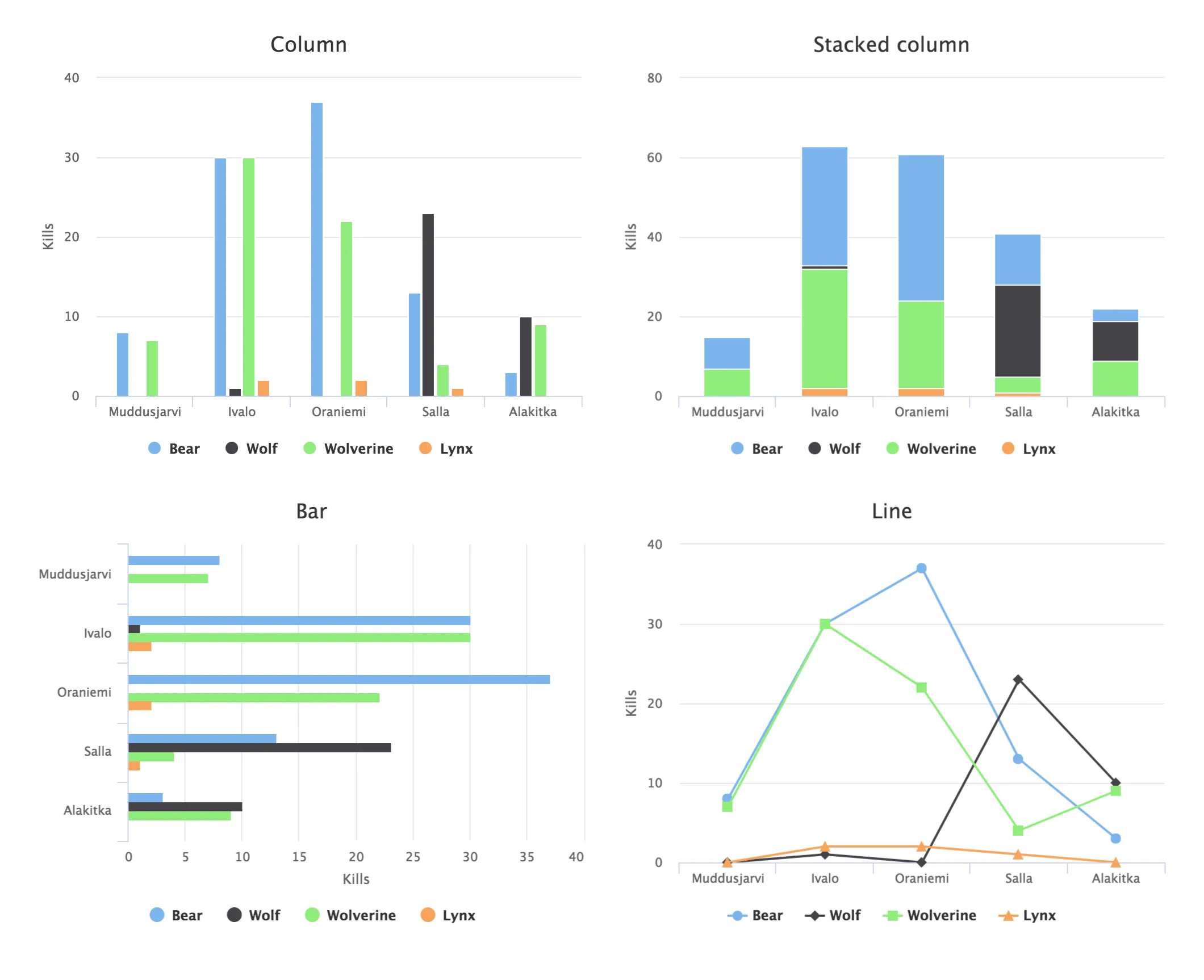
The simplest data, which you saw in the examples earlier in this chapter, is one-dimensional and can be represented with a single data series. Most chart types support multiple data series, which are used for representing two-dimensional data. For example, in line charts, you can have multiple lines, and in column charts, the columns for different series are grouped by category. Different chart types can offer alternative display modes, such as stacked columns. The legend displays the symbols for each series.
Source code
Java
// The data
// Source: V. Maijala, H. Norberg, J. Kumpula, M. Nieminen
// Calf production and mortality in the Finnish
// reindeer herding area. 2002.
String predators[] = {"Bear", "Wolf", "Wolverine", "Lynx"};
int kills[][] = {        // Location:
        {8,   0,  7, 0}, // Muddusjarvi
        {30,  1, 30, 2}, // Ivalo
        {37,  0, 22, 2}, // Oraniemi
        {13, 23,  4, 1}, // Salla
        {3,  10,  9, 0}, // Alakitka
};

// Create a data series for each numeric column in the table
for (int predator = 0; predator < 4; predator++) {
    ListSeries series = new ListSeries();
    series.setName(predators[predator]);

    // The rows of the table
    for (int location = 0; location < kills.length; location++)
        series.addData(kills[location][predator]);
    conf.addSeries(series);
}
The result for both regular and stacked column chart is shown in Multiple Series in a Chart.
Stacking is enabled with setStacking() in PlotOptionsColumn.

Mixed Type Charts
You can enable mixed charts by setting the chart type in the PlotOptions object for a data series, which overrides the default chart type set in the Chart object.
You can also control the animation and other settings for the series in the plot options.
For example, to get a line chart, you need to use PlotOptionsLine.
Source code
Java
// A data series as column graph
DataSeries series1 = new DataSeries();
PlotOptionsColumn options1 = new PlotOptionsColumn();
series1.setPlotOptions(options1);
series1.setData(4900,  12100,  12800,
    6800,  143000, 125000, 51100, 49500);
conf.addSeries(series1);

// A data series as line graph
ListSeries series2 = new ListSeries("Diameter");
PlotOptionsLine options2 = new PlotOptionsLine();
series2.setPlotOptions(options2);
series2.setData(4900,  12100,  12800,
    6800,  143000, 125000, 51100, 49500);
conf.addSeries(series2);
In this case, where you set the chart type for each series, the general chart type is irrelevant.
|
Note
| Gauge and solid gauge series shouldn’t be combined with series of other types. |
|
Note
| A bar series inverts the entire chart; combine with care. |
DD970446-ACF9-482F-89ED-96A16ED45E01