Theming
Vaadin Designer supports theming the same way as Flow. When a design is opened, Vaadin Designer loads the theme, defined by the @Theme annotation and it loads all style sheets defined by any @CssImport, @StyleSheet, and @JsModule annotations.
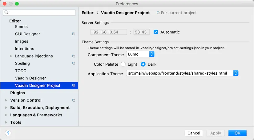
You can change the component theme used by Designer from the project settings. Component themes have different look-and-feel, as well as styles declarations. Changing Designer component theme settings don’t affect your Flow project. Likewise, your Flow project theme settings aren’t reflected in Designer.
Designer component theme setting only affects how designs are rendered by Designer. Typically, you match this with your application’s component theme.
The user should provide all styling through the application theme, if the component theme None was selected.
The None component theme is used as a fallback if project is missing necessary dependencies for the selected theme, for example if vaadin-lumo-styles JAR isn’t available in the classpath.
Theme settings are be stored in your project’s root folder under .vaadin/designer/project-settings.json so that the settings can be preserved and thereby shared with everyone who works with Designer on the project.

Custom Theme
Vaadin Designer supports theming in the same way as Flow. When a design is opened, Vaadin Designer does a few things.
It modifies the package.json file to add utility libraries. These changes should be committed to your version control system. Then it installs frontend dependencies if they aren’t available in the project. This installation process could take a long time because the IDE also needs to re-index the new files, but this happens only once.
It also loads the custom theme, defined by the @Theme annotation. And it loads all style sheets of the theme (and its parent themes if there is any), such as global and component style sheets. Static resources (i.e., images, fonts, …) of the theme are resolved.
When a style sheet under a custom theme is changed, Designer is automatically reloaded to apply the changes.
|
Note
|
Refresh to Apply
When updating the @Theme annotation value, all Designer visual editors need to be re-opened to apply the new theme. Also in Preview mode, you need to refresh the browser manually.
|
F17752F6-F920-43EC-94EF-1A5925B8A128