Styling Overview
- Stylesheets
- Themes
- Component Style Properties
- Applying CSS to Components
- Component Style Variants
- Recommended Approach
- Styling HTML Elements
- Inline Styles
- Topics
Vaadin applications are primarily styled with CSS in style sheets, just like any other web UI. You can also apply inline styles to elements, and use utility classes.
Stylesheets
In most project configurations, stylesheets are placed in the src/main/resources/META-INF/resources folder. In non-Spring projects packaged as WAR files they are placed in the src/main/webapp folder. In both cases they are loaded with the @StyleSheet annotation.
@StyleSheet annotations should primarily be applied to the class that implements the AppShellConfigurator interface. This is often the main application class, although it can be another class as well. This ensures that the CSS in it is applied globally, up-front, when the application UI is loaded into the browser.
Source code
Java
@StyleSheet("styles.css")
public class Application implements AppShellConfigurator {
 ...
}
You can split your CSS over multiple stylesheets, and load them either with separate @StyleSheet annotations, or load additional stylesheets using the CSS @import rule.
Source code
src/main/resources/META-INF/resources/styles.css
src/main/resources/META-INF/resources/styles.css@import "additional-styles.css";
/* your CSS goes here */You can find more details in the Stylesheets section.
|
Note
|
@Theme is deprecated but supported.
Loading styles through the @Theme annotation and a theme folder in frontend/themes has been deprecated, but is still supported through the themeComponentStyles feature flag. See the Vaadin 24 Styling documentation for details on this usage.
|
Themes
By default, Vaadin components are rendered with their simple built-in base styles, which are a good starting point if you want to customize the look and feel extensively. Vaadin also ships with two themes, Aura and Lumo, that give a more polished look and feel for Vaadin components.
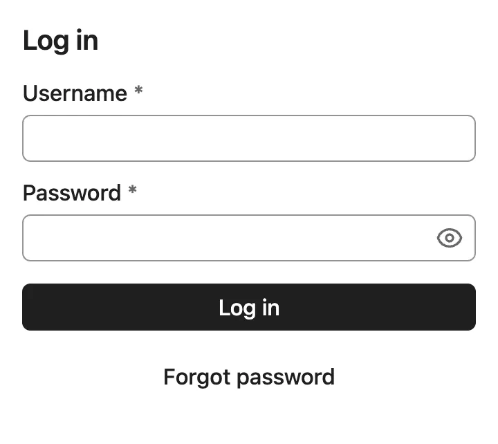
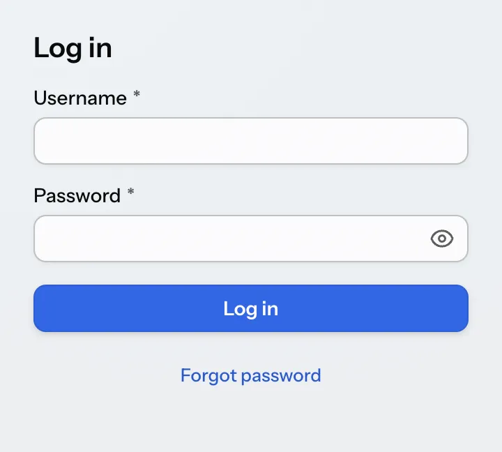
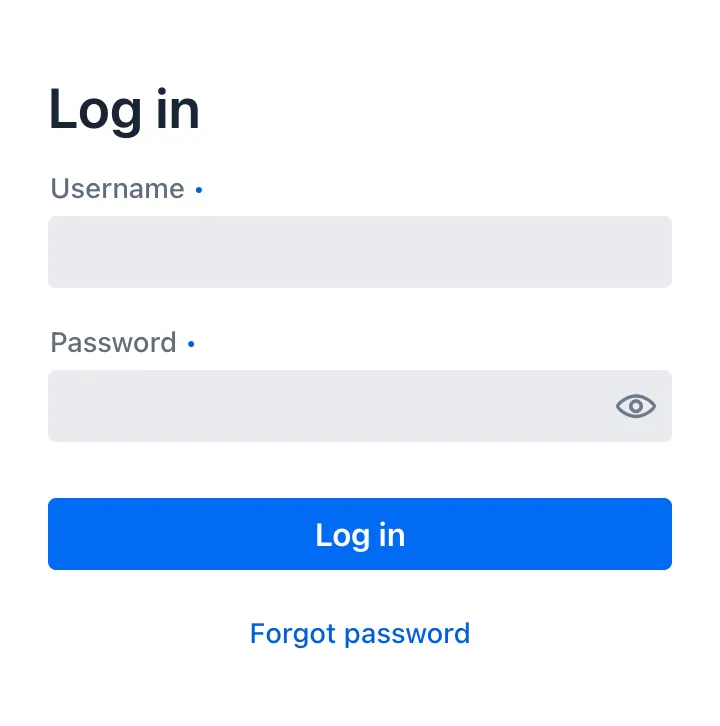
| Base | Aura | Lumo |
|---|---|---|
|
|
|
Vaadin themes can be loaded with the @StyleSheet annotation. The Aura and Lumo Java classes have constants for the stylesheet path that can be used with the @StyleSheet annotation.
Themes should be imported before any other styles in your application, so that style customizations have a higher specificity.
Source code
Java
/* Aura theme loaded with @StyleSheet annotation */
@StyleSheet(Aura.STYLESHEET)
@StyleSheet("styles.css")
public class Application implements AppShellConfigurator {
 ...
}
Both themes offer a comprehensive set of style properties (CSS custom properties) that make them customizable without complex CSS selectors. These properties are listed on the Aura and Lumo reference pages.
Source code
CSS
html {
  --lumo-primary-color: green;
  --lumo-font-family: Times;
}
You can choose to apply your own styling on top of either theme, or on top of the minimal “white label” base styles built into Vaadin components, depending on the look and feel you want to have in your UI.
Component Style Properties
Vaadin components also have their own component-specific style properties for customizing their styles. These properties are listed on the Styling sub-pages in the component documentation (e.g., Text Field Styling), along with the most common CSS selectors you can use to target the parts and states of components with your own CSS.
Component style properties differ from theme style properties in that they are specific to a particular component type.
Source code
Customizing Vaadin component style properties
html {
  --vaadin-button-background: lightgray;
}
Applying CSS to Components
The most common selectors needed to style Vaadin components are listed on the Styling sub-pages in the component documentation (e.g., Text Field Styling), along with the style properties built into the components.
Source code
Applying custom CSS to a component’s state and part
vaadin-button[disabled]::part(label) {
  color: darkgray;
}
Component Style Variants
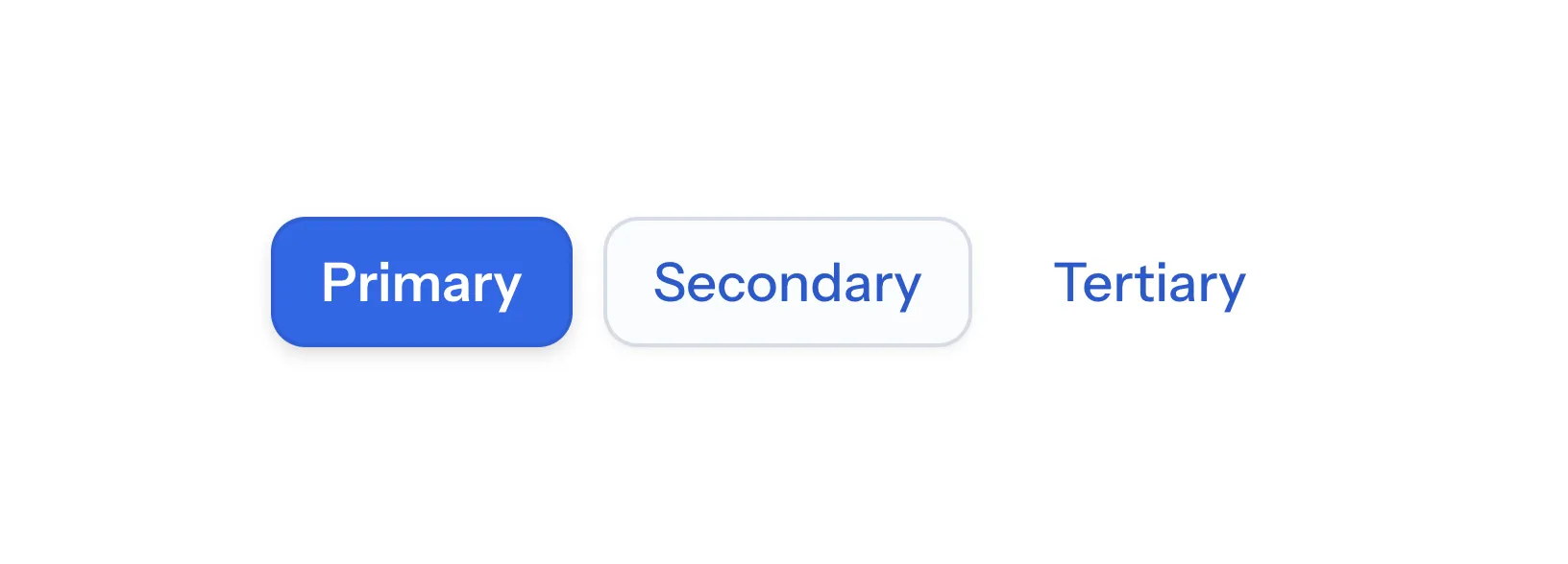
Many Vaadin components also have style variants as a built-in feature. You can find supported variants in the documentation for each component.
Recommended Approach
The recommended approach to styling Vaadin components is:
-
Theme: choose the theme that is the best match to your desired look and feel for components, or stick to the components’ base styles if neither theme is a good match;
-
Variant: check if the component provides a style variant that corresponds (at least partially) to what you’re after;
-
Style Properties: customize the component using theme and/or component style properties;
-
CSS style blocks: write your own CSS (using documented selectors) only once you can’t get further with the above approaches.
|
Note
|
Shadow DOM Styling Not Recommended
In older versions of Vaadin, components were primarily styled by injecting CSS into their shadow DOM using the themes/<theme-name>/components folder or, in even older versions, the themeFor property of the @CssImport annotation. Although still supported, this approach is no longer recommended. All styling documentation, including the reference tables on components’ Styling pages, is based on normal CSS applied to the document scope.
|
Styling HTML Elements
Utility classes can be used to apply styles to HTML elements (like <div> and <span>), and (with some limitations) to Vaadin components. Vaadin supports Tailwind CSS, and the Lumo theme has its own set of Lumo Utility Classes.
Source code
Java
var warningBox = new Div("Warning!");
warningBox.addClassNames("bg-orange-400 p-20px");
Inline Styles
Inline CSS can also be applied to individual elements and components through the getStyle() Java API. These should be used sparingly to avoid hard-to-maintain spaghetti code, but can be useful, for example, for applying styles dynamically based on business logic.
Source code
Java
warningBox.getStyle().setBackground("#ff8904");

saveButton.getStyle().set("--vaadin-button-background", "green");|
Important
|
Inline styles have limited utility in Vaadin components
Inline styles applied through the getStyle() API are mainly useful for styling native HTML elements and the Horizontal and Vertical Layout components. The getStyle() API is rarely effective for styling other Vaadin components, due to the their complex nested structure. Exceptions to this rule include margin, padding, and component style properties.
|
Topics
- Stylesheets
- A guide on how to use stylesheets to style Vaadin applications.
- Styling Components
- Explanation and examples on how to customize the styling of Vaadin components.
- Styling HTML Elements
- A guide to styling HTML elements in Vaadin applications.
- Utility Classes
- A guide to using utility classes in Vaadin applications.
- Themes & Base Styles
- An overview of Vaadin themes and base styles.
- Advanced
- Advanced styling techniques for Vaadin applications.
a8b31702-5795-473f-a23c-25d4e64f3ef3