Lumo
Lumo is the original Vaadin theme. It’s based on a set of customizable style properties, and comes with built-in dark and compact variants.
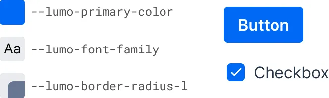
The look and feel of all Vaadin components can be easily customized in a consistent manner across the entire application by supplying your own values to these style properties.
The built-in dark and compact variants are predefined sets of style property values that can be applied to the entire application or to parts of it.
The Lumo theme also includes a comprehensive set of CSS utility classes that can be applied to HTML elements and layout components through Java, to change their styling without writing any CSS of your own.
Light & Dark Color Schemes
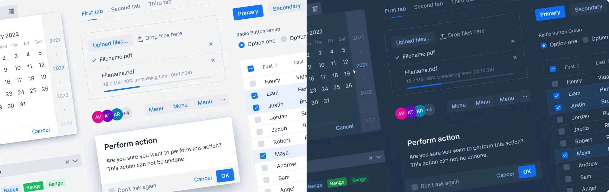
In the screenshot here, you can see the difference between the default light color variant on the left, and the dark variant on the right — which are both built into Lumo.
Lumo supports automatic color scheme selection based on the user’s operating system or browser preference. See Color Schemes for how to apply different color schemes in your application.
Compact Preset
Lumo also has a compact preset that reduces fonts sizes — and proportionally all Vaadin components. It’s applied by loading an additional stylesheet containing a modified set of Lumo sizing properties:
Source code
Java
@StyleSheet(Lumo.STYLESHEET)
@StyleSheet(Lumo.COMPACT_STYLESHEET)
public class Application implements AppShellConfigurator {
    ...
}
Topics
The following topics are covered in this section:
- Style Properties
- The style properties of the built-in Lumo theme.
- Utility Classes
- List of Lumo utility classes and descriptions of them.