Lumo Style Properties
The style properties of the built-in Lumo theme.
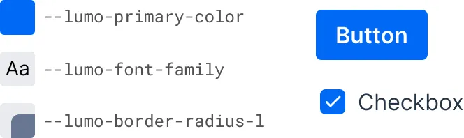
Lumo is based on a set of style properties — CSS custom properties — representing colors, fonts, sizes and other styles, that can be customized by providing new values for them in a CSS stylesheet, either globally, or scoped to a certain component type or instance.
Lumo Style Properties Example & Use in Vaadin Components
Source code
Customizing Values of Lumo Style Properties
html {
  --lumo-primary-color: green;
  --lumo-font-family: 'Roboto';
}
Lumo style properties can also be used in CSS instead of hard-coded literal values, through the var() function:
Source code
Use of Lumo Style Properties in Custom CSS
div {
  border: 1px solid var(--lumo-primary-color);
  border-radius: var(--lumo-border-radius-m);
}
The Styling Vaadin Components section provides more details on using Lumo properties to modify the look and feel of Vaadin components. The Styling Elements section provides more details on using Lumo properties to style other UI elements.
Lists of Lumo Style Properties
- Color
- Colors and their corresponding style properties defined in the Lumo theme.
- Typography
- Tables of Lumo style properties related to displaying and formatting text.
- Size & Space
- Listing of Lumo style properties related to setting the size and spacing of text and components.
- Shape
- Describing the Lumo style properties related to component shapes.
- Elevation
- Listing of Lumo elevation style properties, the visual stacking of elements in a UI.
- Interaction
- Lumo style properties related to how interactions are indicated in an application.