Styling Vaadin Components
- Recommended Styling Approach
- Component Style Properties
- Theme Style Properties
- Writing CSS for Vaadin Components
- Styling Component Parts and States
- Styling Component Instances
You can style Vaadin components in two primary ways:
-
Style properties built into the components themselves, and into the Aura and Lumo themes. These make it easy to customize component styles without having to figure out the appropriate CSS selectors.
-
CSS style blocks that consist of a selector that targets a particular element and/or state of the component, and one or more CSS property-value pairs.
Both style properties and CSS style blocks are placed in stylesheets loaded into the application UI.
Source code
CSS
/* Customizing component styles properties globally */
html {
  --vaadin-button-background: lightgray;
  --vaadin-button-border-color: darkgray;
}

/* Customizing a component part with a style block */
vaadin-app-layout::part(navbar) {
  padding: 0.5em 1em;
}
Many Vaadin components also have style variants as built-in features. These can be found in the documentation for each component. They are applied in Flow through the addThemeVariants method and in React through the theme attribute.
Source code
Java
Button button = new Button("Save");
button.addThemeVariants(ButtonVariant.PRIMARY);
Java
tsx
tsx
Recommended Styling Approach
The following layered approach to styling Vaadin components is recommended to minimize the amount of CSS, avoid breaking components and protect your styling from getting broken in future versions.
-
Theme: choose the theme that is the best match to your desired look and feel for components, or stick to the components’ base styles if neither theme is a good match;
-
Variant: check if the component provides a style variant that corresponds (at least partially) to what you’re after;
-
Style Properties: customize the component using theme and/or component style properties;
-
CSS style blocks: write your own CSS (using documented selectors) only once you can’t get further with the above approaches.
The choice between using component style properties or theme style properties depends on whether you want to customize a generic style (e.g. a color, a font, or a size) across all Vaadin components, or a specific visual detail of a specific type of component.
Component Style Properties
Vaadin components have their own style properties (CSS custom properties) for customizing their look and feel. They are the primary styling API of Vaadin components. Style properties are an easier way to customize component styles as you don’t need to target specific component parts and states with CSS selectors.
Component style properties are prefixed with --vaadin-. Most of these properties are specific to a particular component type, such as --vaadin-button-background. Some properties are shared across multiple component types, like the --vaadin-input-field-* properties that are used by all input field components.
Style properties are most often applied to the html element at the root of the page, where they apply to all instances of the component within your UI. You can also scope them to apply only within a certain part of your UI, or individual component instances, by using other selectors, such as CSS class names.
Source code
CSS
/* Globally to all instances */
html {
  --vaadin-button-background: lightgray;
  --vaadin-button-border-color: darkgray;
}

/* Scoped to the App Layout navbar */
vaadin-app-layout::part(navbar) {
  --vaadin-input-field-background: white;
}

/* Scoped to Text Fields with the 'search' classname */
vaadin-text-field.search {
  --vaadin-input-field-border-radius: 3em;
}|
Note
|
CSS Class Names
CSS class names are identifier-attributes applied to HTML elements that allow you to scope CSS styling to them. The same class name can be applied to multiple elements, and each element can have multiple class names. They have nothing to do with Java or TypeScript classes.
|
When the Aura or Lumo theme is used, most component style properties default to values based on theme style properties.
Theme Style Properties
The Aura and Lumo themes also have their own style properties (CSS custom properties) that make them easy to customize. When either theme is loaded, it applies its own values to the component style properties, most often based on its own style properties.
Aura style properties are prefixed with --aura- while Lumo style properties are prefixed with --lumo-. The theme style properties are listed on the Aura and Lumo reference pages.
Like component style properties, theme properties are most often applied to the html element at the root of the page, where they apply to all instances of the component within your UI. You can also scope them to only apply within a certain part of your UI, or individual component instances, by using other selectors, such as CSS class names.
Source code
CSS
/* Globally to all instances */
html {
  --lumo-primary-color: green;
}

/* Scoped to the App Layout navbar */
vaadin-app-layout::part(navbar) {
  --lumo-primary-color: green;
}

/* Scoped to Text Fields with the 'search' classname */
vaadin-text-field.search {
  --lumo-primary-color: green;
}
Theme style properties can also be used to style HTML elements and layouts, to achieve consistency with component styles, using the CSS var() function:
Source code
Java
var footer = new Footer();
footer.addClassNames("footer");
Source code
CSS
.footer {
  background-color: var(--lumo-contrast-20pct);
  font-size: var(--lumo-font-size-s);
}
Writing CSS for Vaadin Components
Vaadin components are more complex than normal HTML elements, because they consist of many individual elements that enable various features. Most of those elements are encapsulated within the component’s shadow DOM, which protects them from being accidentally affected by external CSS.
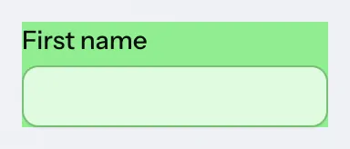
As an example, setting the background-color property of the Text Field component in the same way as you would do on a native HTML <input> element does not change the color of the input field surface. Instead, it applies that color to the entire component’s background, including the label, error message, helper text, and the spacing between them:
Source code
CSS
vaadin-text-field {
  background-color: lightgreen;
}
To style Vaadin components, you need to know the appropriate CSS selectors for targeting various parts and states within the components.
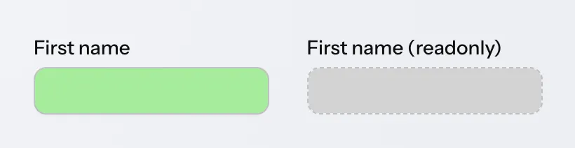
In the example below, the ::part(input-field) selector is used to target the input field surface within the component. The [readonly] selector is used to target the component in the read-only state.
Source code
CSS
vaadin-text-field::part(input-field) {
  background-color: lightgreen;
}

vaadin-text-field[readonly]::part(input-field) {
  background-color: lightgrey;
}
The most common selectors needed to style Vaadin components are listed on the Styling sub-pages in the component documentation (see e.g. Text Field), along with the style properties built into the components.
|
Note
|
Shadow DOM Styling Not Recommended
In older versions of Vaadin, components were primarily styled by injecting CSS into their shadow DOM using the themes/<theme-name>/components folder or, in even older versions, the themeFor property of the @CssImport annotation. Although still supported, this approach is no longer recommended. All styling documentation, including the reference tables on components’ Styling pages, is based on normal CSS applied to the document scope.
|
The web.dev CSS tutorial is a good resource for learning the basics of CSS.
Styling Component Parts and States
Various types of CSS selectors are used when applying custom CSS to Vaadin components. These can be divided into the parts that comprise the component, and the possible states of component parts.
Stylable Parts of Components
The various HTML elements that make up Vaadin components are listed on the Styling page under each component documentation page. You’ll see there four primary types of parts, each of which is associated with a different type of CSS selector.
Root Elements
Each Vaadin component has a root HTML element whose name starts with the vaadin- prefix, such as vaadin-button or vaadin-combo-box.
Source code
CSS
vaadin-button {
  background: orange;
}
Shadow Parts
Shadow parts are elements inside the component’s shadow DOM and are styled using the ::part() selector. As an example, the input surface of a Text Field is styled using the input-field shadow part name:
Source code
CSS
vaadin-text-field::part(input-field) {
  background: white;
  border: 1px solid gray;
}
Some Vaadin components like Grid provide APIs that allow developers to apply their own part names to shadow parts like table cells based on custom logic.
Normal Child Elements
Normal HTML child elements are styled using the > selector. As an example, the Checkbox component’s label is a label element:
Source code
CSS
vaadin-checkbox > label {
  font-weight: bold;
}
Pseudo-Elements
The pseudo-elements ::before and ::after are elements generated with CSS. They are commonly used for font-based icons and highlight effects for states like hover and focus, often on one of the shadow parts rather than the root element. As an example, the Date Picker’s icon is a pseudo-element in the toggle-button shadow part, and its required indicator is a pseudo-element in the required-indicator shadow part:
Source code
CSS
vaadin-date-picker::part(toggle-button)::before {
  color: blue;
}

vaadin-date-picker::part(required-indicator)::after {
  color: salmon;
}
Sub-Components
In addition to the above, many components utilize “sub-components” with their own root HTML elements. In many cases, these have their own shadow parts, child elements and pseudo-elements. As an example, the Date Picker’s overlay content renders month and year selectors using vaadin-month-calendar and vaadin-date-picker-year components. They both contain various shadow parts.
Source code
CSS
vaadin-month-calendar::part(date) {
  font-weight: bold;
}
Component States
The various states of a Vaadin component are listed on the Styling page under each component documentation page. There you’ll see three types of CSS selectors used for states: state attributes; state part-names; and pseudo classes. They’re each described below, as well as how to negate state selectors.
State Attributes
Most states of component root elements and their various parts are exposed through state attributes and styled using attribute selectors of the form component-name[state]. As an example, disabled Buttons are identified by the [disabled] selector:
Source code
CSS
vaadin-button[disabled] {
  background: lightgray;
  color: darkgray;
}
State attributes can be combined with part selectors by placing the attribute selector before the part, child or pseudo-element selector:
Source code
CSS
vaadin-text-field[disabled]::part(input-field) {
  border-color: lightgray;
}

vaadin-checkbox[disabled] > label {
  color: gray;
}

vaadin-date-picker[disabled]::part(toggle-button)::before {
  visibility: hidden;
}
State Part-Names
Some shadow parts have their own states exposed as additional part names. As an example, a disabled date in the Date Picker’s calendar is styled using the part names date and disabled, combined into the same ::part() selector:
Source code
CSS
vaadin-month-calendar::part(date disabled) {
  color: red;
}
Pseudo-Classes
Pseudo-classes are CSS features used for certain native HTML states like hover. They can be combined with any other selector:
Source code
CSS
vaadin-button:hover {
  border-color: blue;
}

vaadin-password-field[readonly]:hover::part(reveal-button) {
  color: green;
}
In the example above, the first style block applies a border color to Buttons on hover, and the second applies a green color to the reveal button of read-only Password Fields on hover.
Negating or Excluding States
To target the opposite of a state exposed as an attribute or a pseudo-class, the state selector can be wrapped in a :not() selector. This is often needed to exclude a particular state from a style block.
Source code
CSS
vaadin-button:not([disabled]) {
  border-color: blue;
}
Component Style Variants
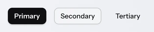
Many Vaadin components come with built-in style variants, listed on the documentation page for each component. These variants can be used to change the color, size, or other visual aspects of individual component instances through the addThemeVariants Java API.
These variants are applied with theme attributes on the root elements of components, and can be targeted with CSS attribute selectors, and excluded by wrapping the attribute selector in a :not() selector.
Source code
CSS
vaadin-button[theme~="primary"] {
  background-color: orange;
}

vaadin-button:not([theme~="primary"]) {
  color: orange;
}
Unintentional Overriding of State and Variant Styles
Custom CSS applied to a component can often override state and variant styles built into the component. As an example, the following CSS changes the text color of all Buttons, including the built-in Primary style variant and the disabled state:
Source code
CSS
vaadin-button {
  color: red;
}
To only change the text color of enabled buttons using the default style variant, you need to exclude those with the :not() selector:
Source code
CSS
/* Selector that excludes disabled and primary buttons */
vaadin-button:not([disabled]):not([theme~="primary"]) {
  color: red;
}
Styling Component Instances
Sometimes you need to apply different styles to specific instances of a component, instead of all components of a particular type. You can do this by applying a CSS class name to the components and using that in your CSS selector, or by scoping the styles to components contained in a particular parent element.
Applying CSS to Component Instances
CSS can be scoped to specific component instances by applying CSS class names to the components with the addClassName method and adding them to the HTML element selector prefixed with a period, as shown in the example here:
Source code
Java
TextField textField = new TextField();
textField.addClassName("bordered");
Java
tsx
tsx
Source code
CSS
vaadin-text-field.bordered::part(input-field) {
  background: white;
  border: 1px solid gray;
}|
Note
|
CSS Class Names
CSS class names are identifier-attributes applied to HTML elements that allow you to scope CSS styling to them. The same class name can be applied to multiple elements, and each element can have multiple class names. They have nothing to do with Java or TypeScript classes. |
Some components like Grid have APIs for applying custom shadow part names to their internal elements, instead of class names.
You can use the same approach to scope styles to a particular view or other UI element.
|
Note
|
Custom Theme Names Supported, Not Recommended
In previous versions of Vaadin, a different feature called theme names was used to apply identifiers that were propagated to sub-components, such as overlays. This feature is still supported and is used for the built-in style variants in Vaadin components. However, it’s no longer the recommended approach for styling components. |
Applying CSS Based on Parent Element
CSS can also be scoped to components based on their parent elements – such as Horizontal Layout and Vertical Layout or HTML elements like divs – in which they are placed. This is done by applying a CSS class name to the parent element, and prefixing the selector with it:
Source code
Java
VerticalLayout filterLayout = new VerticalLayout();
filters.addClassName("filter-layout");
TextField nameFilterField = new TextField();
filterLayout.add(nameFilterField);
Java
tsx
tsx
Source code
CSS
.filterLayout vaadin-text-field::part(input-field) {
  background: white;
  border: 1px solid gray;
}
The parent element can be either the component’s nearest parent element or any outer parent element in the element hierarchy. This can be used to apply CSS to components in a specific view in the application, by applying a CSS class name to the view’s root layout element, and scoping component CSS blocks to it.
63d323e3-3ee2-482b-8aae-873b72d98229