Create a Form Component for Editing Contacts
|
Important
|
Deprecated
This tutorial is no longer maintained. It’s accessible, though, until the new tutorial is completed, which involves adding all of the topics in this tutorial to the new one.
|
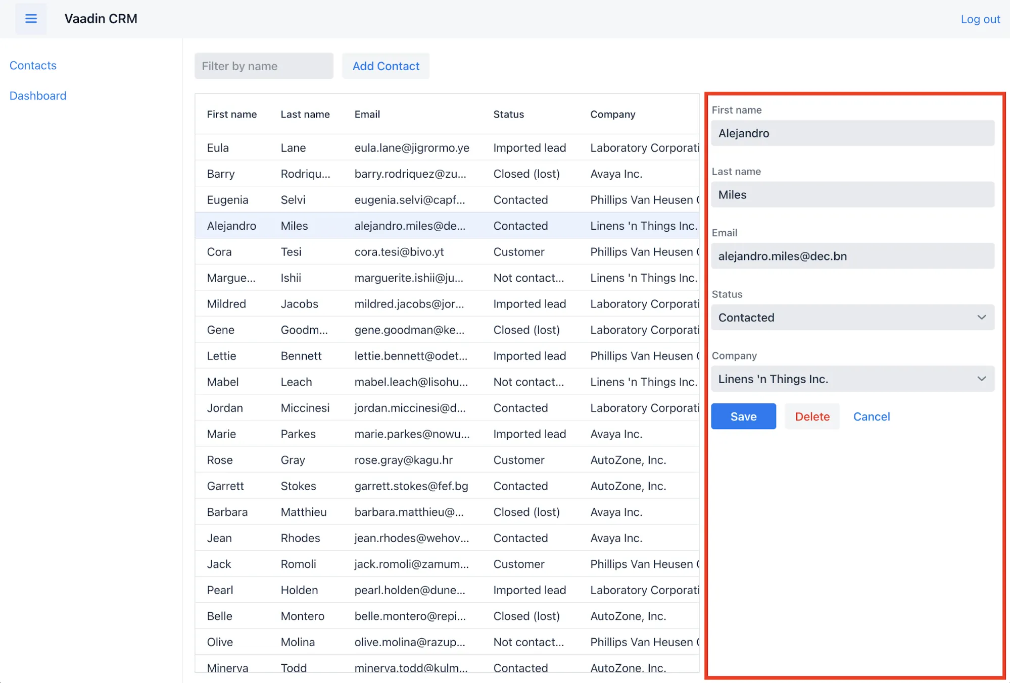
The list view now has a grid to display Contact objects. To complete the view, you need to create a form for editing contacts — like the one in the screenshot here:

This part covers creating a new component, as well as importing and using a custom component.
Components Using Composition
Vaadin Flow is a component-based framework. In the previous parts here, you worked with several components, like Grid, TextField, and VerticalLayout. However, the real power of the component-based architecture is in the ability to create your own components.
Instead of building an entire view in a single class, your view can be composed of smaller components that each handle different parts of the view. The advantage of this approach is that individual components are easier to understand and test. The top-level view is used mainly to orchestrate the components.
Form Component
The form component you’ll create needs text fields for the first and last name, an email field, and two select fields: one to select the company, and another to select the contact status.
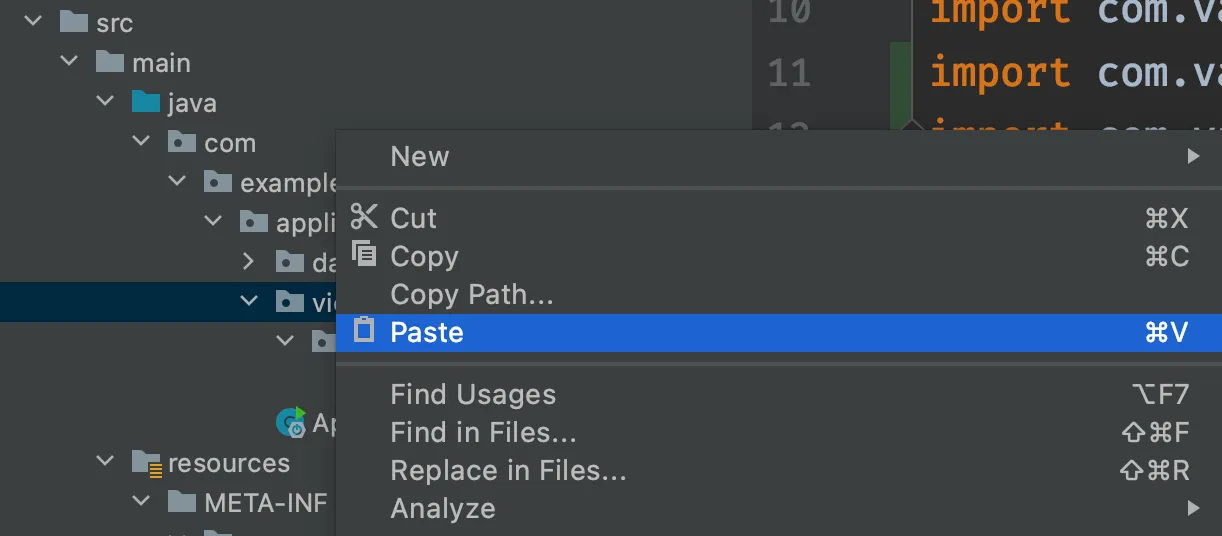
Start by creating a new file, ContactForm.java, in the com.example.application.views.list package. If you’re using IntelliJ, copy the code below and paste it into the views package. IntelliJ automatically creates the file.

package com.example.application.views.list;

import com.example.application.data.Company;
import com.example.application.data.Status;
import com.vaadin.flow.component.Key;
import com.vaadin.flow.component.button.Button;
import com.vaadin.flow.component.button.ButtonVariant;
import com.vaadin.flow.component.combobox.ComboBox;
import com.vaadin.flow.component.formlayout.FormLayout;
import com.vaadin.flow.component.orderedlayout.HorizontalLayout;
import com.vaadin.flow.component.textfield.EmailField;
import com.vaadin.flow.component.textfield.TextField;

import java.util.List;

public class ContactForm extends FormLayout { 1
  TextField firstName = new TextField("First name"); 2
  TextField lastName = new TextField("Last name");
  EmailField email = new EmailField("Email");
  ComboBox<Status> status = new ComboBox<>("Status");
  ComboBox<Company> company = new ComboBox<>("Company");

  Button save = new Button("Save");
  Button delete = new Button("Delete");
  Button close = new Button("Cancel");

  public ContactForm(List<Company> companies, List<Status> statuses) {
    addClassName("contact-form"); 3

    company.setItems(companies);
    company.setItemLabelGenerator(Company::getName);
    status.setItems(statuses);
    status.setItemLabelGenerator(Status::getName);

    add(firstName, 4
        lastName,
        email,
        company,
        status,
        createButtonsLayout());
  }

  private HorizontalLayout createButtonsLayout() {
    save.addThemeVariants(ButtonVariant.LUMO_PRIMARY); 5
    delete.addThemeVariants(ButtonVariant.LUMO_ERROR);
    close.addThemeVariants(ButtonVariant.LUMO_TERTIARY);

    save.addClickShortcut(Key.ENTER); 6
    close.addClickShortcut(Key.ESCAPE);

    return new HorizontalLayout(save, delete, close); 7
  }
}-
ContactFormextendsFormLayout: a responsive layout that shows form fields in one or two columns, depending on the viewport width. -
Creates all the UI components as fields in the component.
-
Gives the component a CSS class name, so you can style it later.
-
Adds all the UI components to the layout. The buttons require a bit of extra configuration. Create and call a new method,
createButtonsLayout(). -
Makes the buttons visually distinct from each other using built-in theme variants.
-
Defines keyboard shortcuts:
Enterto save andEscapeto close the editor. -
Returns a
HorizontalLayoutcontaining the buttons to place them next to each other.
Add Form to Main View
The next step is to add the form you created to the main view. To do this, change ListView as follows:
public class ListView extends VerticalLayout {
    Grid<Contact> grid = new Grid<>(Contact.class);
    TextField filterText = new TextField();
    ContactForm form; 1

    public ListView() {
        addClassName("list-view");
        setSizeFull();
        configureGrid();
        configureForm(); 2

        add(getToolbar(), getContent()); 3
    }

    private Component getContent() {
        HorizontalLayout content = new HorizontalLayout(grid, form);
        content.setFlexGrow(2, grid); 4
        content.setFlexGrow(1, form);
        content.addClassNames("content");
        content.setSizeFull();
        return content;
    }

    private void configureForm() {
        form = new ContactForm(Collections.emptyList(), Collections.emptyList()); 5
        form.setWidth("25em");
    }

    // Remaining methods omitted
}-
Creates a reference to the form so you have access to it from other methods.
-
Create a method for initializing the form.
-
Change the
add()method to callgetContent(). The method returns aHorizontalLayoutthat wraps the form and the grid, showing them next to each other. -
Use
setFlexGrow()to specify that the Grid should have twice the space of the form. -
Initialize the form with empty company and status lists: you’ll add these on the next part.
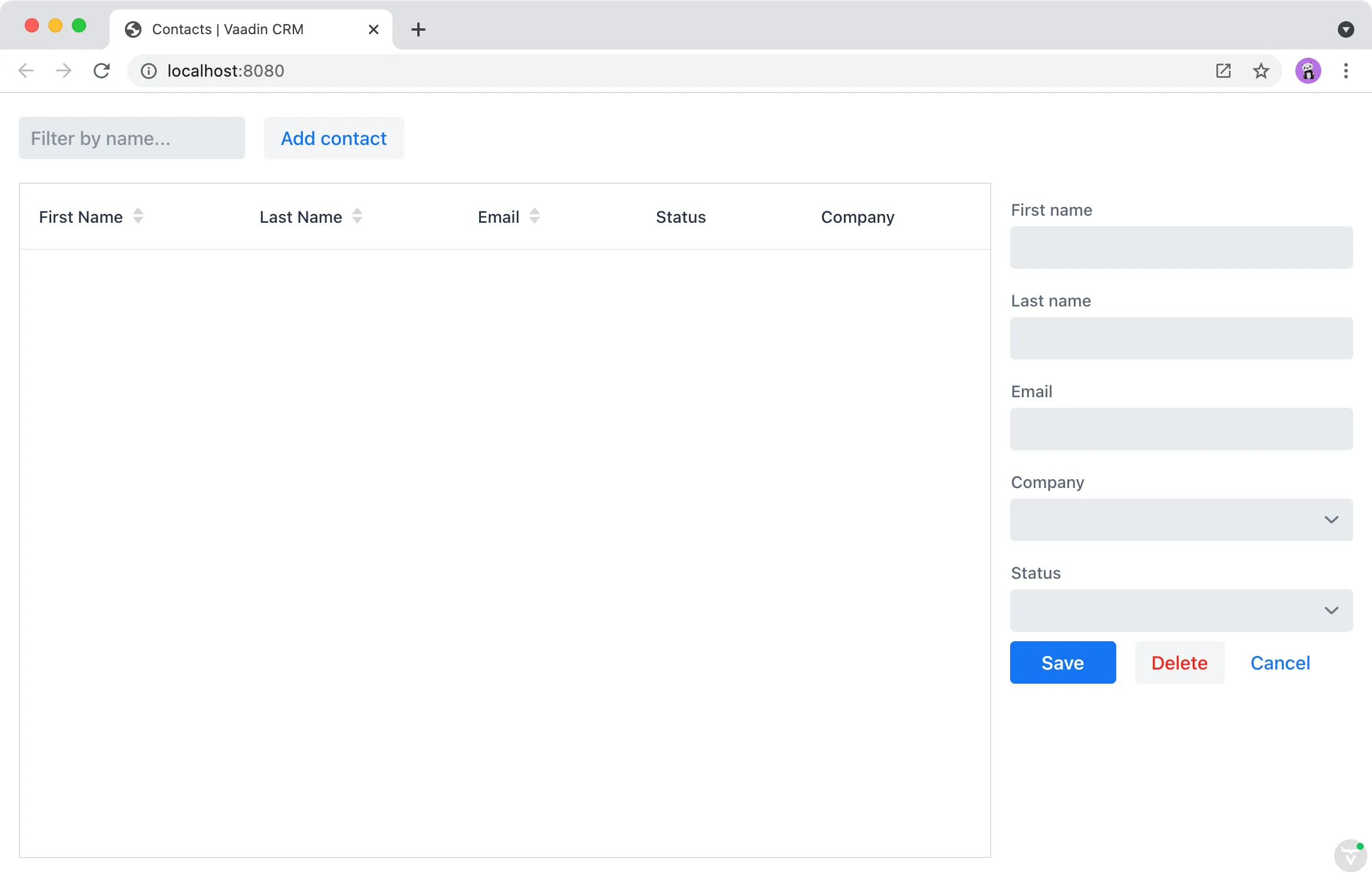
You can now build the project to reload the browser. You should see the form on the right side of the grid.

Now that you have the view built, it’s time to connect it to the backend.
2B0A44E7-14EA-4FF5-ACC0-983F03C27AC4
