Styling Your Application Using Lumo Design Tokens
- Styling by Overriding the Default Values of Lumo Design Tokens
- Styling Using the Default Values of Lumo Design Tokens
The basic building blocks of the Lumo theme are a set of design tokens, which are essentially a set of CSS custom properties for things like colors, font sizes, and other typographic and layout settings.
The Lumo theme combines these design tokens to provide Vaadin applications and components with their default look and feel.
You can use Lumo design tokens to customize the style of your application. However, before doing so, you should consider using one of the available built-in Lumo variants, which are themselves built on top of Lumo design tokens. For example, you can use the Lumo dark mode variant to create a dark theme for your application.
You can use Lumo design tokens directly to customize the style of your application in two ways:
-
By overriding the default values of the design tokens, thereby changing the look and feel of your application.
-
Using the default design-token values as they are to style your application’s custom views and components.
Styling by Overriding the Default Values of Lumo Design Tokens
For example, suppose that you want to style an application that has a bunch of Text Field, Combo Box, Date Picker, and Button components. By default, they look as follows:
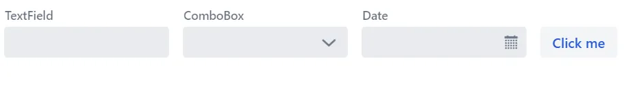
Suppose that you want to increase the roundness of their corners.
By default, the Lumo theme provides these components with a small rounded corner whose value is defined in the --lumo-border-radius-m variable.
To increase the roundness of the corners, you can override the default value of this variable.
Specifically, you can add the following inside the styles.css file to increase the default roundness value:
Source code
styles.css
styles.csshtml {
--lumo-border-radius-m: 1em;
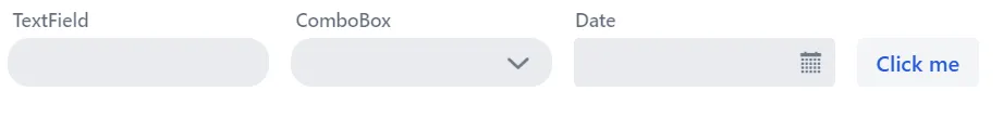
}This style increases the corner roundness of many components at once, so that they look similar to the following screenshot:

But what if one wants to override the defaults for only a subset of components? No problem; use the name of the components as the CSS selector.
For example, if one wants to override the rounded corner defaults for only the Text Field and Combo Box components, then the following should be added inside the styles.css file:
Source code
styles.css
styles.cssvaadin-text-field, vaadin-combo-box {
--lumo-border-radius-m: 1em;
}This changes the defaults for the Text Field and Combo Box only, leaving other components, such as the Date Picker and Button, with their default Lumo values.
Styling Using the Default Values of Lumo Design Tokens
Lumo design tokens are also useful when you want to consistently style views and components. For example, you can use the design tokens for spacing as a standard measure for your application. You can, for instance, add a small margin around all views and components in your application by adding the following to a CSS style sheet:
Source code
CSS
* {
    margin: var(--lumo-space-xs);
}
You can also scope the styles to specific views and components by using specific CSS selectors. For example, you can scope the above styles to Button components only by adding the following to a CSS style sheet:
Source code
CSS
vaadin-button {
    margin: var(--lumo-space-xs);
}
C22768E4-9DFF-427A-B4FD-26F04C947806