Getting Started with Styling Vaadin Applications and Components
- Lumo Theme and Variants
- Declaring a Custom Theme
- Where to Place Your CSS
- Styling by Overriding Lumo Defaults
- How to Selectively Style Views and Components
- Styling the Internals of Vaadin Components Using the /components Directory
- Selectively Styling the Internals of a Vaadin Component
- How to Selectively Style a Sub-component of a Vaadin Component
This guide covers the basics of styling Vaadin applications and components. It provides an overview of several styling features and how to use them. The topics mentioned here are covered in more detail elsewhere in the documentation.
While it’s possible to style some parts of a Vaadin application using the Java API, this approach tends to be rather limited for mid- to large-sized applications. It’s recommended to do custom styling of a Vaadin application by adding CSS inside standard style sheets. This guide focuses only on the recommended style-sheets approach.
The following topics are covered in this guide:
-
Lumo theme and its variants, including its dark-mode variant
-
Selectively styling sub-components of a Vaadin component (for example, the overlay of a Date Picker or a Combo Box)
Lumo Theme and Variants
The default look and feel of Vaadin components is based on a built-in theme called Lumo. This theme is essentially a bunch of CSS custom properties (such as colors, typography, and sizes) that each has a CSS variable assigned to it.
Lumo theme is available in a light and a dark variant. The theme also has two sizing flavors: regular and compact. You can use these variants to customize the look and feel of your application.
-
To enable the dark mode variant, you need to use the
@Themeannotation, which can be added to a class that implementsAppShellConfigurator. In a Spring Boot application, you could have an application configuration class that implementsAppShellConfiguratorand adds the@Theme("dark")annotation to it. -
To enable the compact mode, you need to add
@JsModule("@vaadin/vaadin-lumo-styles/presets/compact.js")annotation anywhere in your application.
The following code snippet shows how to enable both the dark and compact modes:
Source code
Java
@Theme(variant = Lumo.DARK) 1
@JsModule("@vaadin/vaadin-lumo-styles/presets/compact.js") 2
@SpringBootApplication
public class Application extends SpringBootServletInitializer
     implements AppShellConfigurator { 3

  public static void main(String[] args) {
        SpringApplication.run(Application.class, args);
    }

}-
The
@Themeannotation specifies the variant of the Lumo theme to use. By default, the Lumo theme is used in the light variant. -
Adding this
@JsModuleannotation enables the compact mode. -
The
@Themeannotation can only be added once in the application on top of a class that implementsAppShellConfigurator.
For more information and advanced use cases, see the Lumo theme variants guide.
Declaring a Custom Theme
A custom theme is the easiest way to provide a custom look and feel for your entire application. The CSS in a custom theme is always applied on top of the default Lumo theme, or one of its variants.
To start, you need to declare the name of the custom theme. This name is used to identify the location of custom theme’s CSS files.
The easiest way to declare the name of the custom theme is to add the @Theme annotation on a class that implements AppShellConfigurator.
For example, in a Spring Boot application, you can declare a custom theme called my-theme by adding the following @Theme annotation to a class that implements AppShellConfigurator:
Source code
Application.java
Application.java@Theme(value = "my-theme") 1
@SpringBootApplication
public class Application extends SpringBootServletInitializer implements AppShellConfigurator { 2
public static void main(String[] args) {
SpringApplication.run(Application.class, args);
}
}-
The
@Themeannotation is used to declare the name of the custom theme (in this case, the"my-theme"custom theme). This custom theme is applied on top of the default Lumo theme. -
The
@Themeannotation can only be added once in the application on top of a class that implementsAppShellConfigurator.
By default, projects downloaded from https://start.vaadin.com come with the @Theme annotation added to the Application class.
You can also declare a custom theme on top of Lumo’s dark and compact variants.
To declare it on top of the dark variant, you would use the @Theme(value = "my-theme", variant = Lumo.DARK) annotation.
To declare it on top of the compact variant, you would add the @JsModule("@vaadin/vaadin-lumo-styles/presets/compact.js") annotation.
See the @Theme annotation and Creating a Custom Theme guides for more information on declaring a custom theme.
Where to Place Your CSS
The CSS files of a custom theme should be placed inside a specific folder located under the frontend/themes of your project.
This directory has something like the following minimal structure:
Source code
frontend
└── themes              (1)
    └── my-theme        (2)
        ├── components/ (3)
└── styles.css (4)-
The
themesfolder can contain multiple custom themes (but only one can be applied to the application at a time). -
Each theme is in its own sub-folder. The name of this folder is provided as a parameter to the
@Themeannotation to apply the theme to the application. -
The
componentssub-folder is for component style sheets that target the (local CSS) internals of Vaadin components. -
styles.cssis the theme’s master style sheet that’s automatically loaded when the theme is applied.
In the above directory structure, the my-theme sub-folder might be named differently in your case.
This folder should have the same name as the one used to declare the custom theme using the @Theme annotation.
Custom CSS should be placed in one of the following locations:
-
Inside the
styles.cssfile -
As a separate CSS file, which is imported from within
styles.css -
Under the
components/directory to style the (local CSS) internals of Vaadin components (such as a Vaadin Button)
The first and simplest option is to place the custom CSS directly inside the styles.css file.
For example, adding the following snippet to styles.css would change the font family and size of the whole Vaadin application.
Source code
styles.css
styles.css* {
font-family: "Lucida Console", "Courier New", monospace;
font-size: 1rem;
}However, as the amount of custom styling increases, it becomes convenient to organize the styles into separate .css files.
To do this, create a new CSS file and import that from within styles.css.
For example, if you create a new CSS file called main-view.css at frontend/themes/my-theme/views/main-view.css, then you would import this file by adding the following line to styles.css:
Source code
styles.css
styles.css@import url('./views/main-view.css');Finally, the components/ directory is used only to style the (local CSS) internals of Vaadin components.
However, there are special rules for naming files in this directory, which are explained, with examples, in a separate section below.
Styling by Overriding Lumo Defaults
As noted above, the default styling of Vaadin components is based on a built-in theme, called Lumo. One easy way to customize the look and feel of your application involves overriding the default values of this Lumo theme.
For example, suppose that you want to style an application that has a bunch of Text Field, Combo Box, Date Picker, and Button components. By default, they look as follows:

Suppose that you want to increase the roundness of their corners.
By default, the Lumo theme provides these components with a small rounded corner whose value is defined in the --lumo-border-radius-m variable.
To increase the roundness of the corners, you can override the default value of this variable.
Specifically, you can add the following inside the styles.css file to increase the default roundness value:
Source code
styles.css
styles.csshtml {
--lumo-border-radius-m: 1em;
}This style increases the corner roundness of many components at once, so that they look similar to the following screenshot:

But what if one wants to override the defaults for only a subset of components? No problem; use the name of the components as the CSS selector.
For example, if one wants to override the rounded corner defaults for only the Text Field and Combo Box components, then the following should be added inside the styles.css file:
Source code
styles.css
styles.cssvaadin-text-field, vaadin-combo-box {
--lumo-border-radius-m: 1em;
}This changes the defaults for the Text Field and Combo Box only, leaving other components, such as the Date Picker and Button, with their default Lumo values.

For more information about the Lumo theme and how to use it for styling, see the Lumo theme section.
How to Selectively Style Views and Components
So far, the examples have been showing ways to style all components belonging to a certain kind in the same way.
For example, if you want to set the width of all Button components within your application, you could add something like the following to the styles.css file:
Source code
styles.css
styles.cssvaadin-button {
width: 140px;
}However, you often want to style the same kind of component differently, depending on its function within your application. For example, you might want to style the Button component differently in your application, depending on whether it’s a “Sign up” button or a “Delete account” button.
The easiest way to style views and components selectively is by providing them with a CSS class name from the Java API.
All Vaadin components and views have an addClassNames() method that can be used for this purpose.
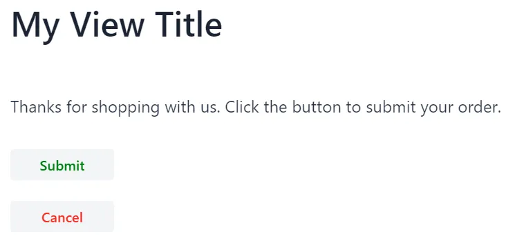
To illustrate, the following view makes use of the addClassNames() method to assign a CSS class name to the view itself, and to the components that it includes.
Source code
Java
import com.vaadin.flow.component.button.Button;
import com.vaadin.flow.component.html.H1;
import com.vaadin.flow.component.html.Paragraph;
import com.vaadin.flow.component.orderedlayout.VerticalLayout;
import com.vaadin.flow.router.Route;

@Route("")
public class MyView extends VerticalLayout {

    public MyView() {
        addClassNames("my-view"); 1

        H1 heading = new H1("My View Title");
        Paragraph text = new Paragraph("Thanks for shopping with us. Click the button to submit your order.");

        Button submitButton = new Button("Submit");
        submitButton.addClassNames("submit-button", "wide-button"); 2

        Button cancelButton = new Button("Cancel");
        cancelButton.addClassNames("cancel-button", "wide-button"); 3

        add(heading, text, submitButton, cancelButton);

    }
}-
The
addClassNames()method is used to assign a CSS class name to the whole view, which is aVerticalLayoutin this case. -
Use the
addClassNames()method on thesubmitButtoncomponent to assign CSS class names to the "Submit" button. -
Use the
addClassNames()method on thecancelButtoncomponent to assign CSS class names to the "Cancel" button.
These CSS class names can then be used to selectively style this view and its components.
For example, adding the following to styles.css demonstrates how selective styling can be achieved.
Source code
styles.css
styles.css.my-view {
padding: 1em;
}
.my-view h1 {
/*Only applies to the h1 headers inside my-view*/
margin-top: 0;
}
p {
/*Applies to all p elements regardless of whether they are
located inside my-view*/
font-size: 1.2em;
}
.submit-button {
color: green;
}
.cancel-button {
color: red;
}
.wide-button {
width: 120px;
}Now after the selective styling is applied, MyView look as follows:
Styling the Internals of Vaadin Components Using the /components Directory
Customizing styling using the two earlier options (namely by placing styles inside styles.css, or inside a separate file imported from within styles.css) should work for views and layouts created within the project.
However, these two options aren’t guaranteed to work if one aims to style the internals of a Vaadin component.
Custom styling of the internals of Vaadin components, such as the Grid or Combo Box components, needs to be placed under the frontend/themes/my-theme/components directory. (Note again that the my-theme folder name might be different in your case.)
For example, consider increasing the size of the toggle icon that opens the drop-down menu of a Combo Box.
If you inspect this toggle in Chrome (right-click on the toggle and select the Inspect option), you see that it has an attribute called part whose value is equal to toggle-button.
To style this part, you need to create a file called vaadin-combo-box.css and place it under the frontend/themes/my-theme/components/ directory.
In this file, you can do something like the following to increase the size of the Combo Box toggle.
Source code
vaadin-combo-box.css
vaadin-combo-box.css[part="toggle-button"] {
font-size: 2em;
}The files placed under the /components directory have to exactly match the Vaadin component names as they appear in the DOM.
For example, the Combo Box component appears in the DOM as vaadin-combo-box.
Accordingly, the styling file of the Combo Box has to be named exactly vaadin-combo-box.css.
Selectively Styling the Internals of a Vaadin Component
You saw in the examples before how to style the internals of a Vaadin component by using the part property and placing the CSS inside a specific file placed under the frontend/themes/my-theme/components/ directory.
Specifically, you saw how to style the Combo Box toggle using the [part="toggle-button"] selector and placing the CSS in a file called vaadin-combo-box.css that is under the frontend/themes/my-theme/components/ directory.
However, this approach styles all toggle elements of all the Combo Box components in your application in the same way. What if you want your styling to apply to only some toggle elements but not to others?
Here you can follow the same approach as you did above to selectively style views and components.
That is, you can provide the component with a CSS class name from the Java API using the addClassNames() method.
Then you can use this CSS class name to selectively style the internal part of the component.
For example, suppose that your application has the following two Combo Box components:
Source code
Java
ComboBox<String> firstCombo = new ComboBox<>();
comboBox.setItems("Earth", "Mars");

ComboBox<String> secondCombo = new ComboBox<>();
comboBox.setItems("Mercury", "Venus");
If you want to style the toggle part of these two components differently, you can do this by providing each Combo Box with a different CSS class name as follows:
Source code
Java
firstCombo.addClassNames("first-combo");
secondCombo.addClassNames("second-combo");
Then, in frontend/themes/my-theme/components/vaadin-combo-box.css, you can selectively style the toggle element of the two components differently by doing something like:
Source code
vaadin-combo-box.css
vaadin-combo-box.css:host(.first-combo) [part="toggle-button"] {
font-size: 2em;
}
:host(.second-combo) [part="toggle-button"] {
font-size: 1em;
}You have to use the :host() pseudo-class function here because the toggle-button part is located inside the shadow DOM of the Combo Box.
How to Selectively Style a Sub-component of a Vaadin Component
Sometimes you can’t use CSS class names to do the selective styling. Specifically, you can’t rely on CSS class names when you want to style the sub-components of a Vaadin component.
What is a sub-component? Some Vaadin components create sub-components that exist in the DOM independently from the Vaadin component itself.
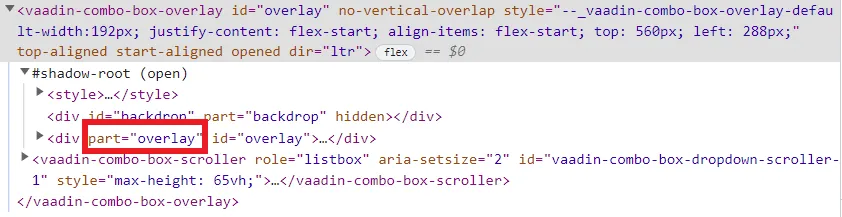
This is noticeably the case for the Vaadin components, such as the Date Picker, Dialog, and Combo Box, that open an overlay during user interaction.
For example, a Combo Box adds a vaadin-combo-box-overlay element in the DOM when the user clicks on the toggle button to see the list of the available options.
This vaadin-combo-box-overlay element exists in the DOM independently from the vaadin-combo-box element itself.
The fact that they exist in the DOM independently from their parent component means that a CSS class name that’s given to the parent element isn’t propagated down to the sub-component.
For example, if you give a Combo Box a class name from the Java API, only the vaadin-combo-box element gets this class name in the DOM, not the vaadin-combo-box-overlay element.
Instead of class names, you can rely on the theme attribute as a selector to selectively style a sub-component of a Vaadin component.
Unlike the class names, the theme attribute has the benefit of propagating through to the sub-components.
You can provide a component with a theme attribute from the Java API using the addThemeName() method.
For example, like before suppose that your application has the following two Combo Box components:
Source code
Java
ComboBox<String> firstCombo = new ComboBox<>();
firstCombo.setItems("Earth", "Mars");

ComboBox<String> secondCombo = new ComboBox<>();
secondCombo.setItems("Mercury", "Venus");
Suppose that you want to change the background color of the drop-down list of items that the user sees when they open the Combo Box.
This background color is controlled by the background-color property of the overlay part of the vaadin-combo-box-overlay element.
This overlay part in the DOM is highlighted in the following screenshot:
To selectively style the background of the overlay of the two Combo Box components, you can first give each one of them a theme name using the Java API as follows:
Source code
Java
firstCombo.addThemeName("first-combo");
secondCombo.addThemeName("second-combo");
Then, you need to create a new file called vaadin-combo-box-overlay.css and place it under the frontend/themes/my-theme/components directory.
In this file, you can selectively style the overlay part of the vaadin-combo-box-overlay element of the two ComboBoxes by doing something like:
Source code
vaadin-combo-box-overlay.css
vaadin-combo-box-overlay.css:host([theme~="first-combo"]) [part="overlay"] {
background-color: rosybrown;
}
:host([theme~="second-combo"]) [part="overlay"] {
background-color: aquamarine;
}Here again you’re using the :host() pseudo-class function because the overlay part is located inside the shadow DOM of the vaadin-combo-box-overlay element.
1ED4F78A-5736-491F-8E91-D7F5A00A0885