Form Inputs
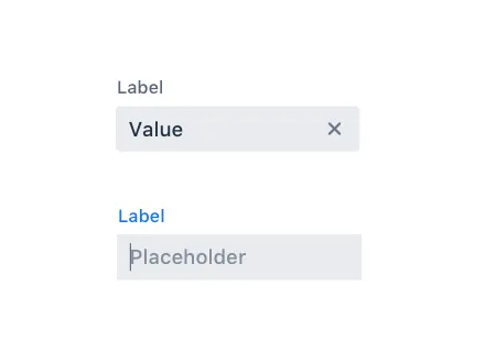
Input Fields
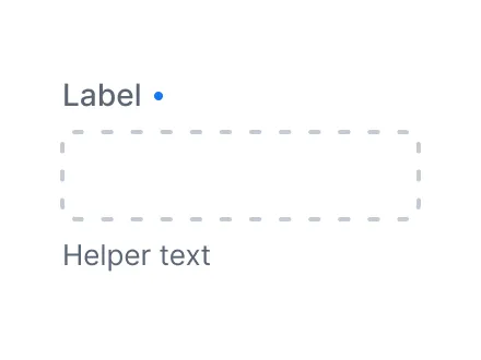
Input field components have common features, such as label, helper text, disabled and required states, and more.
Combo Box
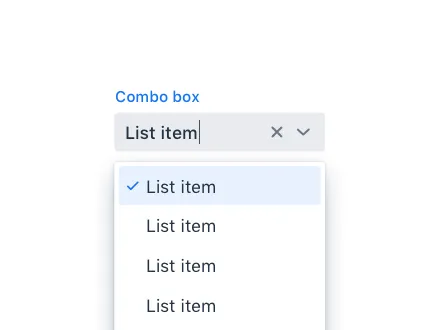
Combo Box allows the user to choose a value from a filterable list of options presented in an overlay.
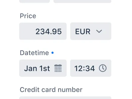
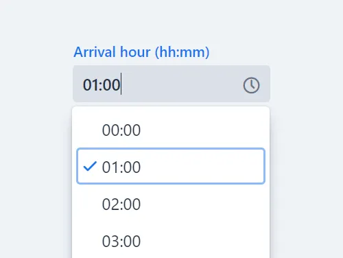
Date Picker
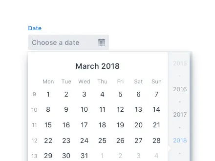
Date Picker is an input field that allows the user to enter a date by typing or by selecting from a calendar overlay.

Number Field
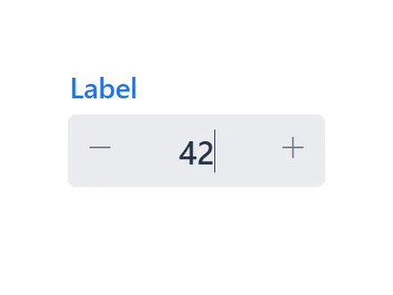
Number Field has many of the same features as Text Field, but it accepts only numeric input.
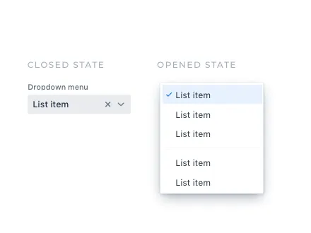
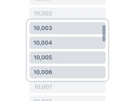
Multi-Select Combo Box
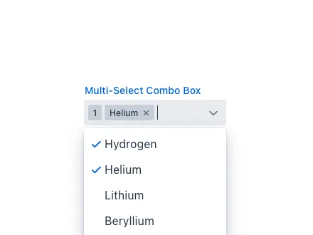
Multi-Select Combo Box allows the user to choose one or more values from a filterable list of options presented in an overlay.
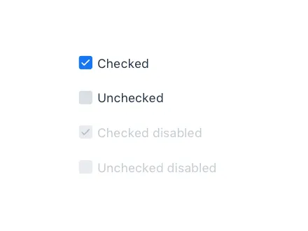
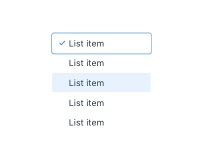
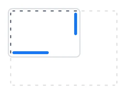
Radio Button
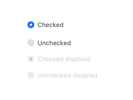
Radio Button Group allows the user to select exactly one value from a list of related, but mutually exclusive, options.


Visualization and Interaction
Avatar
Avatar is a graphical representation of an object or entity, for example a person or an organization.
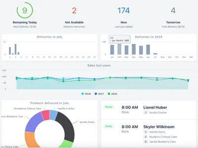
Charts
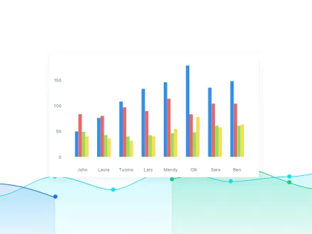
Charts is a feature-rich interactive charting library with a vast number of different chart types from basic plotting to complex financial charting.
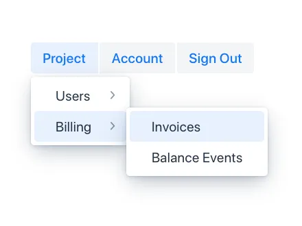
Context Menu
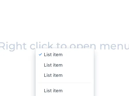
Context Menu is a component that you can attach to any component to display a context menu.
Cookie Consent

Cookie Consent aims to help you comply with privacy laws such as General Data Protection Regulation (GDPR) and California Consumer Privacy Act (CCPA).
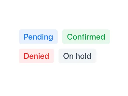
CRUD
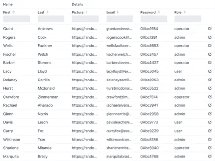
CRUD is a component for managing a dataset. It allows for easy displaying, editing, creating, and deleting of items.
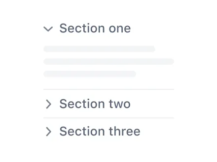
Details

Details is an expandable panel for showing and hiding content from the user, to make the UI less cluttered.
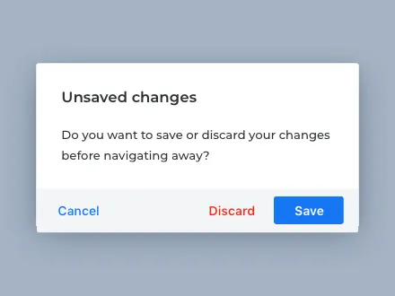
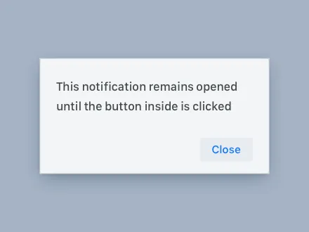
Dialog

Dialog is a small window that can be used to present information and user interface elements in an overlay.
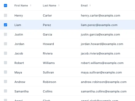
Grid Pro
Grid Pro is an extension of the Grid component that provides inline editing with full keyboard navigation.


Spreadsheet
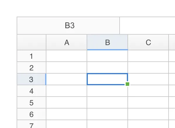
Vaadin Spreadsheet is a component which allows displaying and interacting with the contents of an Excel file.
Layouts

Form Layout
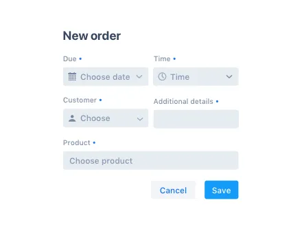
Form Layout allows you to build responsive forms with multiple columns, and to position input labels above or to the side of the input.
Login
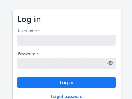
Login is a component that contains a log-in form. You can use it to authenticate the user with a username and password.