Date Input with DateField
The DateField component provides the means to display and input dates. The field comes in two variations: DateField, with a numeric input box and a popup calendar view, and InlineDateField, with the calendar view always visible.
The example below illustrates the use of the DateField. We set the initial date of the date field to current date by using the factory method now of the java.time.LocalDate class.
Source code
Java
// Create a DateField with the default style
DateField date = new DateField();

// Set the date to present
date.setValue(LocalDate.now());
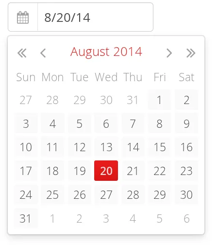
The result is shown in DateField for Selecting a Date.

DateField
The DateField provides date input using a text box. Clicking the handle right of the date opens a popup view for selecting the year, month, and day. The Down key also opens the popup. Once opened, the user can navigate the calendar using the cursor keys.
The date selected from the popup is displayed in the text box according to the default date and format of the current locale, or as specified with setDateFormat(). The same format definitions are used for parsing user input.
Date Format
The date is normally displayed according to the default format for the current locale (see "Locale"). You can specify a custom format with setDateFormat(). It takes a format string that follows the format of the java.time.format.DateTimeFormatter in Java.
Source code
Java
// Display only year, month, and day in ISO format
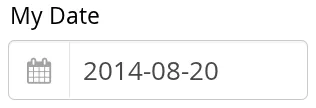
date.setDateFormat("yyyy-MM-dd");

// Display the correct format as placeholder
date.setPlaceholder("yyyy-mm-dd");
The result is shown in Custom Date Format for DateField.

The same format specification is also used for parsing user-input date, as described later.
Handling Malformed User Input
A user can easily input a malformed or otherwise invalid date. DateField has two validation layers: first on the client-side and then on the server-side.
The validity of the entered date is first validated on the client-side, immediately when the input box loses focus. If the date format is invalid, the v-datefield-parseerror style is set. Whether this causes a visible indication of a problem depends on the theme. The built-in reindeer theme does not shown any indication by default, making server-side handling of the problem more convenient.
Source code
CSS
.mydate.v-datefield-parseerror .v-textfield {
    background: pink;
}
The setLenient(true) setting enables relaxed interpretation of dates, so that invalid dates, such as February 30th or March 0th, are wrapped to the next or previous month, for example.
The server-side validation phase occurs when the date value is sent to the server. If the date field is set in immediate state, it occurs immediately after the field loses focus. Once this is done and if the status is still invalid, an error indicator is displayed beside the component. Hovering the mouse pointer over the indicator shows the error message.
You can handle the errors by overriding the handleUnparsableDateString() method. The method gets the user input as a string parameter and can provide a custom parsing mechanism, as shown in the following example.
Source code
Java
// Create a date field with a custom parsing and a
// custom error message for invalid format
DateField date = new DateField("My Date") {
    @Override
    protected Result<LocalDate> handleUnparsableDateString(
          String dateString) {
        try {
            // try to parse with alternative format
            LocalDate parsedAtServer = LocalDate.parse(dateString, DateTimeFormatter.ISO_DATE);
            return Result.ok(parsedAtServer);
        } catch (DateTimeParseException e) {
           return Result.error("Bad date");
        }
    }
};

// Display only year, month, and day in slash-delimited format
date.setDateFormat("yyyy/MM/dd");

// Don't be too tight about the validity of dates
// on the client-side
date.setLenient(true);
CSS Style Rules
Source code
CSS
.v-datefield, v-datefield-popupcalendar {}
  .v-textfield, v-datefield-textfield {}
  .v-datefield-button {}
The top-level element of DateField and InlineDateField have v-datefield style. The DateField also has the v-datefield-popupcalendar style.
In addition, the top-level element has a style that indicates the resolution, with v-datefield- basename and an extension, which is one of full, day, month, or year. The -full style is enabled when the resolution is smaller than a day. These styles are used mainly for controlling the appearance of the popup calendar.
The text box has v-textfield and v-datefield-textfield styles, and the calendar button v-datefield-button.
Once opened, the calendar popup has the following styles at the top level:
Source code
CSS
.v-datefield-popup {}
  .v-popupcontent {}
    .v-datefield-calendarpanel {}
The top-level element of the floating popup calendar has .v-datefield-popup style. Observe that the popup frame is outside the HTML structure of the component, hence it is not enclosed in the v-datefield element and does not include any custom styles. The content in the v-datefield-calendarpanel is the same as in InlineDateField, as described in InlineDateField.
InlineDateField
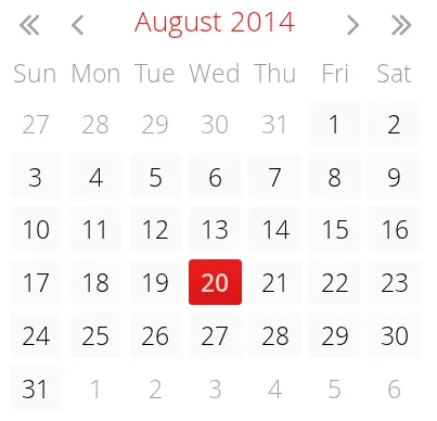
The InlineDateField provides a date picker component with a month view. The user can navigate months and years by clicking the appropriate arrows. Unlike with the pop-up variant, the month view is always visible in the inline field.
Source code
Java
// Create a DateField with the default style
InlineDateField date = new InlineDateField();

// Set the date to present
date.setValue(LocalDate.now());
The result is shown in Example of the InlineDateField.

The user can also navigate the calendar using the cursor keys.
CSS Style Rules
Source code
CSS
.v-datefield {}
  .v-datefield-calendarpanel {}
    .v-datefield-calendarpanel-header {}
      .v-datefield-calendarpanel-prevyear {}
      .v-datefield-calendarpanel-prevmonth {}
      .v-datefield-calendarpanel-month {}
      .v-datefield-calendarpanel-nextmonth {}
      .v-datefield-calendarpanel-nextyear {}
    .v-datefield-calendarpanel-body {}
      .v-datefield-calendarpanel-weekdays,
      .v-datefield-calendarpanel-weeknumbers {}
        .v-first {}
        .v-last {}
      .v-datefield-calendarpanel-weeknumber {}
      .v-datefield-calendarpanel-day {}
The top-level element has the v-datefield style. In addition, the top-level element has a style name that indicates the resolution of the calendar, with v-datefield- basename and an extension, which is one of full, day, month, or year. The -full style is enabled when the resolution is smaller than a day.
The v-datefield-calendarpanel-weeknumbers and v-datefield-calendarpanel-weeknumber styles are enabled when the week numbers are enabled. The former controls the appearance of the weekday header and the latter the actual week numbers.
The other style names should be self-explanatory. For weekdays, the v-first and v-last styles allow making rounded endings for the weekday bar.
Date Resolution
In addition to display a calendar with dates, DateField can also display just the month or year. The visibility of the input components is controlled by setDateResolution(), which you can set with setResolution(). The method takes as its parameter the highest resolution date element that should be visible. Please see the API Reference for the complete list of resolution parameters.
DateField Locale
The date is displayed according to the locale of the user, as reported by the browser. You can set a custom locale with the setLocale() method of AbstractComponent, as described in "Locale". Only Gregorian calendar is supported.