Label buttons expressively
People don’t read dialog box messages. They just click “OK” or “Yes” or whichever button that seems like the right choice to make the dialog go away, without reading, or at least without really thinking about what it’s trying to tell them.
What this means for UI design is that it’s important to label buttons in a way that clearly indicates the result of pressing them, in order to prevent users from making the wrong choice with potentially disastrous results.
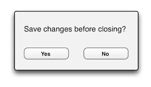
Most desktop applications display a dialog like this when you attempt to close them without first saving the document you were working on:

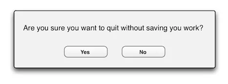
Sometimes, however, the same question is expressed in a subtly different way:

Needless to say, the risk of choosing the wrong answer is quite substantial, unless you actually take the time to read through the message (which most users do not). Of course it helps to stick to the most common way of asking these kinds of questions, and being consistent at least within your own applications. But there is room for improvement here.
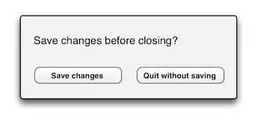
If the options were labelled “Save” and “Discard” or “Save first” and “Quit without saving”, instead of a simple “Yes” and “No”, all ambiguity suddenly disappears. Even if the user doesn’t read a word of the message itself, the effects of these options is quite clear:

This principle doesn’t just apply to buttons in dialog boxes, though. Even in other areas of a user interface, expressive labelling of actions reduces ambiguity and makes users more confident in their work. Consider, for instance, “Post” or even “Post comment” instead of the typical “Submit” for posting a comment on a blog. If your “Cancel” button doesn’t actually cancel anything, but rather resets a form or reverts some changes, consider labelling it “Revert” or “Reset form” instead.
Also try to keep the label as short as possible, and consider starting with a verb. That way the user probably picks the right choice even if he only reads the first word of the label.