Tree
- Overview
- Binding to Data
- Handling Selection and Clicks
- Expanding and Collapsing Nodes
- Prevent Node Collapsing
- Keyboard Navigation and Focus Handling in TreeGrid
- CSS Style Rules
Overview
The Tree component allows a natural way to represent data that has hierarchical relationships. The user can drill down in the hierarchy by expanding items by clicking on the expand arrow, and likewise collapse items. Tree is a selection component that allows selecting items.
A typical use of the Tree component is for displaying a hierarchical menu, as illustrated in A Tree component, or for displaying file systems or hierarchical datasets.
Binding to Data
Tree is used by binding it to a hierarchical data provider. The data provider can be based on in-memory or back end data. For in-memory data, the TreeDataProvider can be used, and for loading data from a back end, you need to implement three methods from the HierarchicalDataProvider interface. Usage of both data providers is described in "Hierarchical Data".
The TreeData class can be used to build the hierarchical data structure, and it can then be passed on to TreeDataProvider. It is simply a hierarchical collection, that the data provider uses to populate the Tree.
The setItems method in Tree can be used to set the root level items. Internally an TreeDataProvider with TreeData is used.
Source code
Java
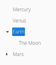
// An initial planet tree
Tree<String> tree = new Tree<>();
TreeData<String> treeData = new TreeData<>();

// Couple of childless root items
treeData.addItem(null,"Mercury");
treeData.addItem(null,"Venus");

// Items with hierarchy
treeData.addItem(null,"Earth");
treeData.addItem("Earth","The Moon");

inMemoryDataProvider = new TreeDataProvider<>(treeData);
tree.setDataProvider(inMemoryDataProvider);
tree.expand("Earth"); // Expand programmatically
If at any time you want to modify the in-memory data in the tree, you may do it as follows:
Source code
Java
// Add Mars with satellites
treeData.addItem(null, "Mars");
treeData.addItem("Mars", "Phobos");
treeData.addItem("Mars", "Deimos");
inMemoryDataProvider.refreshAll();
The result was shown in A Tree component.
The caption and the icon of tree items is generated by the ItemCaptionGenerator and the IconGenerator, set with setItemCaptionGenerator() and setItemIconGenerator() respectively.
Handling Selection and Clicks
Tree supports single selection mode, you can use asSingleSelect() to access the selection object, which supports selection listeners and data binding. For more details, see link:"Selecting Items". The Tree also supports the shortcut method addSelectionListener().
Tree also emits ItemClickEvents when items are clicked. This way you can handle item clicks also when you want special user interaction specifically on clicks.
Source code
Java
tree.addItemClickListener(event ->
    Notification.show("Click",
            Notification.Type.HUMANIZED_MESSAGE)
);Expanding and Collapsing Nodes
Tree nodes that have children can be expanded and collapsed by either user interaction or through the server-side API:
Source code
Java
// Expands a child project. If the child project is not yet
// in the visible hierarchy, nothing will be shown.
tree.expand(childProject);
// Expands the root project. If child project now becomes
// visible it is also expanded into view.
tree.expand(rootProject);
// Collapses the child project.
tree.collapse(childProject);
To use the server-side API with a backend data provider the hashCode and equals methods for the node’s type must be implemented so that when the desired node is retrieved from the backend it can be correctly matched with the object passed to either expand or collapse.
The Tree component supports listening to the expansion and collapsing of items in its hierarchy. The expand and collapse listeners can be added as follows:
Source code
Java
tree.addExpandListener(event -> log("Item expanded: " + event.getExpandedItem()));
tree.addCollapseListener(event -> log("Item collapsed: " + event.getCollapsedItem()));
The return types of the methods getExpandedItem and getCollapsedItem are the same as the type of the Tree the events originated from.
Note that collapse listeners will not be triggered for any expanded subtrees of the collapsed item.
Prevent Node Collapsing
Tree supports setting a callback method that can allow or prevent the user from collapsing an expanded node. It can be set with setItemCollapseAllowedProvider method, that takes a ItemCollapseAllowedProvider. For nodes that cannot be collapsed, the collapse-disabled class name is applied to the expansion element
Avoid doing any heavy operations in the method, since it is called for each item when it is being sent to the client.
Example using a predefined set of persons that can not be collapsed:
Source code
Java
Set<Person> alwaysExpanded;
personTree.setItemCollapseAllowedProvider(person ->
       !alwaysExpanded.contains(person));
Keyboard Navigation and Focus Handling in TreeGrid
The user can navigate through rows with Up and Down, collapse rows with Left, and expand them with Right.
CSS Style Rules
Source code
CSS
.v-tree8 {
  .v-tree8-scroller, .v-tree8-scroller-horizontal { }
  .v-tree8-tablewrapper {
    .v-tree8-body {
      .v-tree8-row,
      .v-tree8-stripe,
      .v-tree8-row-focused,
      .v-tree8-row-has-data {
        .v-tree8-expander, expanded {}
        .v-tree8-cell-content {}
      }
    }
  }
}
Generating Item Styles
You can style each tree item individually by generating a style name for them with a StyleGenerator, which you assign to a tree with setStyleGenerator().
The generator should return a style name for each item or null.
Source code
Java
// Show all leaf nodes as disabled
tree.setStyleGenerator(item -> {
        if (!tree.getDataProvider().hasChildren(item))
            return "leaf";
        return null;
    }
);
Source code
CSS
.leaf .v-tree8-cell-content {
    background-color:green
}