Use tooltips to clarify functions
Even when clearly labelled, the action performed by a button might not be clear enough to the user. This is especially common when space or design constraints force you to keep the label very short, or use an icon instead of a label. This is where tooltips come in handy.
Tooltips are very easy to add to Vaadin components, although the method used to set them is the somewhat misleadingly named setDescription():
Source code
Java
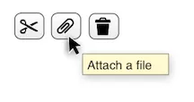
Button btnAttach = new Button();
btnAttach.setIcon(new ThemeResource("icons/attach.png"));
btnAttach.setDescription("Attach a file");
Of course, tooltips can be used for all kinds of UI components, not just buttons. An input field or even a read-only indicator can benefit from a tooltip. While the entire point of tooltips is to convey more information that would fit in the component’s caption or label, it’s still a good idea of try to keep the tooltip’s text as short as possible. Big tooltip balloons get in the way of using the UI and become annoying distractions instead of helpful aids.
Keep in mind, however, that tooltips cannot be seen on a touch screen, since there is no mouse pointer to hover over the component. For input fields, consider using an input prompt instead.