TwinColSelect
The TwinColSelect field provides a multiple selection component that shows two lists side by side, with the left column containing unselected items and the right column the selected items. The user can select items from the list on the left and click on the ">" button to move them to the list on the right. Items can be deselected by selecting them in the right list and clicking on the "<" button.
TwinColSelect is always in multi-select mode, so its selection is always a collection of the selected items in the right column.
The selection columns can have their own captions, separate from the overall component caption, which is managed by the containing layout. You can set the column captions with setLeftColumnCaption() and setRightColumnCaption().
Source code
Java
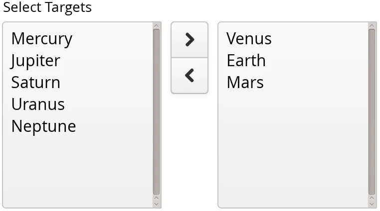
TwinColSelect<String> select =
    new TwinColSelect<>("Select Targets");

// Put some items in the select
select.setItems("Mercury", "Venus", "Earth", "Mars",
        "Jupiter", "Saturn", "Uranus", "Neptune");

// Few items, so we can set rows to match item count
select.setRows(select.size());

// Preselect a few items
select.select("Venus", "Earth", "Mars");

// Handle value changes
select.addSelectionListener(event ->
    layout.addComponent(
        new Label("Selected: " + event.getNewSelection())));
The resulting component is shown in Twin Column Selection.
The setRows() method sets the height of the component by the number of visible items in the selection boxes. Setting the height with setHeight() to a defined value overrides the rows setting.
|
Warning
| The TwinColSelect does not provide lazy loading mechanism. Hence it will slow down significantly if used with large itemsets. The lazy loading feature could be implemented using two single column Grids instead. |
Common selection component features are described in "Selection Components".
CSS Style Rules
Source code
CSS
.v-select-twincol {}
  .v-select-twincol-options-caption {}
  .v-select-twincol-selections-caption {}
  .v-select-twincol-options {}
  .v-select-twincol-buttons {}
    .v-button {}
      .v-button-wrap {}
        .v-button-caption {}
    .v-select-twincol-deco {}
  .v-select-twincol-selections {}
The TwinColSelect component has an overall v-select-twincol style. If set, the left and right column captions have v-select-twincol-options-caption and v-select-twincol-options-caption style names, respectively. The left box, which displays the unselected items, has v-select-twincol-options-caption style and the right box, which displays the selected items, has v-select-twincol-options-selections style. Between them is the button area, which has overall v-select-twincol-buttons style; the actual buttons reuse the styles for the Button component. Between the buttons is a divider element with v-select-twincol-deco style.