FormLayout
FormLayout lays the components and their captions out in two columns, with optional indicators for required fields and errors that can be shown for each field. The field captions can have an icon in addition to the text. FormLayout is an ordered layout and much like VerticalLayout. For description of margins, spacing, and other features in ordered layouts, see "VerticalLayout and HorizontalLayout".
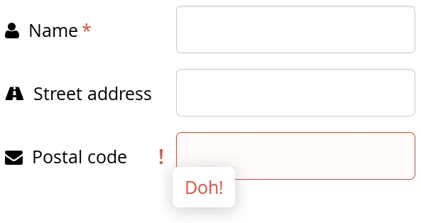
The following example shows typical use of FormLayout in a form:
Source code
Java
FormLayout form = new FormLayout();
TextField tf1 = new TextField("Name");
tf1.setIcon(VaadinIcons.USER);
tf1.setRequiredIndicatorVisible(true);
form.addComponent(tf1);

TextField tf2 = new TextField("Street address");
tf2.setIcon(VaadinIcons.ROAD);
form.addComponent(tf2);

TextField tf3 = new TextField("Postal code");
tf3.setIcon(VaadinIcons.ENVELOPE);
form.addComponent(tf3);
// normally comes from validation by Binder
tf3.setComponentError(new UserError("Doh!"));
The resulting layout will look as follows. The error message shows in a tooltip when you hover the mouse pointer over the error indicator.
CSS Style Rules
Source code
CSS
.v-formlayout {}
.v-formlayout .v-caption {}

/* Columns in a field row. */
.v-formlayout-contentcell {} /* Field content. */
.v-formlayout-captioncell {} /* Field caption. */
.v-formlayout-errorcell {}   /* Field error indicator. */

/* Overall style of field rows. */
.v-formlayout-row {}
.v-formlayout-firstrow {}
.v-formlayout-lastrow {}

/* Required field indicator. */
.v-formlayout .v-required-field-indicator {}
.v-formlayout-captioncell .v-caption
        .v-required-field-indicator {}

/* Error indicator. */
.v-formlayout-cell .v-errorindicator {}
.v-formlayout-error-indicator .v-errorindicator {}
The top-level element of FormLayout has the v-formlayout style. The layout is tabular with three columns: the caption column, the error indicator column, and the field column. These can be styled with v-formlayout-captioncell, v-formlayout-errorcell, and v-formlayout-contentcell, respectively. While the error indicator is shown as a dedicated column, the indicator for required fields is currently shown as a part of the caption column.
For information on setting margins and spacing, see also "Spacing in Ordered Layouts" and "Layout Margins".