MenuBar
The MenuBar component allows creating horizontal drop-down menus, much like the main menu in desktop applications.
The menu items open as the user navigates them by hovering or clicking with the mouse. Menus can have separators to divide items into sub-sections. Menu items can have an icon and styling. They can also be checkable, so that the user can click on them to toggle between checked and unchecked.
Creating a Menu
The actual menu bar component is first created as follows:
Source code
Java
MenuBar barmenu = new MenuBar();
main.addComponent(barmenu);
You insert the top-level menu items to the MenuBar object with the addItem() method. It takes a string label, an icon resource, and a command as its parameters. The icon and command are not required and can be null. The addItem() method returns a MenuBar.MenuItem object, which you can use to add sub-menu items. The MenuItem has an identical addItem() method.
For example (the command is explained later):
Source code
Java
// A top-level menu item that opens a submenu
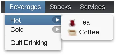
MenuItem drinks = barmenu.addItem("Beverages", null, null);
// Submenu item with a sub-submenu
MenuItem hots = drinks.addItem("Hot", null, null);
hots.addItem("Tea",
new ThemeResource("icons/tea-16px.png"), mycommand);
hots.addItem("Coffee",
new ThemeResource("icons/coffee-16px.png"), mycommand);
// Another submenu item with a sub-submenu
MenuItem colds = drinks.addItem("Cold", null, null);
colds.addItem("Milk", null, mycommand);
colds.addItem("Weissbier", null, mycommand);
// Another top-level item
MenuItem snacks = barmenu.addItem("Snacks", null, null);
snacks.addItem("Weisswurst", null, mycommand);
snacks.addItem("Bratwurst", null, mycommand);
snacks.addItem("Currywurst", null, mycommand);
// Yet another top-level item
MenuItem servs = barmenu.addItem("Services", null, null);
servs.addItem("Car Service", null, mycommand);Handling Menu Selection
Menu selection is handled by executing a command when the user selects an item from the menu. A command is a call-back class that implements the MenuBar.Command interface.
Source code
Java
// A feedback component
final Label selection = new Label("-");
main.addComponent(selection);

// Define a common menu command for all the menu items.
MenuBar.Command mycommand = new MenuBar.Command() {
    public void menuSelected(MenuItem selectedItem) {
        selection.setValue("Ordered a " +
                           selectedItem.getText() +
                           " from menu.");
    }
};
Menu Items
Menu items have properties such as a caption, icon, enabled, visible, and description (tooltip). The meaning of these is the same as for components.
Submenus are created by adding sub-items to an item with addItem() or addItemBefore().
The command property is a MenuBar.Command that is called when the particular menu item is selected. The menuSelected() callback gets the clicked menu item as its parameter.
Menus can have separators, which are defined before or after an item with addSeparatorBefore() or addSeparator() on the item, respectively.
Source code
Java
MenuItem drinks = barmenu.addItem("Beverages", null, null);
...

// A sub-menu item after a separator
drinks.addSeparator();
drinks.addItem("Quit Drinking", null, null);
Enabling checkable on an menu item with setCheckable() allows the user to switch between checked and unchecked state by clicking on the item. You can set the checked state with setChecked(). Note that if such an item has a command, the checked state is not flipped automatically, but you need to do it explicitly.
Menu items have various other properties as well, see the API documentation for more details.
CSS Style Rules
Source code
CSS
.v-menubar { }
  .v-menubar-submenu { }
    .v-menubar-menuitem { }
      .v-menubar-menuitem-caption { }
    .v-menubar-menuitem-selected { }
    .v-menubar-submenu-indicator { }
The menu bar has the overall style name .v-menubar. Each menu item has .v-menubar-menuitem style normally and additionally .v-menubar-selected when the item is selected, that is, when the mouse pointer hovers over it. The item caption is inside a v-menubar-menuitem-caption. In the top-level menu bar, the items are directly under the component element.
Submenus are floating v-menubar-submenu elements outside the menu bar element. Therefore, you should not try to match on the component element for the submenu popups. In submenus, any further submenu levels are indicated with a v-menubar-submenu-indicator.
Styling Menu Items
You can set the CSS style name for the menu items with setStyleName(), just like for components. The style name will be prepended with v-menubar-menuitem-. As MenuBar does not indicate the previous selection in any way, you can do that by highlighting the previously selected item. However, beware that the selected style for menu items, that is, v-menubar-menuitem-selected, is reserved for mouse-hover indication.
Source code
Java
MenuBar barmenu = new MenuBar();
barmenu.addStyleName("mybarmenu");
layout.addComponent(barmenu);

// A feedback component
final Label selection = new Label("-");
layout.addComponent(selection);

// Define a common menu command for all the menu items
MenuBar.Command mycommand = new MenuBar.Command() {
    MenuItem previous = null;

    public void menuSelected(MenuItem selectedItem) {
        selection.setValue("Ordered a " +
                selectedItem.getText() +
                " from menu.");

        if (previous != null)
            previous.setStyleName(null);
        selectedItem.setStyleName("highlight");
        previous = selectedItem;
    }
};

// Put some items in the menu
barmenu.addItem("Beverages", null, mycommand);
barmenu.addItem("Snacks", null, mycommand);
barmenu.addItem("Services", null, mycommand);
You could then style the highlighting in CSS as follows:
Source code
CSS
.mybarmenu .v-menubar-menuitem-highlight {
    background: #000040; /* Dark blue */
}