Enable and disable buttons to indicate state
- Disabling actions to prevent errors
- Disabling/enabling actions to indicate state
- How to do this in a Vaadin application
Most user interfaces have actions that can only be performed if certain conditions are met. In other cases, the actions can be performed at any time in principle, but don’t really make any sense to in certain situations. And quite often, there are actions that really need to be performed, e.g. to prevent data loss.
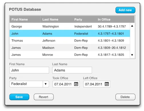
A good example of this is a typical CRUD form for entering items into a database, with buttons for saving, reverting (i.e. discarding changes) and deleting items:

The above image illustrates a typical UI for adding, modifying and deleting data: A table listing the available items above, and a form for editing the selected item below. The same form is also used to enter new items. The Add new button prepares the form for entering a new item. Clicking a table row selects the corresponding item for editing.
Disabling actions to prevent errors
Naturally, the Save action in the UI depicted above can only be performed if an existing item has been selected, or if the “Add new” button has been clicked to create a new item. Assuming there are required fields (which there nearly always are), the Save action can only be successfully performed when all these have been properly filled in. Let’s call these two requirements the technical criteria for performing the Save action.
Similarly, the Delete action can only be performed if an existing, previously saved item is selected. Attempting to delete a nonexistent (yet to be saved) item would result in an error. Thus, selection of an existing item is a technical criterion for the Delete action.
So how do we handle these criteria in our code? An unfortunately common solution is to display a pop-up error message explaining the situation. The problem with this approach is that the user’s time is wasted invoking an unperformable action and in being forced to dismiss an annoying pop-up window (usually by clicking “OK” or something to that effect). Also, users tend to ignore popups and just click them away without reading the message, so they might not even be aware that the action wasn’t performed.
A clearly superior approach is to simply disable actions until their criteria are fulfilled. By disabling actions that cannot be currently performed, the user gets a clear visual indication of this situation, is spared the trouble of attempting in vain to perform the action, and the nuisance of an error message.

Disabling/enabling actions to indicate state
The action criteria discussed so far are only the purely technical criteria for performing the Save and Delete actions. They are simply there to prevent an exception from being thrown or a database constraint being violated. Looking beyond the technical requirements, neither the Save action or the Revert action actually do anything unless there are unsaved changes in the form, so it doesn’t really make sense do perform them at that time, even though they wouldn’t result in an error. We could call the existence of unsaved changes the logical criteria for the Save and Revert actions.
On the other hand, if there are unsaved changes, then either Save or Revert should be performed to either save the changes or revert the fields to their original values, and you definitely want your users to be aware of this state.
It might seem unlikely that a user would be unaware of the state of the form he or she is currently filling in, but out in The Real World, your users will be constantly distracted by co-workers, incoming emails, internet porn, coffee breaks and shiny things. They probably have “a hunch” about whether they already clicked Save or not, but even then they might have some doubts about whether that action was successfully performed. In the end, any uncertainty about whether their precious data is safely stored is a tiny source of unnecessary stress for your users.
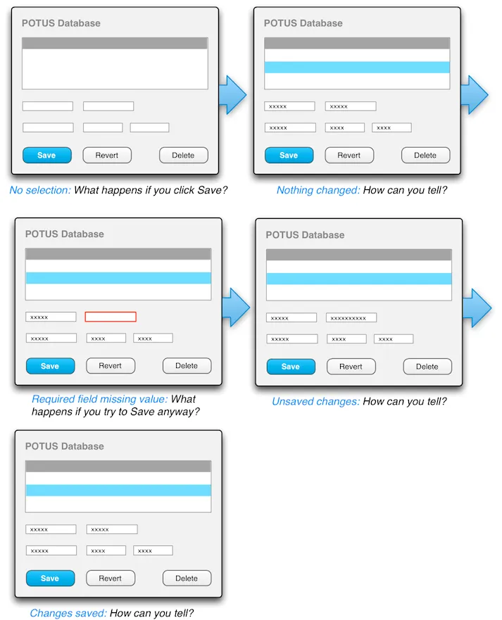
The following graphic illustrates a UI that does not, in any way, indicate the current state of the form:

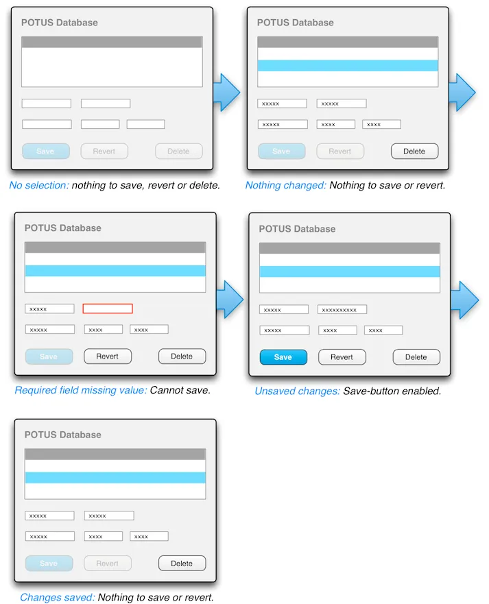
Thus, both of these states (unsaved changes or not) should be indicated to the user somehow. The solution, again, is disabling and enabling the corresponding actions: The Save/Cancel buttons are disabled until any change is made in the form. As soon as changes are detected, and the new values have been validated, the Save/Cancel buttons are enabled. When either one is clicked, both are disabled again to indicate that the action was successfully performed.
With this approach we add even more information about the current state of the application to the buttons themselves. Not only are we indicating when actions technically can be performed, but we also indicate when they logically make sense to perform, and, in cases like the Save/Cancel actions in the example above, we also notify the user about actions that probably should be performed to prevent data loss. This is a great deal of information being subtly and non-intrusively conveyed to the user, without resorting to annoying popups, simply by enabling and disabling buttons.

How to do this in a Vaadin application
To implement the above functionality, we need to be able to trigger the button-toggling code for changes in the following states:
-
Item selection
-
Field validation
-
Unsaved changes
The first one, whether or not an item has been selected and loaded into the form is quite trivial of course. You can check for that in the same code that handles item selection.
The second one is really easy if you’ve bound the fields with a FieldGroup, since in that case you can use the isValid() method on the FieldGroup to check if all fields are valid or not. Empty required fields cause this to return false, as do any validators you’ve explicitly added.
The third one is a bit trickier, since a change listener has to be added to each field separately, and the type of listener you need to add depends on the type of field. For most field components, a ValueChangeListener is fine, since it triggers a notification when the field’s value changes, such as when a different item is selected in a ComboBox. However, for the various text field components (TextField, TextArea and PasswordField) you’ll be better off with a TextChangeListener, since you’ll want to trigger the button-toggling code as soon as any change is made to the field’s text content, and a ValueChangeListener won’t do that.
Luckily, adding the change listeners can be done in a fairly simple loop over the components in a layout, or the fields bound through a FieldGroup. The appropriate type of listener can be chosen based on whether the component implements the FieldEvents.TextChangeNotifier interface:
Source code
Java
TextChangeListener textListener = new TextChangeListener() {
  @Override
  public void textChange(TextChangeEvent event) {
    formHasChanged();
  }
};

ValueChangeListener valueListener = new ValueChangeListener() {
  @Override
  public void valueChange(ValueChangeEvent event) {
    formHasChanged();
  }
};

for (Field f : fieldGroup.getFields()) {
  if (f instanceof TextChangeNotifier) {
    ((TextChangeNotifier) f).addTextChangeListener(textListener);
  } else {
    f.addValueChangeListener(valueListener);
  }
}
Source code
Java
public void formHasChanged() {
  btnRevert.setEnabled(true);
  boolean allFieldsValid = fieldGroup.isValid();
  btnSave.setEnabled(allFieldsValid);
}