Overview
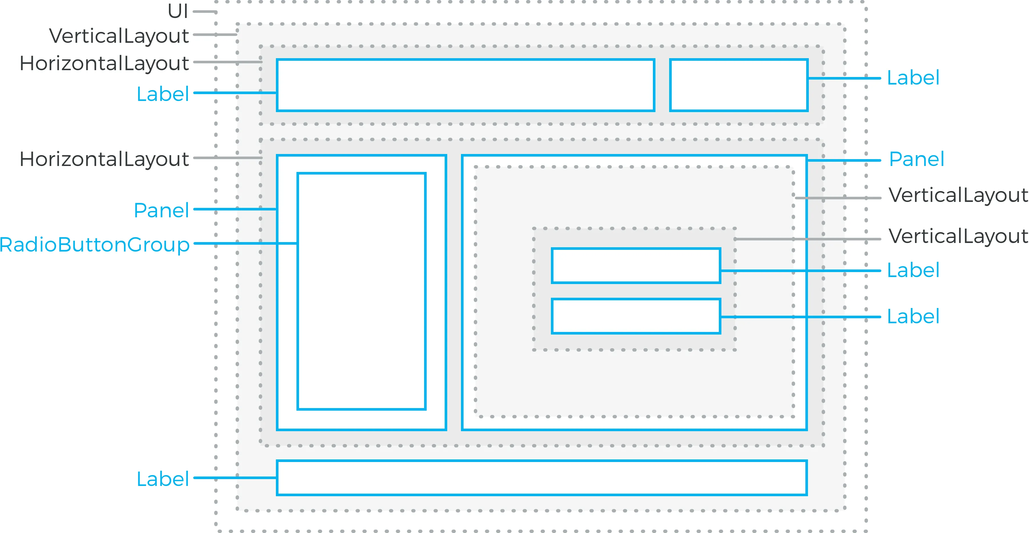
The user interface components in Vaadin can roughly be divided in two groups: components that the user can interact with and layout components for placing the other components to specific places in the user interface. The layout components are identical in their purpose to layout managers in regular desktop frameworks for Java. You can use plain Java to accomplish sophisticated component layouts.

You start by creating a content layout for the UI and then add other layout components hierarchically, and finally the interaction components as the leaves of the component tree.

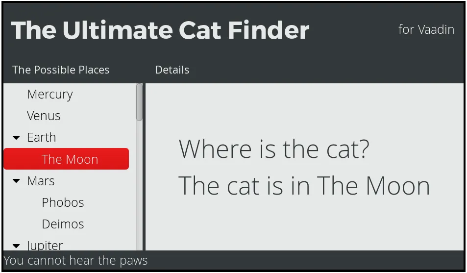
Let us look at building a bit simplified version of the layout in Layout example:
Source code
Java
// Set the root layout for the UI
VerticalLayout content = new VerticalLayout();
setContent(content);

HorizontalLayout titleBar = new HorizontalLayout();
titleBar.setWidth("100%");
root.addComponent(titleBar);

Label title = new Label("The Ultimate Cat Finder");
titleBar.addComponent(title);
titleBar.setExpandRatio(title, 1.0f); // Expand

Label titleComment = new Label("for Vaadin");
titleComment.setSizeUndefined(); // Take minimum space
titleBar.addComponent(titleComment);

... build rest of the layout ...
Or in the declarative format (roughly):
Source code
HTML
<vaadin-vertical-layout>
  <vaadin-label>The Ultimate Cat Finder</vaadin-label>

  <vaadin-horizontal-layout>
    <vaadin-radio-button-group caption="Possible Places"/>
    <vaadin-panel/>
    ...
  </vaadin-horizontal-layout>
</vaadin-vertical-layout>
You will usually need to tune the layout components a bit by setting sizes, expansion ratios, alignments, spacings, and so on. The general settings are described in "Layout Formatting".
Layouts are coupled with themes that specify various layout features, such as backgrounds, borders, text alignment, and so on. Definition and use of themes is described in "Themes".
You can see a finished version of the above example in Layout example.