Notifications
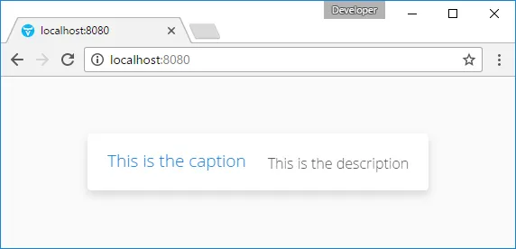
Notifications are error or information boxes that appear briefly, typically at the center of the screen. A notification box has a caption and an optional description and icon. The box stays on the screen either for a preset time or until the user clicks it. The notification type defines the default appearance and behaviour of a notification.
There are two ways to create a notification. The easiest is to use a static shorthand Notification.show() method, which takes the caption of the notification as a parameter, and an optional description and notification type, and displays it in the current page.
Source code
Java
Notification.show("This is the caption",
                  "This is the description",
                  Notification.Type.HUMANIZED_MESSAGE);
For more control, you can create a Notification object. Different constructors exist for taking just the caption, and optionally the description, notification type, and whether HTML is allowed or not. Notifications are shown in a Page, typically the current page.
Source code
Java
new Notification("This is a warning",
    "This is the <i>last</i> warning",
    Notification.Type.WARNING_MESSAGE, true)
    .show(Page.getCurrent());
The caption and description are by default written on the same line. If you want to have a line break between them, use the HTML line break markup " <br/>" if HTML is enabled, or " \n" if not. HTML is disabled by default, but can be enabled with setHtmlContentAllowed(true). When enabled, you can use any HTML markup in the caption and description of a notification. If it is in any way possible to get the notification content from user input, you should either disallow HTML or sanitize the content carefully, as noted in "Sanitizing User Input to Prevent Cross-Site Scripting".

Notification Type
The notification type defines the overall default style and behaviour of a notification. If no notification type is given, the "humanized" type is used as the default. The notification types, listed below, are defined in the Notification.Type class.
- HUMANIZED_MESSAGE
-

A user-friendly message that does not annoy too much: it does not require confirmation by clicking and disappears quickly. It is centered and has a neutral gray color.
- WARNING_MESSAGE
-

Warnings are messages of medium importance. They are displayed with colors that are neither neutral nor too distractive. A warning is displayed for 1.5 seconds, but the user can click the message box to dismiss it. The user can continue to interact with the application while the warning is displayed.
- ERROR_MESSAGE
-

Error messages are notifications that require the highest user attention, with alert colors, and they require the user to click the message to dismiss it. The error message box does not itself include an instruction to click the message, although the close icon on the right side indicates it visually. Unlike with other notifications, the user can not interact with the application while the error message is displayed. If you don’t want to show the close icon, you can hide by adding the style constant ValoTheme.NOTIFICATION_CRITICAL_ERROR to the Notification.
- TRAY_NOTIFICATION
-

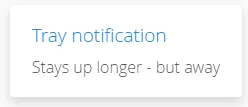
Tray notifications are displayed in the "system tray" area, that is, in the lower-right corner of the browser view. As they do not usually obscure any user interface, they are displayed longer than humanized or warning messages, 3 seconds by default. The user can continue to interact with the application normally while the tray notification is displayed.
Customizing Notifications
All of the features of specific notification types can be controlled with the Notification properties. Once configured, you need to show it in the current page.
Source code
Java
// Notification with default settings for a warning
Notification notif = new Notification(
    "Warning",
    "Area of reindeer husbandry",
    Notification.TYPE_WARNING_MESSAGE);

// Customize it
notif.setDelayMsec(20000);
notif.setPosition(Position.BOTTOM_RIGHT);
notif.setStyleName("mystyle");
notif.setIcon(new ThemeResource("img/reindeer.png"));

// Show it in the page
notif.show(Page.getCurrent());
The setPosition() method allows setting the positioning of the notification. The position can be specified by any of the constants defined in the Position enum.
The setDelayMSec() allows setting the time for how long the notification is displayed in milliseconds. Parameter value -1 means that the message is displayed until the user clicks the message box. It also prevents interaction with other parts of the application window, which is the default behaviour for error notifications. It does not, however, add a close box that the error notification has.
Styling with CSS
Source code
CSS
.v-Notification {}
  .popupContent {}
    .gwt-HTML {}
      h1 {}
      p  {}
The notification box is a floating div element under the body element of the page. It has an overall v-Notification style. The content is wrapped inside an element with popupContent style. The caption is enclosed within an h1 element and the description in a p element.
To customize it, add a style for the Notification object with setStyleName("mystyle"), and make the settings in the theme, for example as follows:
Source code
CSS
.v-Notification.mystyle {
    background: #FFFF00;
    border: 10px solid #C00000;
    color: black;
}
The result is shown, with the icon set earlier in the customization example, in A Styled Notification.
