CssLayout
CssLayout allows strong control over styling of the components contained inside the layout. The components are contained in a simple DOM structure consisting of <div> elements. By default, the contained components are laid out horizontally and wrap naturally when they reach the width of the layout, but you can control this and most other behaviour with CSS. You can also inject custom CSS for each contained component. As CssLayout has a very simple DOM structure and no dynamic rendering logic, relying purely on the built-in rendering logic of the browsers, it is the fastest of the layout components.
The basic use of CssLayout is just like with any other layout component:
Source code
Java
CssLayout layout = new CssLayout();

// Component with a layout-managed caption and icon
TextField tf = new TextField("A TextField");
tf.setIcon(new ThemeResource("icons/user.png"));
layout.addComponent(tf);

// Labels are 100% wide by default so must unset width
Label label = new Label("A Label");
label.setWidth(Sizeable.SIZE_UNDEFINED, 0);
layout.addComponent(label);

layout.addComponent(new Button("A Button"));
The result is shown in Basic Use of CssLayout. Notice that the default spacing and alignment of the layout is quite crude and CSS styling is nearly always needed.
The display attribute of CssLayout is inline-block by default, so the components are laid out horizontally following another. CssLayout has 100% width by default. If the components reach the width of the layout, they are wrapped to the next "line" just as text would be. If you add a component with 100% width, it will take an entire line by wrapping before and after the component.
CSS Injection
Overriding the getCss() method allows injecting custom CSS for each component. The CSS returned by the method is inserted in the style attribute of the <div> element of the component, so it will override any style definitions made in CSS files.
Source code
Java
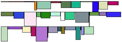
CssLayout layout = new CssLayout() {
@Override
protected String getCss(Component c) {
if (c instanceof Label) {
// Color the boxes with random colors
int rgb = (int) (Math.random()*(1<<24));
return "background: #" + Integer.toHexString(rgb);
}
return null;
}
};
layout.setWidth("400px"); // Causes to wrap the contents
// Add boxes of various sizes
for (int i=0; i<40; i++) {
Label box = new Label(" ", ContentMode.HTML);
box.addStyleName("flowbox");
box.setWidth((float) Math.random()*50,
Sizeable.UNITS_PIXELS);
box.setHeight((float) Math.random()*50,
Sizeable.UNITS_PIXELS);
layout.addComponent(box);
}The style name added to the components allows making common styling in a CSS file:
Source code
CSS
.v-label-flowbox {
  border: thin black solid;
}
Use of getCss() and line wrap shows the rendered result.
Browser Compatibility
The strength of the CssLayout is also its weakness. Much of the logic behind the other layout components is there to give nice default behavior and to handle the differences in different browsers. With CssLayout, you may need to make use of the browser-specific style classes in the root element of the application to write browser specific CSS rules. Some features in the other layouts are not even solvable in pure CSS, at least in all browsers.
Styling with CSS
Source code
CSS
.v-csslayout {}
.v-csslayout-margin {}
.v-csslayout-container {}
The CssLayout component has v-csslayout root style. The margin element with v-csslayout-margin style is always enabled. The components are contained in an element with v-csslayout-container style.
For example, we could style the basic CssLayout example shown earlier as follows:
Source code
CSS
/* Have the caption right of the text box, bottom-aligned */
.csslayoutexample .mylayout .v-csslayout-container {
    direction: rtl;
    line-height: 24px;
    vertical-align: bottom;
}

/* Have some space before and after the caption */
.csslayoutexample .mylayout .v-csslayout-container .v-caption {
    padding-left:  3px;
    padding-right: 10px;
}
The example would now be rendered as shown in Styling CssLayout.
Captions and icons that are managed by the layout are contained in an element with v-caption style. These caption elements are contained flat at the same level as the actual component elements. This may cause problems with wrapping in inline-block mode, as wrapping can occur between the caption and its corresponding component element just as well as between components. Such use case is therefore not feasible.