Selection Components
- Binding Selection Components to Data
- Item Captions
- Item Icons
- Getting and Setting Selection
- Handling Selection Events
- Multiple Selection
For a better overview on how selection works, see link:"Selecting Items".
Vaadin offers many alternative ways for selecting one or more items. The core library includes the following selection components, all based on either AbstractSingleSelect or AbstractMultiSelect class:
- ComboBox ("ComboBox")
-
A drop-down list with a text box, where the user can type text to find matching items and select one item. The component also provides a placeholder and the user can enter new items.
- ListSelect ("ListSelect")
-
A vertical list box for selecting items in multiple selection mode.
- NativeSelect ("NativeSelect")
-
Provides selection using the native selection component of the browser, typically a drop-down list for single selection and a multi-line list in multiselect mode. This uses the <select> element in HTML.
- RadioButtonGroup ("CheckBoxGroup and RadioButtonGroup")
-
Shows the items as a vertically arranged group of radio buttons in single selection mode.
- CheckBoxGroup ("CheckBoxGroup and RadioButtonGroup")
-
Shows the items as a vertically arranged group of check boxes in multiple selection mode.
- TwinColSelect ("TwinColSelect")
-
Shows two list boxes side by side where the user can select items from a list of available items and move them to a list of selected items using control buttons.
In addition, the Grid component allows user selection.
Binding Selection Components to Data
The selection components are typically bound to list of items obtained from backend system. You can give the list of items in the constructor or set it with setItems(). Read more in "Binding Components to Data".
You can get the current selection as the value of the selection component using getValue defined in HasValue interface. Selection changes are handled as value change or selection events, as is described later.
Item Captions
The items are typically a strings, in which case they can be used as the caption, but can be any object type. We could as well have given Planet instances for the items and use captions generated based on them setItemCaptionGenerator() method.
Source code
Java
// List of Planet objects
List<Planet> planets = new ArrayList<>();
planets.add(new Planet("Mercury"));
planets.add(new Planet("Venus"));
planets.add(new Planet("Earth"));

// Create a selection component
ComboBox<Planet> select = new ComboBox<>("My Select");

// Add an items to the ComboBox
select.setItems(planets);

select.setItemCaptionGenerator(Planet::getName);

// Select the first
select.setSelectedItem(planets.get(0));
// or
// select.setValue(planets.get(0));
In addition to a caption, an item can have an icon. The icon is set with setItemIconGenerator().
Typical use cases for captions are:
Using the items as the caption: the caption is retrieved with toString() method from the item. This is useful for simple objects like String or Integers, but also for objects that have human readable output for toString() .
Using a field of a item as caption: the caption is retrieved using the ItemCaptionGenerator typically given as a lambda or a method reference.
Item Icons
You can set an icon for each item with setItemIconGenerator(), in a fashion similar to captions. Notice, however, that icons are not supported in NativeSelect, TwinColSelect, and some other selection components and modes. This is because HTML does not support images inside the native select elements.
Getting and Setting Selection
For a better overview on how selection works, see link:"Selecting Items".
You can get selected the item with getValue() of the HasValue interface that returns either a single selected item (case of SingleSelect) or a collection of selected items (case of MultiSelect). You can select an item with the corresponding setValue() method.
The ComboBox and NativeSelect will show empty selection when no actual item is selected.
Handling Selection Events
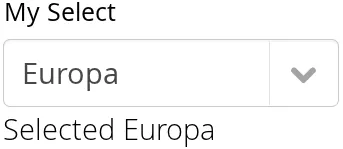
You can access the currently selected item with the getValue() (SingleSelect) or getSelectedItems() (MultiSelect) method of the component. Also, when handling selection events with a SelectionListener, the SelectionEvent will have the selected items of the event. Single- and Multiselect components have their own more specific listener and event types, SingleSelectionListener for SingleSelectionEvent and MultiSelectionListener for MultiSelectionEvent respectively. Both can be added with the addSelectionListener method.
Source code
Java
// Create a selection component with some items
ComboBox<String> select = new ComboBox<>("My Select");
select.setItems("Io", "Europa", "Ganymedes", "Callisto");

// Handle selection event
select.addSelectionListener(event ->
    layout.addComponent(new Label("Selected " +
        event.getSelectedItem().orElse("none")));
The result of user interaction is shown in Selected Item.

Multiple Selection
For a better overview on how selection works, see link:"Selecting Items".
Some selection components, such as CheckBoxGroup, ListSelect and TwinColSelect are multiselect components, they extend AbstractMultiSelect class.
Multiselect components use the MultiSelect interface which extends HasValue. This provides more fine grained API for selection. You can get and set the selection with the getSelectedItems() and select() methods.
A change in the selection will trigger a SelectionEvent, which you can handle with a SelectionListener. The following example shows how to handle selection changes with a listener.
Source code
Java
// A selection component with some items
ListSelect<String> select = new ListSelect<>("My Selection");
select.setItems("Mercury", "Venus", "Earth",
    "Mars", "Jupiter", "Saturn", "Uranus", "Neptune");

// Feedback on value changes
select.addSelectionListener(event -> {
        // Some feedback
        layout.addComponent(new Label("Selected: " +
            event.getNewSelection()));
    }
});