Overview
Vaadin provides a comprehensive set of user interface components and allows you to define custom components.
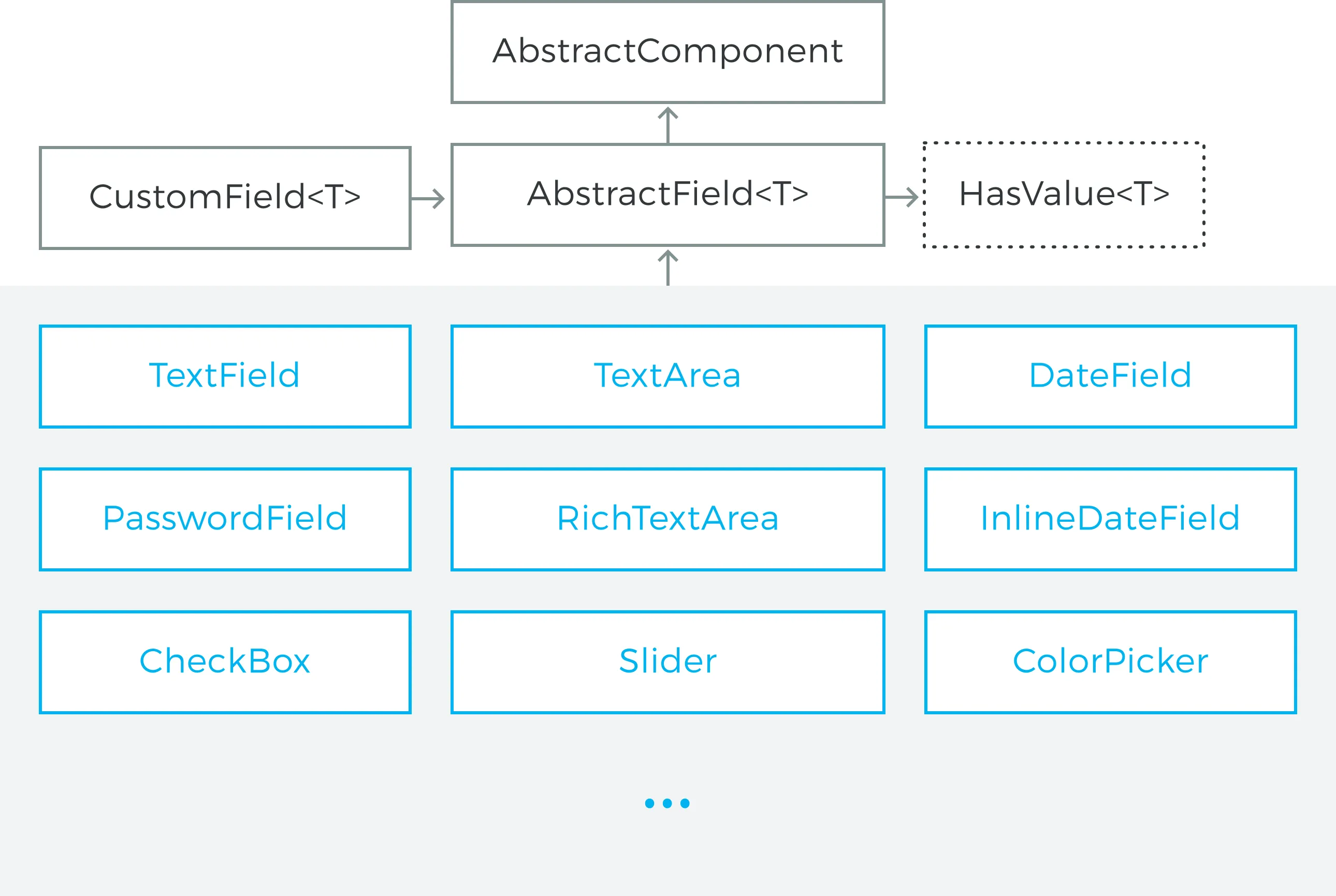
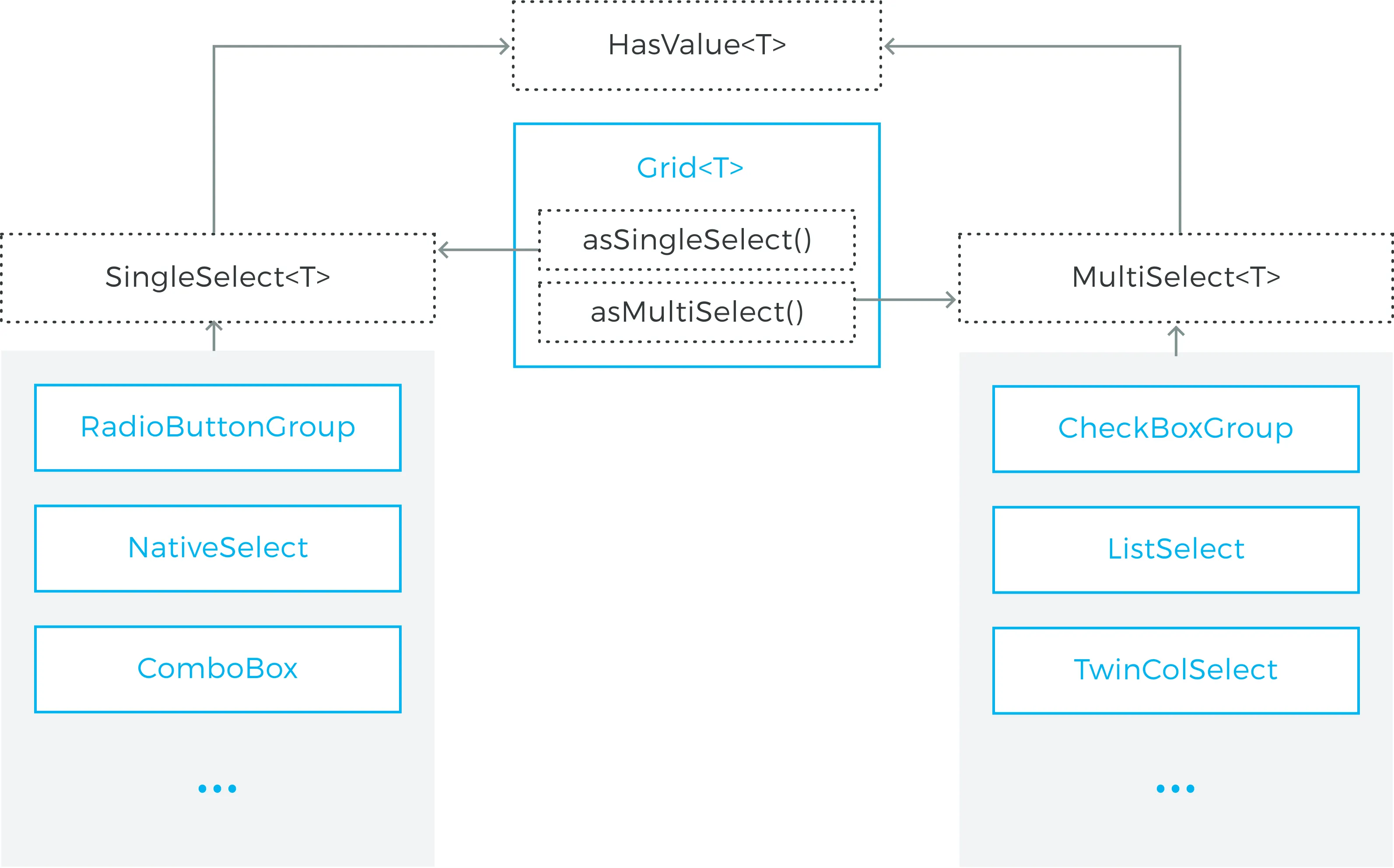
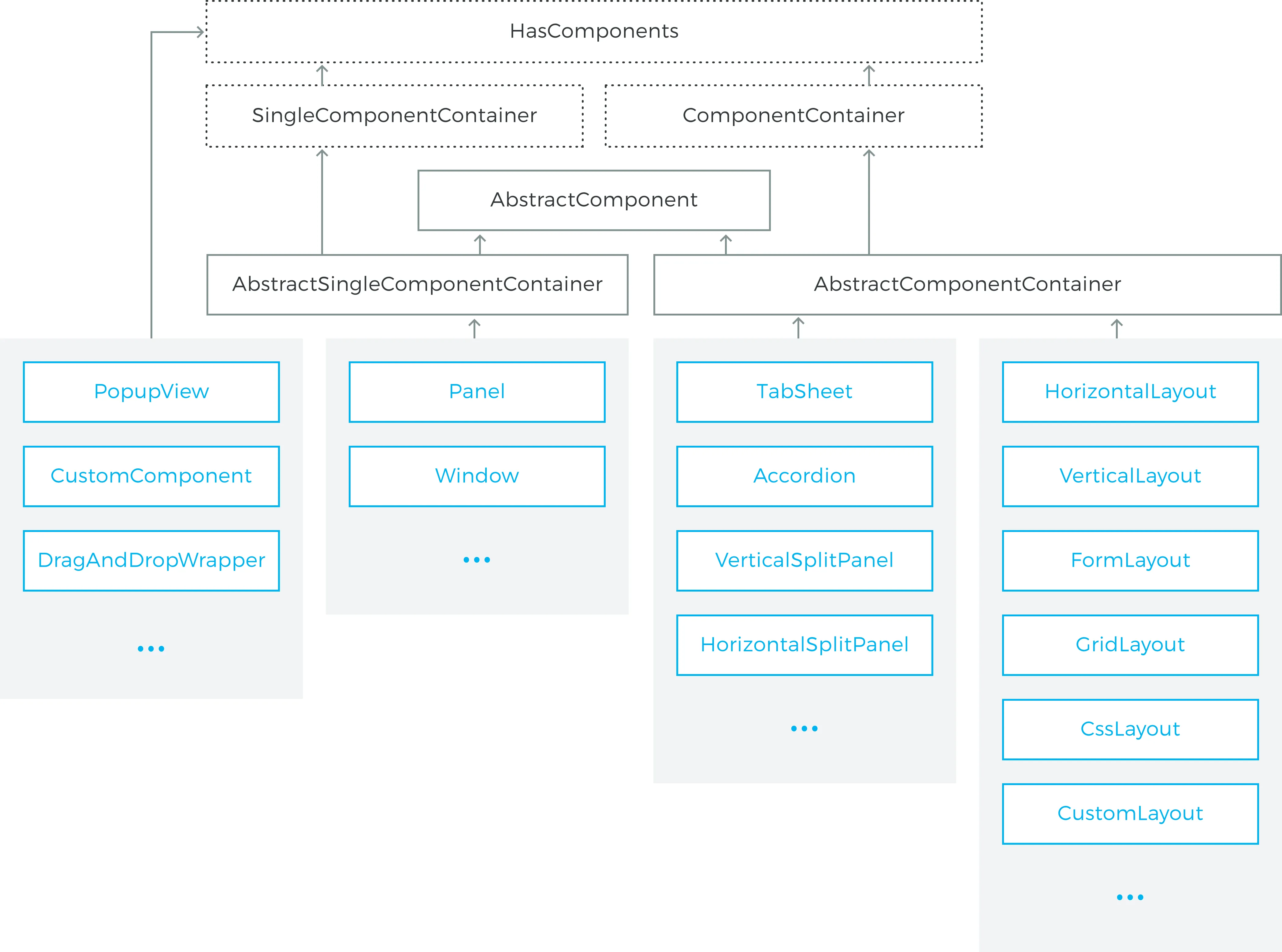
The component hierarchy of Vaadin is presented in the next four diagrams:
-
Basic Components illustrates the inheritance hierarchy of the UI component classes and interfaces not bound directly to business objects.
-
Field Components presents fields bound to single values
-
Selection Components presents components that show a list of data and allow selection
-
Layouts and Component Containers layouts and other component containers
Interfaces are displayed with a dotted outline, abstract classes in gray, and regular classes in blue.
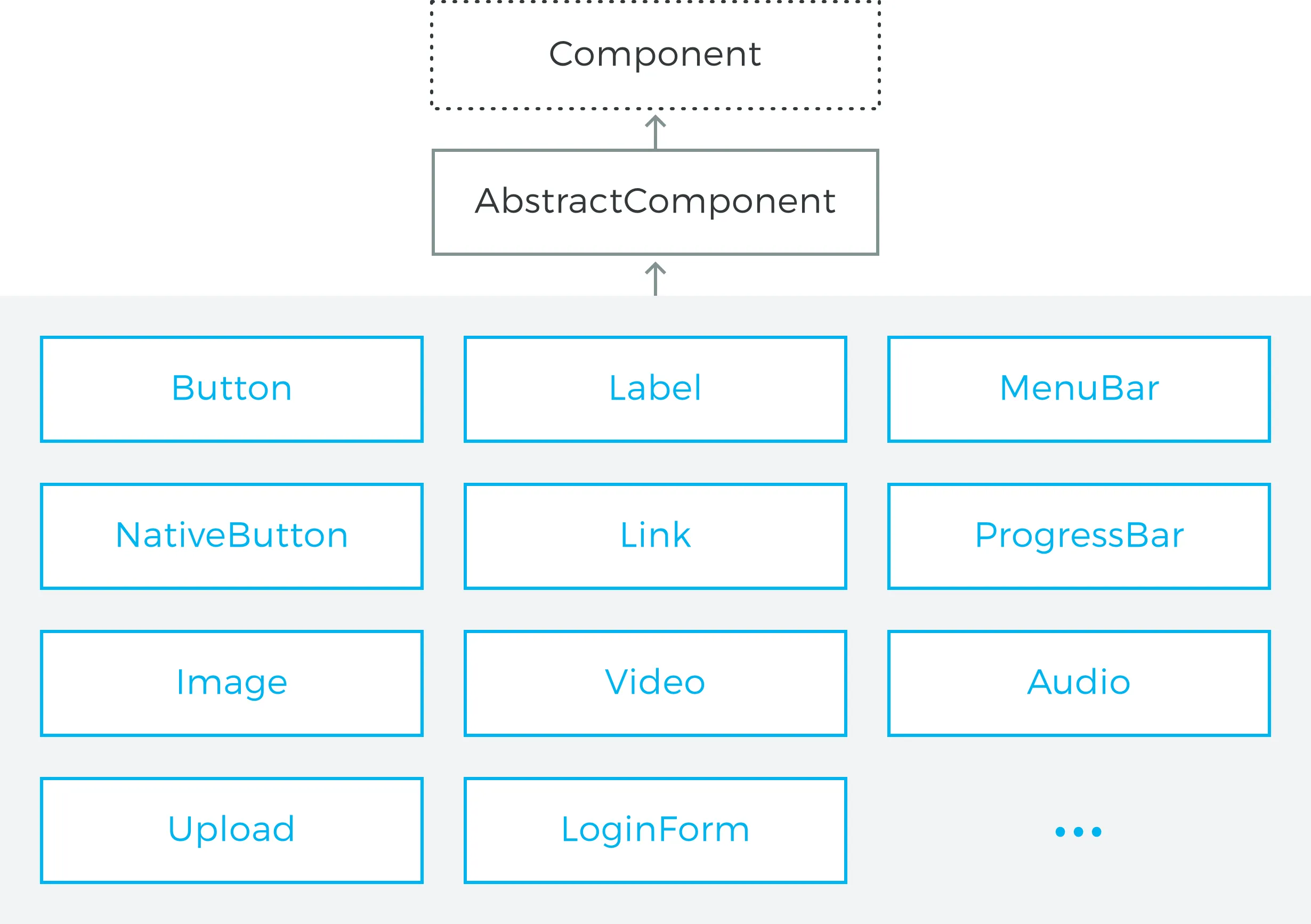
The Component is interface implemented by all components. In practice, all components extend the AbstractComponent abstract class.
There are three more specific types of components.
- Field Components
-
allow user to edit a value in the UI. All extend AbstractField. Field components are described in detail in "Field Components".
- Selection Component
-
show a list of data that the user can select from. All extend AbstractListing. Selection components are described in detail in "Selection Components".
- Layouts and Component Containers
-
Components that can contain other components. All layouts and containers implement the HasComponents interface. Layout components are described in detail in "Managing Layout".
You can browse the built-in UI components of Vaadin library in the Sampler application of the Vaadin Demo. The Sampler shows a description, JavaDoc documentation, and a code samples for each of the components.
In addition to the built-in components, many components are available as add-ons, either from the Vaadin Directory or from independent sources. Both commercial and free components exist. The installation of add-ons is described in "Using Vaadin Add-ons".