Visually distinguish primary actions
Most forms and dialogs have at least two actions that can be performed, such as Submit/Cancel, Save/Revert or Yes/No. Quite often, there are more, such as a login form with the actions “Sign in”, “Register”, and “Forgot password”. Usually, one of these actions is by far the most commonly used, and as such, the most likely one the user is going to be looking for.
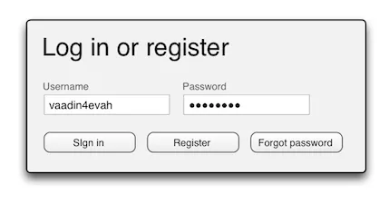
If all actions are represented by identical buttons (save for the caption), identifying the primary button can be quite slow, and the risk of selecting the wrong action by mistake (especially when in a hurry) is substantial:
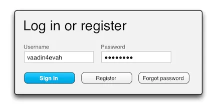
By visually distinguishing primary actions, e.g. by color, size or shape, the user can quickly and accurately find them even in a crowded, cluttered UI. A typical approach is to use a stronger (more saturated) color with greater contrast for the primary actions, and a grayer, lower contrast color for the secondary actions:
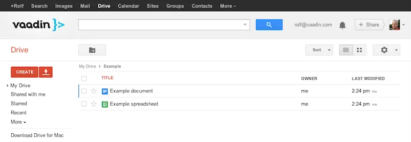
Sometimes a view can have more than one primary action simultaneously available, although usually in different parts of the view. Google handles this quite elegantly by systematically styling creation primary buttons (such as Compose in Gmail and Create in Drive) in red, and other primary buttons (such as search) in blue, while leaving secondary buttons gray:
Choose colors wisely, though – red, for instance, means “no”, "stop" or “danger” in most cultures, so using that for “Yes” or “Submit” might send the user mixed signals. You might also want to take into account the effects of color blindness (affecting approximately 10% of men and 1% of women), especially if your user base is going to be tens of thousands of people.
Setting a different visual style for primary action buttons is very easy to do in Vaadin by using the BUTTON_DEFAULT stylename in any of the built-in themes like Reindeer or Chameleon:
Source code
Java
Button btnSignIn = new Button("Sign in");
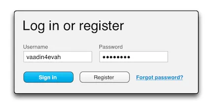
btnSignIn.addStyleName(Reindeer.BUTTON_DEFAULT);Another common approach, mainly used on the web, is to use text links instead of buttons for secondary or tertiary actions. This has a significantly stronger effect than color or size, and should only be used for significantly less common actions, such as a password reset request, not for the “No” option in a Yes/No dialog, for instance:
This is just as easy in Vaadin. Just use the BUTTON_LINK stylename defined in the base theme (and inherited in all built in themes), and your Button will look like a normal text-hyperlink.
Source code
Java
Button btnForgotPwd = new Button("Forgot password?");
btnForgotPwd.addStyleName(Reindeer.BUTTON_LINK);
(Note that the separate Link component should not be used for server actions, since you can’t bind a ClickListener to a Link.)
Consider binding the Enter key to the primary action
Especially in short, often used forms, such as a login form, it is usually a good idea to bind the Enter key to the primary action. This relieves the user from having to move his hand from the keyboard to the mouse.
Source code
Java
Button btnSignIn = new Button("Sign in");
btnSignIn.addStyleName(Reindeer.BUTTON_DEFAULT);
btnSignIn.setClickShortcut(KeyCode.ENTER);
If the primary action is something that really mustn’t be invoked by mistake or without properly thinking about it first, however, it’s probably better not to bind it to a keyboard shortcut, to avoid accidental invocations. Another reason to abstain from a keyboard shortcut is if the form contains an input field in which Enter can be used for something, such as a multi-line text area (where Enter creates a line break).