ComboBox
ComboBox is a selection component allows selecting an item from a drop-down list. The component also has a text field area, which allows entering search text by which the items shown in the drop-down list are filtered. Common selection component features are described in "Selection Components".
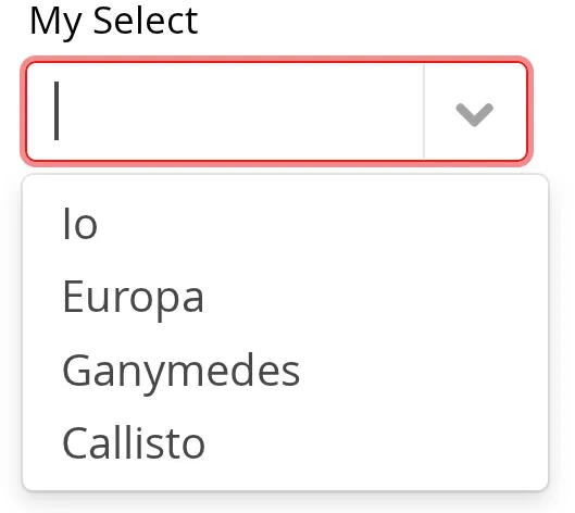
Filtered Selection
ComboBox allows filtering the items available for selection in the drop-down list by the text entered in the input box. To apply custom filtering, the setItems(CaptionFilter, Collection) can be used. When using a DataProvider, the filtering is delegated to it.
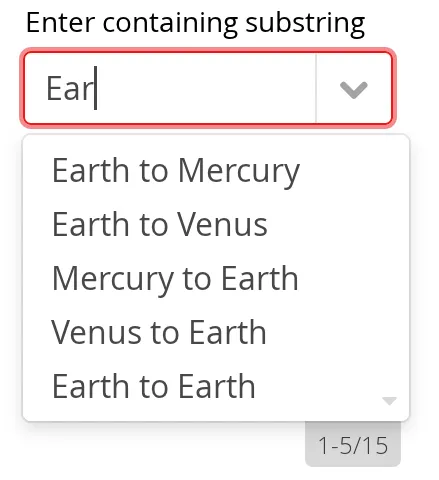
Pressing Enter will complete the item in the input box. Pressing Up and Down arrow keys can be used for selecting an item from the drop-down list. The drop-down list is paged and clicking on the scroll buttons will change to the next or previous page. The list selection can also be done with the arrow keys on the keyboard. The shown items are loaded from the server as needed, so the number of items held in the component can be quite large. The number of matching items is displayed by the drop-down list.
Allowing Adding New Items
ComboBox allows the user to add new items, when the user types in a value and presses Enter. You need to enable this with setNewItemHandler().
Adding new items is not possible if the selection component is read-only. An attempt to do so may result in an exception.
Handling New Items
Adding new items is handled by a NewItemProvider, which gets the item caption string as parameter for the accept(String) method.
Source code
Java
// List of planets
List<Planet> planets = new ArrayList<>();
planets.add(new Planet(1, "Mercury"));
planets.add(new Planet(2, "Venus"));
planets.add(new Planet(3, "Earth"));

ComboBox<Planet> select =
    new ComboBox<>("Select or Add a Planet");
select.setItems(planets);

// Use the name property for item captions
select.setItemCaptionGenerator(Planet::getName);

// Allow adding new items and add
// handling for new items
select.setNewItemProvider(inputString -> {

    Planet newPlanet = new Planet(planets.size(), inputString);
    planets.add(newPlanet);

    // Update combobox content
    select.setItems(planets);

    return Optional.of(newPlanet);
});
CSS Style Rules
Source code
CSS
.v-filterselect { }
  .v-filterselect-input { }
  .v-filterselect-button { }

// Under v-overlay-container
.v-filterselect-suggestpopup { }
  .popupContent { }
    .v-filterselect-prevpage,
      .v-filterselect-prevpage-off { }
    .v-filterselect-suggestmenu { }
      .gwt-MenuItem { }
    .v-filterselect-nextpage,
      .v-filterselect-nextpage-off { }
    .v-filterselect-status { }
In its default state, only the input field of the ComboBox component is visible. The entire component is enclosed in v-filterselect style (a legacy remnant), the input field has v-filterselect-input style and the button in the right end that opens and closes the drop-down result list has v-filterselect-button style.
The drop-down result list has an overall v-filterselect-suggestpopup style. It contains the list of suggestions with v-filterselect-suggestmenu style. When there are more items that fit in the menu, navigation buttons with v-filterselect-prevpage and v-filterselect-nextpage styles are shown. When they are not shown, the elements have -off suffix. The status bar in the bottom that shows the paging status has v-filterselect-status style.