Right-align comparable numeric fields
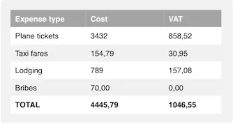
In the table below, the various numerical fields are kind of hard to compare and easy misinterpret, because of the alignment of the values:

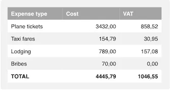
By right-aligning numerical fields, the values become easier to compare and less prone to misinterpretation, since the least significant digits are vertically aligned:
Source code
Java
Table tblExpenses = new Table();
tblExpenses.setContainerDataSource(expensesData);
tblExpenses.setColumnAlignment("cost", Table.Align.RIGHT);
tblExpenses.setColumnAlignment("vat", Table.Align.RIGHT);
This effect is of course ruined if the formats of these fields are different, such as different number of decimals. Make sure that you’re using the same format for fields that should be easy to compare.
Even though this example was of a table, the same principles also apply to input fields. Right-aligning a text field indicates to the user that a numerical value is expected, and makes multiple numerical fields in the same form easier to compare. To do this, you’ll need to set up a custom theme for your application (which you’ll probably end up doing at some point anyway), set a custom stylename to the field, such as “numerical” or “right-aligned”…
Source code
Java
TextField tfExpensesLodging = new TextField(“Lodging”);
tfExpensesLodging.addStyleName(“numerical”);…and get your hands dirty with a bit of CSS:
Source code
CSS
.v-textfield.numerical {
  text-align: right;
}
Note that right-aligning non-comparable numerical fields, such as product IDs or ISBNs is kind of pointless, and probably best to avoid.