TabSheet
The TabSheet is a multicomponent container that allows switching between the components with "tabs". The tabs are organized as a tab bar at the top of the tab sheet. Clicking on a tab opens its contained component in the main display area of the layout. If there are more tabs than fit in the tab bar, navigation buttons will appear.
Adding Tabs
You add new tabs to a tab sheet with the addTab() method. The simple version of the method takes as its parameter the root component of the tab. You can use the root component to retrieve its corresponding Tab object. Typically, you put a layout component as the root component.
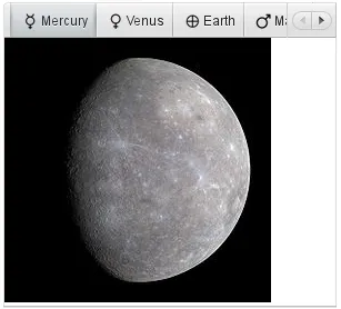
You can also give the caption and the icon as parameters for the addTab() method. The following example demonstrates the creation of a simple tab sheet, where each tab shows a different Label component. The tabs have an icon, which are (in this example) loaded as Java class loader resources from the application.
Source code
Java
TabSheet tabsheet = new TabSheet();
layout.addComponent(tabsheet);

// Create the first tab
VerticalLayout tab1 = new VerticalLayout();
tab1.addComponent(new Image(null,
        new ThemeResource("img/planets/Mercury.jpg")));
tabsheet.addTab(tab1, "Mercury",
        new ThemeResource("img/planets/Mercury_symbol.png"));

// This tab gets its caption from the component caption
VerticalLayout tab2 = new VerticalLayout();
tab2.addComponent(new Image(null,
        new ThemeResource("img/planets/Venus.jpg")));
tab2.setCaption("Venus");
tabsheet.addTab(tab2).setIcon(
        new ThemeResource("img/planets/Venus_symbol.png"));
...
Tab Objects
Each tab in a tab sheet is represented as a Tab object, which manages the tab caption, icon, and attributes such as hidden and visible. You can set the caption with setCaption() and the icon with setIcon(). If the component added with addTab() has a caption or icon, it is used as the default for the Tab object. However, changing the attributes of the root component later does not affect the tab, but you must make the setting through the Tab object. The addTab() returns the new Tab object, so you can easily set an attribute using the reference.
Source code
Java
// Set an attribute using the returned reference
tabsheet.addTab(myTab).setCaption("My Tab");
Disabling and Hiding Tabs
A tab can be disabled by setting setEnabled(false) for the Tab object, thereby disallowing selecting it.
A tab can be made invisible by setting setVisible(false) for the Tab object. The hideTabs() method allows hiding the tab bar entirely. This can be useful in tabbed document interfaces (TDI) when there is only one tab.
Tab Change Events
Clicking on a tab selects it. This fires a TabSheet.SelectedTabChangeEvent, which you can handle by implementing the TabSheet.SelectedTabChangeListener interface. You can access the tabsheet of the event with getTabSheet(), and find the new selected tab with getSelectedTab().
You can programmatically select a tab with setSelectedTab(), which also fires the SelectedTabChangeEvent (beware of recursive events). Reselecting the currently selected tab does not fire the event.
Notice that when the first tab is added, it is selected and the change event is fired, so if you want to catch that, you need to add your listener before adding any tabs.
Creating Tab Content Dynamically
In the following example, we create the tabs as empty content layouts, and add the tab content dynamically when a tab is selected:
Source code
Java
TabSheet tabsheet = new TabSheet();

// Create tab content dynamically when tab is selected
tabsheet.addSelectedTabChangeListener(
        new TabSheet.SelectedTabChangeListener() {
    public void selectedTabChange(SelectedTabChangeEvent event) {
        // Find the tabsheet
        TabSheet tabsheet = event.getTabSheet();

        // Find the tab (here we know it's a layout)
        Layout tab = (Layout) tabsheet.getSelectedTab();

        // Get the tab caption from the tab object
        String caption = tabsheet.getTab(tab).getCaption();

        // Fill the tab content
        tab.removeAllComponents();
        tab.addComponent(new Image(null,
            new ThemeResource("img/planets/"+caption+".jpg")));
    }
});

// Have some tabs
String[] tabs = {"Mercury", "Venus", "Earth", "Mars"};
for (String caption: tabs)
    tabsheet.addTab(new VerticalLayout(), caption,
        new ThemeResource("img/planets/"+caption+"_symbol.png"));
Enabling and Handling Closing Tabs
You can enable a close button for individual tabs with the closable property in the TabSheet.Tab objects.
Source code
Java
// Enable closing the tab
tabsheet.getTab(tabComponent).setClosable(true);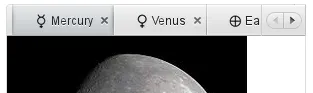
Handling Tab Close Events
You can handle closing tabs by implementing a custom TabSheet.CloseHandler. The default implementation simply calls removeTab() for the tab to be closed, but you can prevent the close by not calling it. This allows, for example, opening a dialog window to confirm the close.
Source code
Java
tabsheet.setCloseHandler(new CloseHandler() {
    @Override
    public void onTabClose(TabSheet tabsheet,
                           Component tabContent) {
        Tab tab = tabsheet.getTab(tabContent);
        Notification.show("Closing " + tab.getCaption());

        // We need to close it explicitly in the handler
        tabsheet.removeTab(tab);
    }
});
CSS Style Rules
Source code
CSS
.v-tabsheet {}
.v-tabsheet-tabs {}
.v-tabsheet-content {}
.v-tabsheet-deco {}
.v-tabsheet-tabcontainer {}
.v-tabsheet-tabsheetpanel {}
.v-tabsheet-hidetabs {}

.v-tabsheet-scroller {}
.v-tabsheet-scrollerPrev {}
.v-tabsheet-scrollerNext {}
.v-tabsheet-scrollerPrev-disabled{}
.v-tabsheet-scrollerNext-disabled{}

.v-tabsheet-tabitem {}
.v-tabsheet-tabitem-selected {}
.v-tabsheet-tabitemcell {}
.v-tabsheet-tabitemcell-first {}

.v-tabsheet-tabs td {}
.v-tabsheet-spacertd {}
The entire tabsheet has the v-tabsheet style. A tabsheet consists of three main parts: the tabs on the top, the main content pane, and decorations around the tabsheet.
The tabs area at the top can be styled with v-tabsheet-tabs, v-tabsheet-tabcontainer and v-tabsheet-tabitem*.
The style v-tabsheet-spacertd is used for any empty space after the tabs. If the tabsheet has too little space to show all tabs, scroller buttons enable browsing the full tab list. These use the styles v-tabsheet-scroller*.
The content area where the tab contents are shown can be styled with v-tabsheet-content, and the surrounding decoration with v-tabsheet-deco.