Panel
Panel is a single-component container with a frame around the content. It has an optional caption and an icon which are handled by the panel itself, not its containing layout. The panel itself does not manage the caption of its contained component. You need to set the content with setContent().
Panel has 100% width and undefined height by default. This corresponds with the default sizing of VerticalLayout, which is perhaps most commonly used as the content of a Panel. If the width or height of a panel is undefined, the content must have a corresponding undefined or fixed size in the same direction to avoid a sizing paradox.
Source code
Java
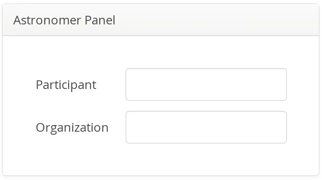
Panel panel = new Panel("Astronomer Panel");
panel.addStyleName("mypanelexample");
panel.setSizeUndefined(); // Shrink to fit content
layout.addComponent(panel);

// Create the content
FormLayout content = new FormLayout();
content.addStyleName("mypanelcontent");
content.addComponent(new TextField("Participant"));
content.addComponent(new TextField("Organization"));
content.setSizeUndefined(); // Shrink to fit
content.setMargin(true);
panel.setContent(content);
The resulting layout is shown in A Panel.
Scrolling the Panel Content
Normally, if a panel has undefined size in a direction, as it has by default vertically, it will fit the size of the content and grow as the content grows. However, if it has a fixed or percentual size and its content becomes too big to fit in the content area, a scroll bar will appear for the particular direction. Scroll bars in a Panel are handled natively by the browser with the overflow: auto property in CSS.
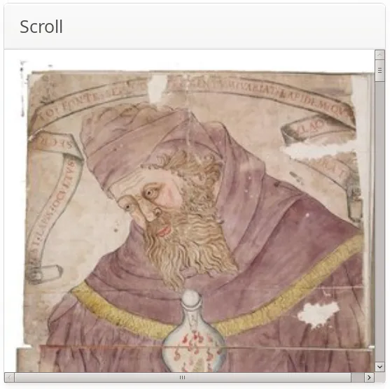
In the following example, we have a 300 pixels wide and very high Image component as the panel content.
Source code
Java
// Display an image stored in theme
Image image = new Image(null,
    new ThemeResource("img/Ripley_Scroll-300px.jpg"));

// To enable scrollbars, the size of the panel content
// must not be relative to the panel size
image.setSizeUndefined(); // Actually the default

// The panel will give it scrollbars.
Panel panel = new Panel("Scroll");
panel.setWidth("300px");
panel.setHeight("300px");
panel.setContent(image);

layout.addComponent(panel);
The result is shown in Panel with Scroll Bars. Notice that also the horizontal scrollbar has appeared even though the panel has the same width as the content (300 pixels) - the 300px width for the panel includes the panel border and vertical scrollbar.
Programmatic Scrolling
Panel implements the Scrollable interface to allow programmatic scrolling. You can set the scroll position in pixels with setScrollTop() and setScrollLeft(). You can also get the scroll position set previously, but scrolling the panel in the browser does not update the scroll position to the server-side.
CSS Style Rules
Source code
CSS
.v-panel {}
.v-panel-caption {}
.v-panel-nocaption {}
.v-panel-content {}
.v-panel-deco {}
The entire panel has v-panel style. A panel consists of three parts: the caption, content, and bottom decorations (shadow). These can be styled with v-panel-caption, v-panel-content, and v-panel-deco, respectively. If the panel has no caption, the caption element will have the style v-panel-nocaption.
The built-in borderless style in the Valo theme has no borders or border decorations for the Panel. You can use the ValoTheme.PANEL_BORDERLESS constant to add the style to a panel.