CheckBoxGroup and RadioButtonGroup
RadioButtonGroup is a single selection component that allows selection from a group of radio buttons. CheckBoxGroup is a multiselection component where items are displayed as check boxes. The common selection component features are described in "Selection Components".
Source code
Java
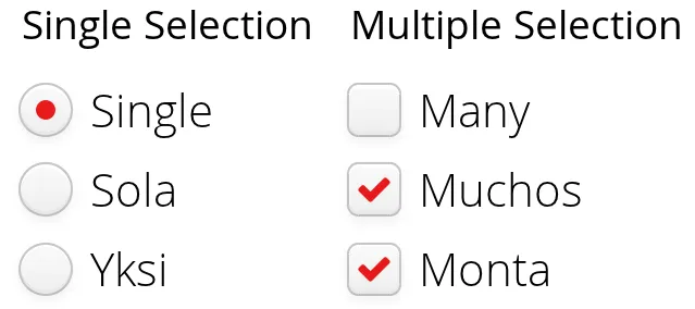
// A single-select radio button group
RadioButtonGroup<String> single =
    new RadioButtonGroup<>("Single Selection");
single.setItems("Single", "Sola", "Yksi");

// A multi-select check box group
CheckBoxGroup<String> multi =
    new CheckBoxGroup<>("Multiple Selection");
multi.setItems("Many", "Muchos", "Monta");
RadioButtonGroup and CheckBoxGroup shows the RadioButtonGroup and CheckBoxGroup.
You can also create check boxes individually using the CheckBox class, as described in "CheckBox". The advantages of the CheckBoxGroup component are that as it maintains the individual check box objects, you can get an array of the currently selected items easily, and that you can easily change the appearance of a single component and use it with a Binder.
Disabling Items
You can disable individual items in a RadioButtonGroup or a CheckBoxGroup with setItemEnabledProvider(). The user can not select or deselect disabled items in a CheckBoxGroup, but in a RadioButtonGroup the user can change the selection from a disabled to an enabled item. The selections can be changed programmatically regardless of whether an item is enabled or disabled.
Source code
Java
// Have a radio button group with some items
RadioButtonGroup<String> group = new RadioButtonGroup<>("My Disabled Group");
group.setItems("One", "Two", "Three");

// Disable one item
group.setItemEnabledProvider(item-> !"Two".equals(item));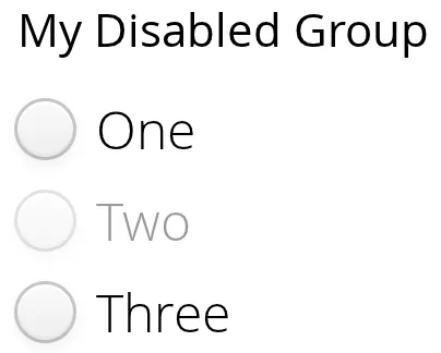
Setting an item as disabled turns on the v-disabled style for it.
CSS Style Rules
Source code
CSS
.v-select-optiongroup {}
  .v-select-option.v-checkbox {}
  .v-select-option.v-radiobutton {}
The v-select-optiongroup is the overall style for the component. Each check box will have the v-checkbox style, borrowed from the CheckBox component, and each radio button the v-radiobutton style. Both the radio buttons and check boxes will also have the v-select-option style that allows styling regardless of the option type and additionally v-select-option-selected when the item is selected. Disabled items have additionally the v-disabled style.