Button
The Button component is normally used for initiating some action, such as finalizing input in forms. When the user clicks a button, a Button.ClickEvent is fired, which can be handled by adding a click listener using either the onClick() or the addClickListener() method.
You can handle button clicks most easily with an anonymous class or a lambda expression, as follows:
Source code
Java
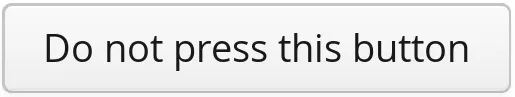
Button button = new Button("Do not press this button");

button.addClickListener(clickEvent ->
    Notification.show("Do not press this button again"));
The listener can also be given in the constructor, which is often perhaps simpler.
CSS Style Rules
Source code
CSS
.v-button { }
  .v-button-wrap { }
    .v-button-caption { }
A button has an overall v-button style. The caption has v-button-caption style. There is also an intermediate wrap element, which may help in styling in some cases.
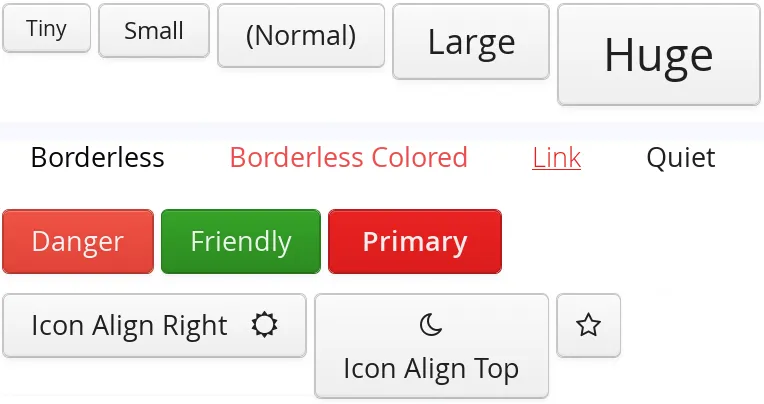
The button component has many style variants in the Valo theme, as illustrated in Button in different styles of the Valo theme. The styles are defined in the ValoTheme class.