Configure input fields to guide data entry
Field size
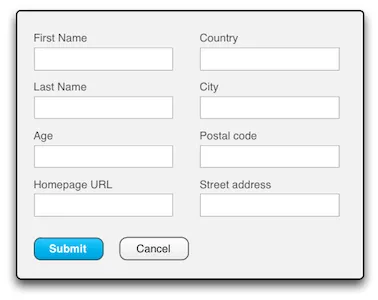
There are a number of tricks we can use to help users understand what kind of values we expect them to enter into a field, without resorting to tooltips, footnotes or excessively long captions. Consider the form below:

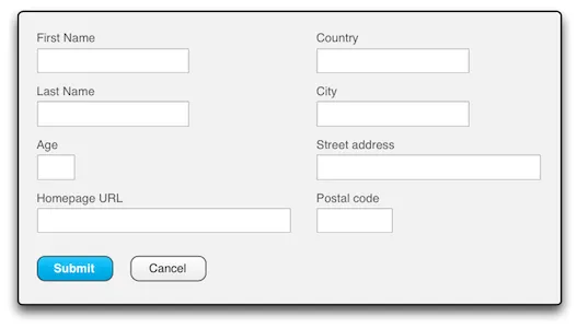
The shape, size and layout of these fields don’t really correspond to the kinds of values expected to be entered in them, or to the relations between different fields. For instance, while the homepage url is probably between 25 and 55 characters long, European postal codes are only about 6 digits long, and age maxes out at three digits. By setting the widths of these fields to be approximately proportional to the lengths of expected values, the fields become easier to identify, and the entire form feels more friendly and less monotonous:

Please note that there is no point in trying to match the exact lengths of expected values – the positive effect here relies more on the sizes of fields relative to each other than on specific widths. Also note that it’s important not to make the shortest fields too short just to distinguish them from longer ones. An address field that can only display 10 characters at a time would be really annoying.
An easy way to set field widths to approximately a certain number of characters is to set the component’s widths using Em units, found in Vaadin’s Sizeable.Unit enum. One Em is approximately the width of (actually usually slightly wider than) an uppercase M.
Source code
Java
TextField tfPostalCode = new TextField("Postal code");
tfPostalCode.setWidth(6, Unit.EM);
This was all about the width of input fields, since most input fields are single-line. Fields for which you expect more than a few words of text should of course be multi-line TextAreas. While the height of a TextArea might not be as important as the width of a TextField (since it has scrollbars), it’s still a good idea to set both the width and the height of a TextArea to roughly match the amount of text you expect people to enter. A bigger TextArea encourages the user to enter more text into it, while a smaller area suggests that perhaps a few carefully chosen words is enough, thank you very much.
Component grouping
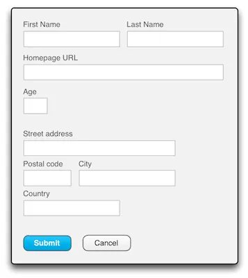
Some of the fields in the above example clearly “belong together”. First and last name. Street address, postal code, city and country. By changing the layout slightly, moving the most closely related fields to the same line and adding a little spacing between groups of related fields the fields become even easier to identify, and the form easier to understand in a single glance:

(See layout component sections in Tutorial and Book of Vaadin to see how this is done in Vaadin.)
Placeholders
A placeholder is an input prompt text inside an input field that disappears as soon as a value is entered into the field. Many input components in Vaadin have a setPlaceholder() method for this:
Source code
Java
TextField tfSearch = new TextField();
tfSearch.setPlaceholder(“Search by keywords”);
One use for placeholders is as an alternative to a separate caption. This can be useful especially if there is very little space for the field, or if you wish to reduce the visual clutter of your UI. A common example is a search or text-filter field with a placeholder like “Search by keywords” or “Filter by name” :

The decision to use placeholders as captions should not be taken lightly, however. Keep in mind that the placeholder disappears as soon as any text is entered into the field, so the user will have to remember what the field was for, or be able to deduce its identity from its current value. In the example above, with just a single search field, or even in a login form with username and password fields, this is acceptable. In a significantly longer form, however, especially one that the user might wish to read through before submitting to check that everything has been correctly entered, this approach quickly turns into a problem.
Another way to use placeholders is for displaying additional information about the field, such as the expected format, or the types of values that are accepted. This is quite similar to tooltips, with the difference that the placeholder must be kept short enough to fit into the field itself, and that it is immediately visible, without hovering over the field with the mouse pointer. For this reason, placeholders are useful on touch screens, as opposed to tooltips.
A good example of indicating the types of values a fields accepts is a Location field where you can enter a street address, a postal code or just the name of the city. These details are probably too long to fit in the field’s caption, and might not be discoverable enough in a tooltip. A placeholder briefly explaining the options is an excellent solution:
