Choosing input field components wisely
The core Vaadin framework has more than ten different input field components. Choosing the right one can improve your application’s usability significantly. Which component is the best fit in a certain situation depends on so many factors that it’s pretty much impossible to set down any specific rules. Nevertheless, here are some helpful pointers that might guide you in the right direction.
Textfield or selection component?
TextFields are of course the most obvious choice in most cases. However, their inherent lack of restrictions requires that the user understands what kind of values are acceptable. They don’t present any options to choose from, and, although you can restrict them to certain kinds of values e.g. by using Converters, these restrictions are not immediately obvious to the user. Furthermore, if the UI in question is mostly mouse-operated, a TextField forces the user to move her hands to the keyboard to enter a value. Thus, a selection component can in many cases be more convenient for your users.
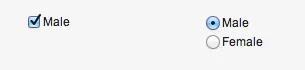
OptionGroup and Checkbox
OptionGroups are handy for very small sets of options (typically 2-4). You can toggle between single-select (radiobuttons) and multi-select (checkboxes) with the setMultiSelect(boolean) method. Using an OptionGroups to present purely numerical options might be somewhat strange, though.

For binary either/or, yes/no options, a CheckBox is a natural choice. However, if the meaning of the "no" option (i.e. unchecked) is not completely obvious, or the "yes" (i.e. checked) option could be confusing by itself, a two-item single-select OptionGroup might be better, since it clearly states what both options represent.
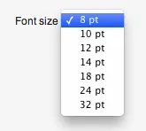
NativeSelect
The often-overlooked NativeSelect component is also convenient for small sets of options (up to 10 or so), and works great both for named items and small sets of numbers.
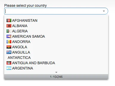
ComboBox
If the set of options is larger than about 10 items, a ComboBox might be a better choice, since it allows the user to search for a specific value to typing part of it, and supports lazy loading.
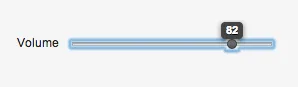
Slider
The Slider is great for quickly selecting a value from a wide range of values, if precision is not that important, such as audio volume, brightness, or any approximate value. (If precision is important it’s much better to allow the user to manually enter the value, such as with a TextField.)
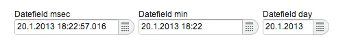
DateFields
The PopupDateField component, which opens a calendar popup for date selection, is great for entering dates and times. Remember to set the datefield’s resolution to something appropriate: seconds are hardly relevant in most cases, and sometimes all you need is the date.
There’s also the InlineDateField, which is really just the PopupDateField’s datepicker without a textfield. It’s probably a bit too big to use in most forms, but if picking dates is one of the few tasks in a form, give it a try if you have the space.