|
Note
| Partially outdated: This article was written before Vaadin 7.3, and is referring to the previous default theme, Reindeer. The visual appearance of read-only fields is different in the newer default theme, Valo. In Valo, read-only fields retain the border around the input field. |
Vaadin input field components have both a disabled and a read-only state (which can be set through the setEnabled(false) and setReadOnly(true) methods respectively). While at first glance these seem to be interchangeable, there is a distinct difference in their effects and proper usage.
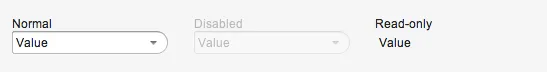
As you can see in the image above, the visual effects of the two states are clearly different. The disabled ComboBox is “grayed out” but looks otherwise identical to its normal state. The read-only ComboBox, meanwhile, doesn’t look like a ComboBox at all, but more like a Label. This visual difference is the key to understanding when to use which state.
Disabled fields
An input field is disabled to indicate that it cannot currently be used. This might be because it is not applicable, e.g. due to the value of some other field. Let’s look at the following piece of a questionnaire form as an example:
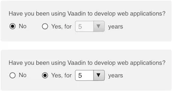
The “years” dropdown above is disabled unless the Yes radio button is selected, since it naturally is not applicable otherwise. Another reason for disabling a field might be that the user lacks the required permissions to set it, such as in the following example:
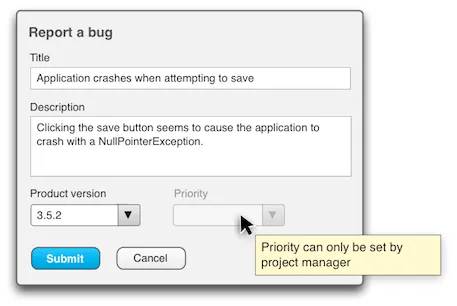
In both cases, there is no need to read the value of the field, since it cannot have a value or simply isn’t applicable or relevant in the current context. This is why disabled fields are grayed out with a reduced opacity effect in Vaadin built-in themes.
Read-only fields
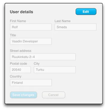
Read-only, on the other hand, is used when a field is currently only used to display a value, without providing any means of changing it. In this case, it is important that the field is presented in a readable way, which is why Vaadin generally renders them like labels, without the unnecessary component chrome. A very common example is a form that can be toggled between viewing and editing modes:
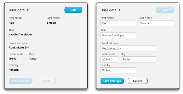
Using read-only fields in viewing mode means that you don’t have to swap between labels and input fields in your UI code when view/edit mode is toggled. Instead, you just iterate through your fields set read-only mode on or off:
Source code
Java
Iterator<Component> i = someLayout.getComponentIterator();
while (i.hasNext()) {
  Component c = i.next();
  if (c instanceof com.vaadin.ui.AbstractField) {
    AbstractField field = (AbstractField)c;
    field.setReadOnly(true);
  }
}
Even better, if your fields are databound through a FieldGroup, their read-only states can be collectively toggled through the FieldGroup:
Source code
Java
FieldGroup fieldGrp = new FieldGroup(dataItem);
TextField tfName = new TextField(“Name”);
fieldGrp.bind(tfName, “name”);
TextField tfAge = new TextField(“Age”);
fieldGrp.bind(tfAge, “age”);
fieldGrp.setReadOnly(true);
(Unfortunately, setting a Vaadin component container, like a layout, read-only does not set all its components read-only recursively, as one might expect. Doing the same with disabled does, though.)
One caveat regarding read-only fields is that if the text is longer than the field, it will be clipped, as opposed to a Label, which instead will wrap the text to a new line. Thus, in certain situations, switching to Labels may be preferable.
It’s probably best to mention here that setReadOnly(true) also has a certain side-effect in Vaadin that setEnabled(false) does not: You cannot set the value of a read-only field even in server-side code. The following code would throw a ReadOnlyException:
Source code
Java
TextField tfFoo = new TextField();
tfFoo.setReadOnly(true);
tfFoo.setValue(“foo”);
Why this is important
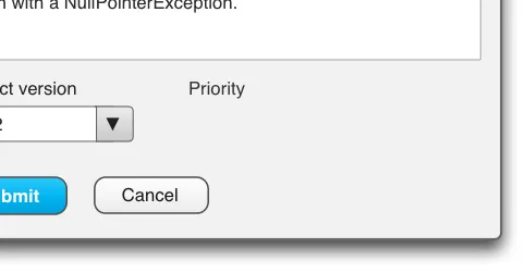
Understanding the difference between disabled and read-only is important because using them wrong tends to harm usability. First, let’s see what happens if you use disabled instead read-only in the view/edit example form above:
Not very readable, is it? Looks kind of awful, doesn’t it? The reduced opacity and unnecessary component chrome really make reading the form rather painful, which kind of defeats the entire "view" mode.
Okay, so the other way around, what if we use read-only instead of disabled in the wrong situation? The field will look like a Label, and that’s not so bad, right? Well, if the field is empty, as is often the case with disabled fields, then in read-only mode it would simply be invisible, save for the caption (if it has one):
Admittedly, not as bad as using disabled for read-only forms, but bad enough. Also, even if the field does have a value, setting it read-only gives the user the impression that it cannot be changed at all, whereas a grayed out disabled field indicates that it could be changed, if only the circumstances were different…