Responsive Themes
Vaadin includes support for responsive design which enables size range conditions in CSS selectors, allowing conditional CSS rules that respond to size changes in the browser window on the client-side.
See the Vaadin Blog article on Responsive design for some additional information.
You can use the Responsive extension to extend either a component, typically a layout, or the entire UI. You specify the component by the static makeResponsive() method.
Source code
// Have some component with an appropriate style name
VerticalLayout l = new VerticalLayout();

Label c = new Label("Here be text");
l.addStyleName("myresponsive");
l.addComponent(c);

// Enable Responsive CSS selectors for the component
Responsive.makeResponsive(l);
You can now use width-range and height-range conditions in CSS selectors as follows:
Source code
/* Basic settings for all sizes */
.myresponsive {
    padding: 5px;
    line-height: 36pt;
}

/* Small size */
.myresponsive[width-range~="0-300px"] {
    background: orange;
    font-size: 16pt;
}

/* Medium size */
.myresponsive[width-range~="301px-600px"] {
    background: azure;
    font-size: 24pt;
}

/* Anything bigger */
.myresponsive[width-range~="601px-"] {
    background: palegreen;
    font-size: 36pt;
}
You can have overlapping size ranges, in which case all the selectors matching the current size are enabled.
Note that responsive themes currently do not work together with stylesheets or widget sets loaded from a different domain than the Vaadin application. Such resources must be loaded from the same domain as the application. The problem occurs only in Firefox. A SecurityError is shown in the debug window. The limitation concerns stylesheets such as for web fonts served from external sites, as described in "Loading Web Fonts".
Flexible Wrapping
You can use the CssLayout to have automatic wrap-around when the components in the layout would go off right side of the layout. Components that wrap must, however, have either undefined or fixed width, and thereby can not utilize the full area of the screen. With the Responsive extension, you can have more flexible wrap-around that gives the component tiles maximum width.
In the following, we have a text and image box, which are laid out horizontally with 50-50 sizing if the screen is wide enough, but wrap to a vertical layout if the screen is narrow.
Source code
CssLayout layout = new CssLayout();
layout.setWidth("100%");
layout.addStyleName("flexwrap");
content.addComponent(layout);
// Enable Responsive CSS selectors for the layout
Responsive.makeResponsive(layout);
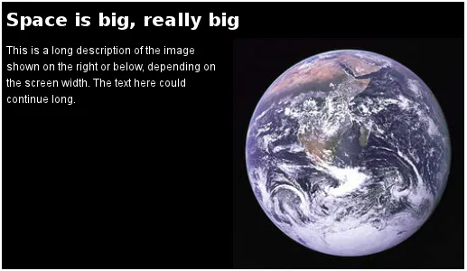
Label title = new Label("Space is big, really big");
title.addStyleName("title");
layout.addComponent(title);
Label description = new Label("This is a " +
"long description of the image shown " +
"on the right or below, depending on the " +
"screen width. The text here could continue long.");
description.addStyleName("itembox");
description.setSizeUndefined();
layout.addComponent(description);
Image image = new Image(null,
new ThemeResource("img/planets/Earth.jpg"));
image.addStyleName("itembox");
layout.addComponent(image);The SCSS could be as follows:
Source code
/* Various general settings */
.flexwrap {
    background: black;
    color: white;

    .title {
        font-weight: bold;
        font-size: 20px;
        line-height: 30px;
        padding: 5px;
    }

    .itembox {
        white-space: normal;
        vertical-align: top;
    }

    .itembox.v-label {padding: 5px}
}

.flexwrap[width-range~="0-499px"] {
    .itembox {width: 100%}
}

.flexwrap[width-range~="500px-"] {
    .itembox {width: 50%}
}
The layout in the wide mode is shown in Flexible Wrapping.
You could also play with the display: block vs display: inline-block properties.
Notice that, while the Responsive extension makes it possible to do various CSS trickery with component sizes, the normal rules for component and layout sizes apply, as described in "Layout Size" and elsewhere, and you should always check the size behaviour of the components. In the above example, we set the label to have undefined width, which disables word wrap, so we had to re-enable it.
Toggling the Display Property
The display property allows especially powerful ways to offer radically different UIs for different screen sizes by enabling and disabling UI elements as needed. For example, you could disable some parts of the UI when the space gets too small, but bring forth navigation buttons that, when clicked, add component styles to switch to the hidden parts.
In the following, we simply show alternative components based on screen width:
Source code
CssLayout layout = new CssLayout();
layout.setWidth("100%");
layout.addStyleName("toggledisplay");
content.addComponent(layout);

// Enable Responsive CSS selectors for the layout
Responsive.makeResponsive(layout);

Label enoughspace =
    new Label("This space is big, mindbogglingly big");
enoughspace.addStyleName("enoughspace");
layout.addComponent(enoughspace);

Label notenoughspace = new Label("Quite small space");
notenoughspace.addStyleName("notenoughspace");
layout.addComponent(notenoughspace);
The SCSS could be as follows:
Source code
/* Common settings */
.toggledisplay {
    .enoughspace, .notenoughspace {
        color: white;
        padding: 5px;
    }

    .notenoughspace { /* Really small */
        background: red;
        font-weight: normal;
        font-size: 10px;
        line-height: 15px;
    }

    .enoughspace { /* Really big */
        background: darkgreen;
        font-weight: bold;
        font-size: 20px;
        line-height: 30px;
    }
}

/* Quite little space */
.toggledisplay[width-range~="0-499px"] {
    .enoughspace    {display: none}
}

/* Plenty of space */
.toggledisplay[width-range~="500px-"] {
    .notenoughspace {display: none}
}
Responsive Demos
You can find a simple responsive demo at demo.vaadin.com/responsive. It demonstrates the flexible wrapping technique described in Flexible Wrapping.
The Parking demo for TouchKit uses a responsive theme to adapt to mobile devices with different screen sizes and when the screen orientation changes.