Layout Formatting
While the formatting of layouts is mainly done with style sheets, just as with other components, style sheets are not ideal or even possible to use in some situations. For example, CSS does not allow defining the spacing of table cells, which is done with the cellspacing attribute in HTML.
Moreover, as many layout sizes are calculated dynamically in the Client-Side Engine of Vaadin, some CSS settings can fail altogether.
Layout Size
The size of a layout component can be specified with the setWidth() and setHeight() methods defined in the Sizeable interface, just like for any component. It can also be undefined, in which case the layout shrinks to fit the component(s) inside it. "Sizing Components" gives details on the interface.
Many layout components take 100% width by default, while they have the height undefined.
The sizes of components inside a layout can also be defined as a percentage of the space available in the layout, for example with setWidth("100%"); or with the (most commonly used method) setFullSize() that sets 100% size in both directions. If you use a percentage in a HorizontalLayout, VerticalLayout, or GridLayout, you will also have to set the component as expanding, as noted below.
|
Warning
|
A layout that contains components with percentual size must have a defined size! If a layout has undefined size and a contained component has, say, 100% size, the component will try to fill the space given by the layout, while the layout will shrink to fit the space taken by the component, which is a paradox. This requirement holds for height and width separately. The debug mode allows detecting such invalid cases; see "Inspecting Component Hierarchy". |
For example:
Source code
Java
// This takes 100% width but has undefined height.
VerticalLayout layout = new VerticalLayout();

// A button that takes all the space available in the layout.
Button button = new Button("100%x100% button");
button.setSizeFull();
layout.addComponent(button);

// We must set the layout to a defined height vertically, in
// this case 100% of its parent layout, which also must
// not have undefined size.
layout.setHeight("100%");
If you have a layout with undefined height, such as VerticalLayout, in a UI, Window, or Panel, and put enough content in it so that it extends outside the bottom of the view area, scrollbars will appear. If you want your application to use all the browser view, nothing more or less, you should use setFullSize() for the root layout.
Source code
Java
// Create the UI content
VerticalLayout content = new VerticalLayout();

// Use entire view area
content.setSizeFull();

setContent(content);
Expanding Components
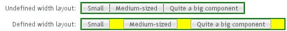
If you set a HorizontalLayout to a defined size horizontally or a VerticalLayout vertically, and there is space left over from the contained components, the extra space is distributed equally between the component cells. The components are aligned within these cells, according to their alignment setting, top left by default, as in the example below.
Often, you don’t want such empty space, but want one or more components to take all the leftover space. You need to set such a component to 100% size and use setExpandRatio(). If there is just one such expanding component in the layout, the ratio parameter is irrelevant.
If you set multiple components as expanding, the expand ratio dictates how large proportion of the available space (overall or excess depending on whether the components are sized as a percentage or not) each component takes. In the example below, the buttons have 1:2:3 ratio for the expansion.
GridLayout has corresponding method for both of its directions, setRowExpandRatio() and setColumnExpandRatio().
Expansion is covered in detail in the documentation of the layout components that support it. See "VerticalLayout and HorizontalLayout" and "GridLayout" for details on components with relative sizes.
Layout Cell Alignment
When a component in a layout cell has size (width or height) smaller than the size of the cell, it will by default be aligned in the top-left corner of the cell. You can set the alignment with the setComponentAlignment() method. The method takes as its parameters the component contained in the cell to be formatted, and the horizontal and vertical alignment. The component must have been added to the layout before setting the alignment.
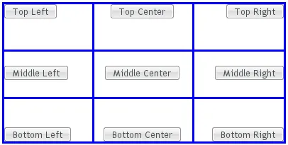
Cell Alignments illustrates the alignment of components within a GridLayout.
Note that a component with 100% relative size can not be aligned, as it will take the entire width or height of the cell, in which case alignment is meaningless. This should especially be noted with the Label component, which has 100% default width, and the text alignment within the component is separate, defined by the CSS text-align property.
The easiest way to set alignments is to use the constants defined in the Alignment class. Let us look how the buttons in the top row of the above GridLayout are aligned with constants:
Source code
Java
// Create a grid layout
GridLayout grid = new GridLayout(3, 3);

grid.setWidth(400, Sizeable.UNITS_PIXELS);
grid.setHeight(200, Sizeable.UNITS_PIXELS);

Button topleft = new Button("Top Left");
grid.addComponent(topleft, 0, 0);
grid.setComponentAlignment(topleft, Alignment.TOP_LEFT);

Button topcenter = new Button("Top Center");
grid.addComponent(topcenter, 1, 0);
grid.setComponentAlignment(topcenter, Alignment.TOP_CENTER);

Button topright = new Button("Top Right");
grid.addComponent(topright, 2, 0);
grid.setComponentAlignment(topright, Alignment.TOP_RIGHT);
...
The following table lists all the Alignment constants by their respective locations:
TOP_LEFT | TOP_CENTER | TOP_RIGHT |
MIDDLE_LEFT | MIDDLE_CENTER | MIDDLE_RIGHT |
BOTTOM_LEFT | BOTTOM_CENTER | BOTTOM_RIGHT |
Another way to specify the alignments is to create an Alignment object and specify the horizontal and vertical alignment with separate constants. You can specify either of the directions, in which case the other alignment direction is not modified, or both with a bitmask operation between the two directions.
Source code
Java
Button middleleft = new Button("Middle Left");
grid.addComponent(middleleft, 0, 1);
grid.setComponentAlignment(middleleft,
          new Alignment(Bits.ALIGNMENT_VERTICAL_CENTER |
                        Bits.ALIGNMENT_LEFT));

Button middlecenter = new Button("Middle Center");
grid.addComponent(middlecenter, 1, 1);
grid.setComponentAlignment(middlecenter,
          new Alignment(Bits.ALIGNMENT_VERTICAL_CENTER |
                        Bits.ALIGNMENT_HORIZONTAL_CENTER));

Button middleright = new Button("Middle Right");
grid.addComponent(middleright, 2, 1);
grid.setComponentAlignment(middleright,
          new Alignment(Bits.ALIGNMENT_VERTICAL_CENTER |
                        Bits.ALIGNMENT_RIGHT));
Obviously, you may combine only one vertical bitmask with one horizontal bitmask, though you may leave either one out. The following table lists the available alignment bitmask constants:
Horizontal | Bits.ALIGNMENT_LEFT |
Bits.ALIGNMENT_HORIZONTAL_CENTER | Bits.ALIGNMENT_RIGHT |
Vertical | Bits.ALIGNMENT_TOP |
Bits.ALIGNMENT_VERTICAL_CENTER | Bits.ALIGNMENT_BOTTOM |
You can determine the current alignment of a component with getComponentAlignment(), which returns an Alignment object. The class provides a number of getter methods for decoding the alignment, which you can also get as a bitmask value.
Size of Aligned Components
You can only align a component that is smaller than its containing cell in the direction of alignment. If a component has 100% width, as some components have by default, horizontal alignment does not have any effect. For example, VerticalLayout is 100% wide by default and can not therefore be horizontally aligned as such. The problem can sometimes be hard to notice, as the content inside a VerticalLayout is left-aligned by default.
You usually need to set either a fixed size, undefined size, or less than a 100% relative size for the component to be aligned - a size that is smaller than the containing layout has.
If you set the size as undefined and the component itself contains components, make sure that the contained components also have either undefined or fixed size.
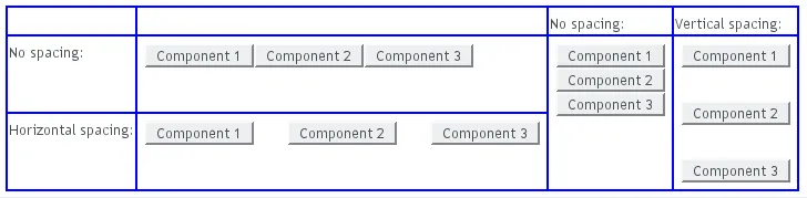
Layout Cell Spacing
The VerticalLayout, HorizontalLayout, and GridLayout layouts offer a setSpacing() method to enable or disable spacing between the cells of the layout.
For example:
Source code
Java
VerticalLayout layout = new VerticalLayout();
layout.setSpacing(false);
layout.addComponent(new Button("Component 1"));
layout.addComponent(new Button("Component 2"));
layout.addComponent(new Button("Component 3"));
The effect of spacing in VerticalLayout and HorizontalLayout is illustrated in Layout Spacings.
The exact amount of spacing is defined in CSS. If the default is not suitable, you can customize it in a custom theme.
In the Valo theme, you can specify the spacing with the $v-layout-spacing-vertical and $v-layout-spacing-horizontal parameters, as described in "Common Settings". The spacing defaults to the $v-unit-size measure.
When adjusting spacing in other themes, you should note that it is implemented in a bit different ways in different layouts. In the ordered layouts, it is done with spacer elements, while in the GridLayout it has special handling. Please see the sections on the individual components for more details.
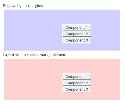
Layout Margins
Most layout components (with the exception of VerticalLayout) do not have any margin around them by default. The ordered layouts, as well as GridLayout, support enabling or disabling a margin with setMargin(). This enables CSS classes for each margin in the HTML element of the layout component.
In the Valo theme, the margin sizes default to $v-unit-size. You can customize them with $v-layout-margin-top, right, bottom, and left. See "Common Settings" for a description of the parameters.
To customize the default margins in other themes, you can define each margin with the padding property in CSS. You may want to have a custom CSS class for the layout component to enable specific customization of the margins, as is done in the following with the mymargins class:
Source code
.mymargins.v-margin-left   {padding-left:   10px;}
.mymargins.v-margin-right  {padding-right:  20px;}
.mymargins.v-margin-top    {padding-top:    40px;}
.mymargins.v-margin-bottom {padding-bottom: 80px;}
You can enable only specific margins by passing a MarginInfo to the setMargin(). The margins are specified in clockwise order for top, right, bottom, and left margin. The following would enable the left and right margins:
Source code
Java
layout.setMargin(new MarginInfo(false, true, false, true));The resulting margins are shown in Layout Margins below. The two ways produce identical margins.