Label
Label component displays non-editable text. This text can be used for short simple labels or for displaying long text, such as paragraphs. The text can be formatted in HTML or as preformatted text, depending on the content mode of the label.
You can give the label text most conveniently in the constructor, as is done in the following. Label has undefined default width, so it will only take the space it needs.
Source code
Java
// A container that is 100% wide by default
VerticalLayout layout = new VerticalLayout();

// label will only take the space it needs
Label label = new Label("Labeling can be dangerous");
layout.addComponent(label);
You can get and set the text of a Label with the getValue() and setValue() methods.
Source code
Java
// Get the label's text to initialize a field
TextField editor = new TextField(null, // No caption
                                 label.getValue());

// Change the label's text
editor.addValueChangeListener(event -> label.setValue(event.getValue()));
Even though Label is text and is often used as a caption, it is a normal component and therefore also has a caption that you can set with setCaption(). As with most other components, the caption is managed by the containing layout.
Text Width and Wrapping
Label has undefined default width, so it will only take the space it needs. If the width of the label’s text exceeds the available width for the label in the layout, the text overflows, and normally, gets truncated.
Source code
Java
// A container with a defined width.
Panel panel = new Panel("Panel Containing a Label");
panel.setWidth("300px");

panel.setContent(
    new Label("This is a Label inside a Panel. There is " +
              "enough text in the label to make the text " +
              "get truncated when it exceeds the width of the panel."));
As the size of the Panel in the above example is fixed and the width of Label is the default undefined, the Label will overflow the layout horizontally and be truncated.
Setting Label to defined width will cause it to not overflow the layout, but to wrap to the next line.
Content Mode
The content of a label is formatted depending on a content mode. By default, the text is assumed to be plain text and any contained HTML-specific characters will be quoted appropriately to allow rendering the contents of a label in HTML in a web browser. The content mode can be set in the constructor or with setContentMode(), and can have the values defined in the ContentMode enumeration type in com.vaadin.shared.ui package:
- TEXT
-
The default content mode where the label contains only plain text. All characters are allowed, including the special <, >, and & characters in HTML, which are quoted properly in HTML while rendering the component. This is the default mode.
- PREFORMATTED
-
Content mode where the label contains preformatted text. It will be, by default, rendered with a fixed-width typewriter font. Preformatted text can contain line breaks, written in Java with the \n escape sequence for a newline character (ASCII 0x0a), or tabulator characters written with \t (ASCII 0x09).
- HTML
-
Content mode where the label contains HTML.
Please note the following security and validity warnings regarding the HTML content mode.
|
Warning
|
Cross-Site Scripting Warning
Having Label in HTML content mode allows pure HTML content. If the content comes from user input, you should always carefully sanitize it to prevent cross-site scripting (XSS) attacks. Please see "Sanitizing User Input to Prevent Cross-Site Scripting". Also, the validity of the HTML content is not checked when rendering the component and any errors can result in an error in the browser. If the content comes from an uncertain source, you should always validate it before displaying it in the component. |
The following example demonstrates the use of Label in different modes.
Source code
Java
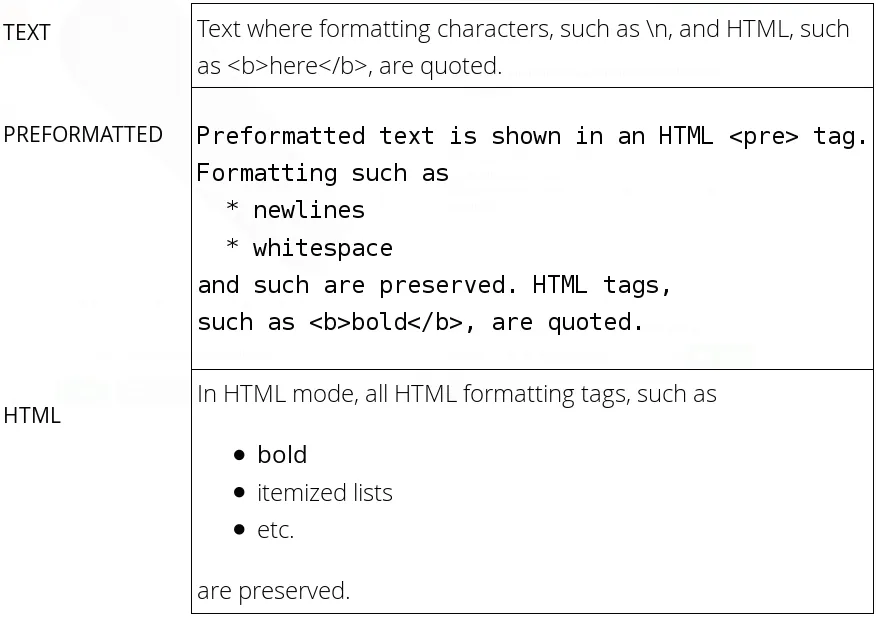
Label textLabel = new Label(
    "Text where formatting characters, such as \\n, " +
    "and HTML, such as <b>here</b>, are quoted.",
    ContentMode.TEXT);

Label preLabel = new Label(
    "Preformatted text is shown in an HTML <pre> tag.\n" +
    "Formatting such as\n" +
    "  * newlines\n" +
    "  * whitespace\n" +
    "and such are preserved. HTML tags, \n"+
    "such as <b>bold</b>, are quoted.",
    ContentMode.PREFORMATTED);

Label htmlLabel = new Label(
    "In HTML mode, all HTML formatting tags, such as \n" +
    "<ul>"+
    "  <li><b>bold</b></li>"+
    "  <li>itemized lists</li>"+
    "  <li>etc.</li>"+
    "</ul> "+
    "are preserved.",
    ContentMode.HTML);
The rendering will look as shown in Label Content Modes.
Spacing with a Label
You can use a Label to create vertical or horizontal space in a layout. If you need a empty "line" in a vertical layout, having just a label with empty text is not enough, as it will collapse to zero height. The same goes for a label with only whitespace as the label text. You need to use a non-breaking space character, either or  :
Source code
Java
layout.addComponent(new Label(" ", ContentMode.HTML));Using the ContentMode.PREFORMATTED mode has the same effect; preformatted spaces do not collapse in a vertical layout. In a HorizontalLayout, the width of a space character may be unpredictable if the label font is proportional, so you can use the preformatted mode to add em-width wide spaces.
If you want a gap that has adjustable width or height, you can use an empty label if you specify a height or width for it. For example, to create vertical space in a VerticalLayout:
Source code
Java
Label gap = new Label();
gap.setHeight("1em");
verticalLayout.addComponent(gap);
You can make a flexible expanding spacer by having a relatively sized empty label with 100% height or width and setting the label as expanding in the layout.
Source code
Java
// A wide component bar
HorizontalLayout horizontal = new HorizontalLayout();
horizontal.setWidth("100%");

// Have a component before the gap (a collapsing cell)
Button button1 = new Button("I'm on the left");
horizontal.addComponent(button1);

// An expanding gap spacer
Label expandingGap = new Label();
expandingGap.setWidth("100%");
horizontal.addComponent(expandingGap);
horizontal.setExpandRatio(expandingGap, 1.0f);

// A component after the gap (a collapsing cell)
Button button2 = new Button("I'm on the right");
horizontal.addComponent(button2);