Data Entry
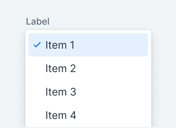
Combo Box
Combo Box allows the user to choose a value from a filterable list of options presented in an overlay.
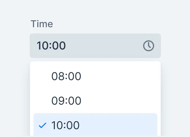
Date Picker
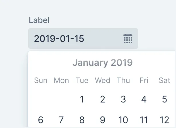
Date Picker is an input field that allows the user to enter a date by typing or by selecting from a calendar overlay.


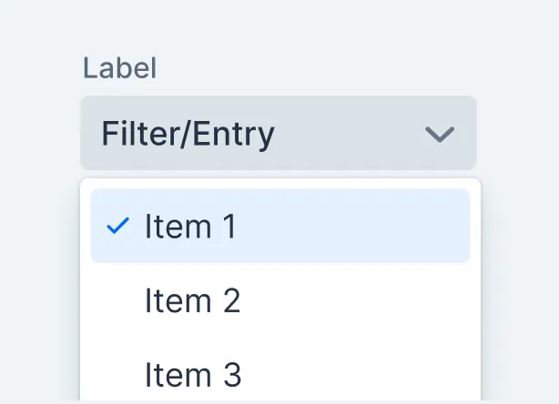
Multi-Select Combo Box
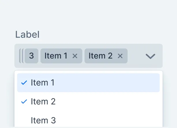
Multi-Select Combo Box allows the user to choose one or more values from a filterable list of options presented in an overlay.
Slider

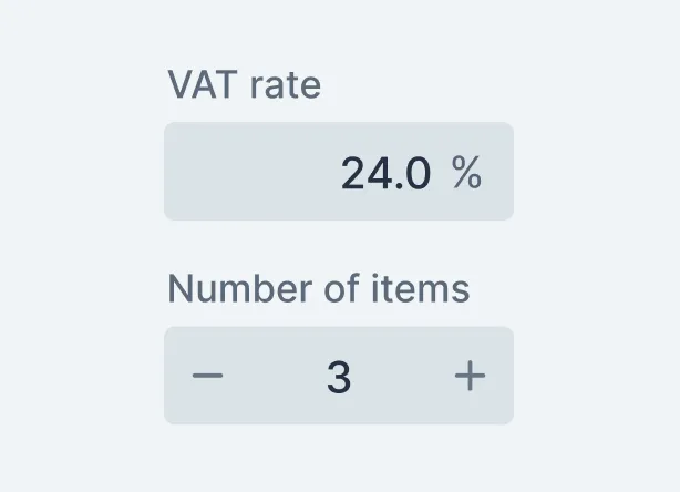
Slider is an input field that lets users pick a numeric value within a range by dragging a thumb along a track. Use arrow keys for precise adjustments.


Visualization and Interaction
Avatar
Avatar is a graphical representation of an object or entity, for example, a person or an organization.
Button
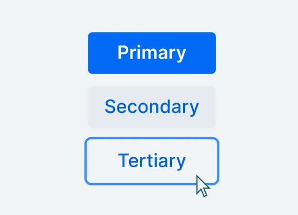
The Button component allows users to perform actions. It comes in several different style variants and supports icons as well as text labels.
Charts
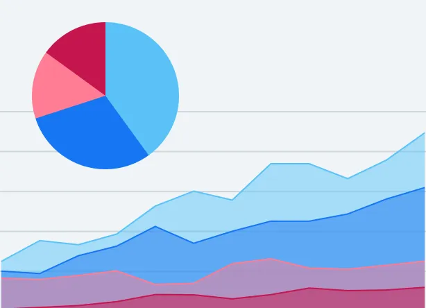
Charts is a feature-rich interactive charting library with a vast number of different chart types from basic plotting to complex financial charting.
Card

The Card component is a versatile container for grouping related content and actions, with several customization options for layout and appearance.
Context Menu
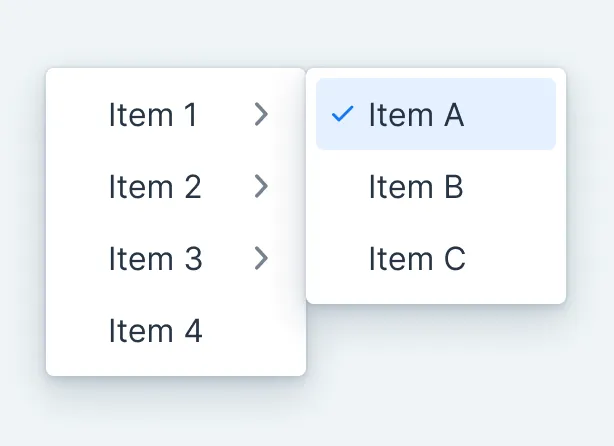
Context Menu is a component that you can attach to any component to display a context menu.
CRUD
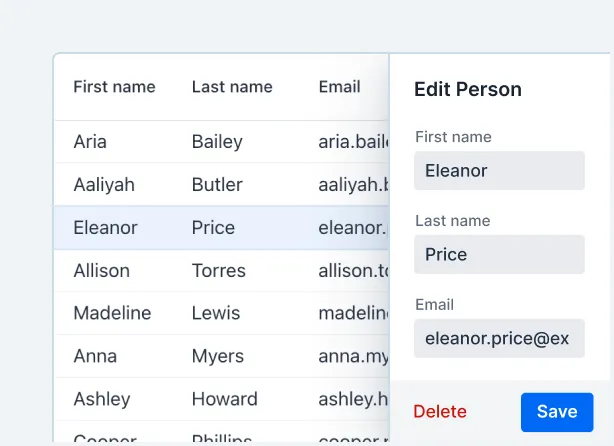
CRUD is a component for managing a dataset. It allows for easy displaying, editing, creating, and deleting of items.
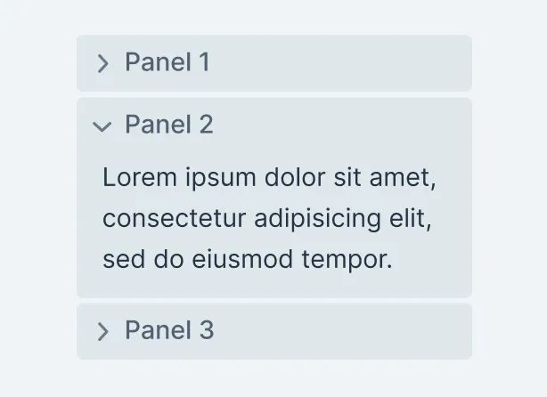
Details
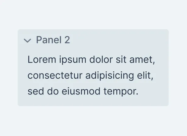
Details is an expandable panel for showing and hiding content from the user, to make the UI less cluttered.
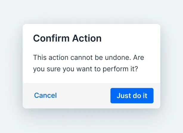
Dialog
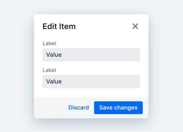
Dialog is a small window that can be used to present information and user interface elements in an overlay.
Grid
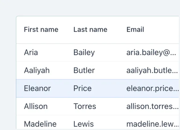
Vaadin Grid is a component for displaying tabular data, including various enhancements to grid renderings.
Grid Pro
Grid Pro is an extension of the Grid component that provides inline editing with full keyboard navigation.


Notification

Notification is used to provide feedback to the user about activities, processes, and events in the application.


Side Navigation
Side Navigation provides a vertical list of navigation links with support for collapsible, nested sections.
Spreadsheet
Vaadin Spreadsheet allows displaying and interacting with the contents of an Excel file.


Tree Grid
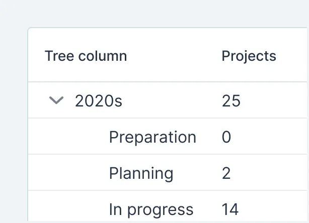
Tree Grid is a component for displaying hierarchical tabular data grouped into expandable nodes.

Layouts
App Layout
App Layout is a component for the root layout of a Vaadin application. It provides predefined areas for the navigation drawer, the header, and the view’s content.
Dashboard

A component for building static dashboard layouts and dynamic, user-configurable dashboards.
Form Layout

Form Layout allows you to build responsive forms with multiple columns, and to position input labels above or to the side of the input.
Login
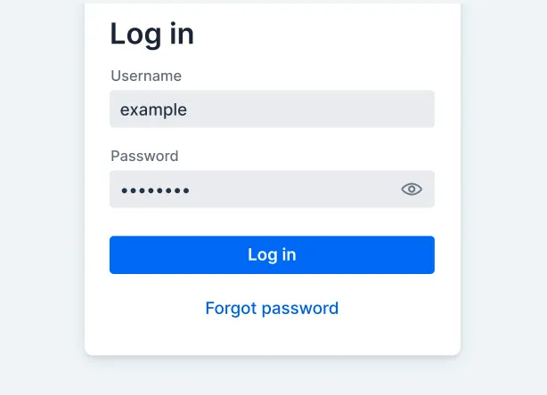
Login is a component that contains a log-in form. You can use it to authenticate the user with a username and password.
Master-Detail Layout

Master-Detail Layout is component for building UIs with a horizontally or vertically split pair consisting of a master area and a detail area that can responsively switch to an overlay.


Didn’t Find What You Need?
Browse Vaadin Directory
Vaadin Directory is a place where you can find add-ons built by the community for your applications, such as components and themes, and share your work with other community members.
Create Components in Java
You can create new components by combining and extending existing ones, or by constructing them using the Element Java API in Flow.