Visual Theme Editor
Visual Theme Editor is a tool for editing the theme of Vaadin applications in development mode. You can use it to change the web component color, font size, and more in views without editing code.
Any changes you make are reflected in real-time, both in the live preview and in your code.
|
Note
|
Free Preview
Theme Editor is not a final product, but is currently available as a free preview.
|

Features
Theme Editor has many features. The following are supported in the preview:
- Click to Select Components
-
Click a component you want to style. Both Vaadin and common HTML components are supported.
- Edit a Component
-
Style individual components with the visual editor and automatically update your code to reflect changes. For example, pick a Button in your view and make it appear green, instead of the default blue.
- Edit Multiple Components
-
Create universal style rules by editing all components of the same type. For example, make every Button appear green.
- Locate Code Changes
-
With a click, open the code in your IDE where your changes have been applied.
Getting Started
Start with Theme Editor by running your Vaadin application project in Development Mode. Click on the Vaadin symbol }> at the bottom right-hand corner of your browser window to open Development Tools.
Theme Editor is available behind a Feature Flag. You can enable it in the Feature Flags tab and use it after restarting your server.
Theme Editor is only compatible, though, with Lumo-based themes. Lumo is the default theme for Vaadin applications.
Selecting Components
Start selecting components by clicking the + button in Theme Editor. You can then highlight components in the application view by hovering the mouse cursor over them. You pick a component for editing by clicking on it with your primary mouse button. You can navigate between components in the different layers of your layout with the arrow keys on your keyboard.


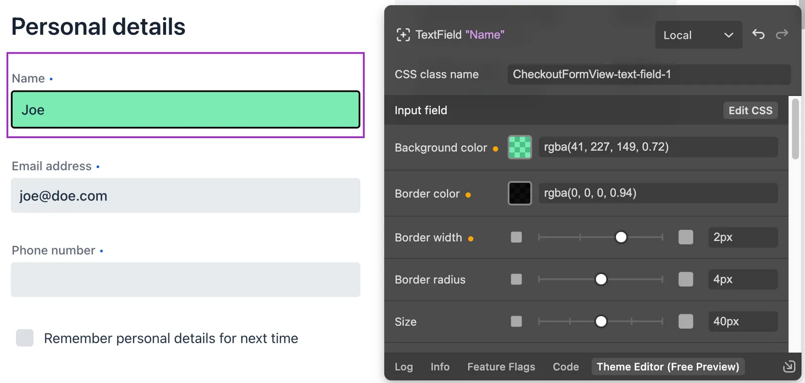
Understanding the User Interface


-
The button for selecting components and the name of the selected component — and its friendly display name.
-
Switch between Local and Global editing.
-
Undo and Redo changes.
-
The CSS class name for styling the component instance in Local editing mode.
-
The name of the component properties section.
-
The button for jumping to the CSS rule definition.
-
List of component properties with editable values. Modified values are marked with an orange indicator.
Local & Global Editing Modes


You can choose the scope for changes, either Local for only the selected component, or Global for all components of a given type.
Local
In Local mode, Theme Editor uses a unique class name to distinguish the selected component. Theme Editor suggests a new name if none is given.


When you’re applying the class name in Java code, Theme Editor adds an addClassName call with a <theme-editor-local-classname> comment above it:
//<theme-editor-local-classname>
textField.addClassName("my-text-field");|
Caution
| Don’t delete the comment. If you do, Theme Editor loses track of the class name it applied. |
Styling Component Elements
Theme Editor displays a list of stylable parts, after you’ve selected a component, with properties that can be modified. For example, the screenshot here shows the properties of the Label part of the Text Field component.


Code Generation
Theme Editor saves CSS rules in a theme-editor.css file within your application theme directory.
|
Note
|
Changing Values Manually
You can manually change values in the theme-editor.css file. Theme Editor processes the changes and formats the application accordingly.
|
Limitations
The preview comes with some limitations of which you should be aware:
-
You have to use the Lumo theme.
-
You can’t change global Lumo theme variables.
-
Styling component states — like hover, required, and invalid — are not supported.
-
Adding or styling theme variants (e.g., primary buttons) is not supported.
-
Not all Vaadin components are supported.
-
While working with Theme Editor, automatic application restarts during hot deployment (i.e., JRebel, Spring DevTools, HotSwap Agent) are disabled.
Please use the Flow repository for reporting bugs, asking questions, and proposing enhancement ideas.
AC548300-ED41-4A1B-AD9D-80FD719CEA70