Styling Components
- Prerequisites
- Example
- Custom Properties
- Stylable Parts
- Supported CSS Selectors
- States
- Sub-components
- Overlays
- Scoping Component Styles
Write component-specific style sheets in order to customize their internal styling.
There are different ways to affect the styles of a component. The easiest is to use the CSS custom properties available for each component. If you need more control, such as styling different states of a component, you need to write component-specific style sheets and import them to the local style scope of each component.
Prerequisites
You should be familiar with Style Scopes, CSS Custom Properties, and Importing Style Sheets before you can style Vaadin components effectively.
Vaadin components use the ThemableMixin utility, which allows developers to add custom style sheets to the component’s local scope.
Your custom components can also utilize the same mixin. This documentation applies only to such components.
Example
As an example, we customize the styles of the text field component.
Source code
Styles included into the local scope of <vaadin-text-field>
Styles included into the local scope of <vaadin-text-field>:host {
padding: 0;
}
[part="input-field"] {
box-shadow: inset 0 0 0 1px var(--lumo-contrast-30pct);
background-color: var(--lumo-base-color);
}
[part="input-field"]:hover {
box-shadow: inset 0 0 0 1px var(--lumo-contrast-50pct);
}
:host([invalid]) [part="input-field"] {
box-shadow: inset 0 0 0 1px var(--lumo-error-color);
}
:host([focused]) [part="input-field"] {
box-shadow: 0 0 0 2px var(--lumo-primary-color-50pct);
}You might need to use more specific selectors to override the current theme’s styles. Use the browser inspector to identify the applied styles for the element that you wish to customize.
See Importing Style Sheets for instructions how to import the above styles into the local style scope of the text field component.
Custom Properties
Currently, the only global CSS that can affect styles inside a shadow DOM’s local scope are properties that are inherited.
Properties can be inherited by default, such as font-family, color and all custom properties, or explicitly by the custom element using the inherit property value.
You can adjust any component-specific custom properties in the global scope, making them affect all instances of the component.
Source code
Styles included into the global scope
Styles included into the global scopehtml {
--vaadin-text-field-default-width: 10em;
}You can find component-specific custom properties from the component’s HTML API documentation. For example, see the Styling section for Text Field.
Stylable Parts
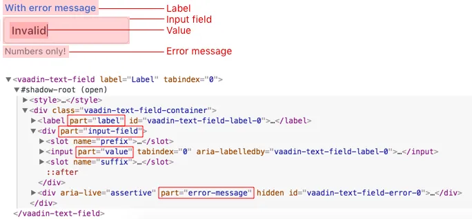
Vaadin components define certain elements inside their shadow DOM as their stylable parts.
They form the public theming and styling API of the component, together with custom properties and state attributes.
These stylable elements are marked with the part attribute.
The internal parts of each component are listed in the component’s HTML API documentation. See the Styling section in Text Field API docs for an example.

Supported CSS Selectors
When writing style sheets for a component’s local style scope (inside shadow DOM), a subset of CSS selectors is considered as part of a component’s public styling API.
Other selectors (including the .class and #id selectors) may stop working with any release because they are considered as internal implementation details.
In general, the [part] attribute selector is the only one you should use to target elements inside a component.
Do not rely on the element type which a part applies to.
For example, given <input type="text" part="value">, you should not rely on the information that the element is actually a native <input> element, for example by using a selector like input[part="value"].
This is considered as an internal implementation detail.
The element type could change in the future while the part name stays the same, for example, to <div contenteditable="true" part="value">.
- :host
-
The
:hostselector allows you to select the host of the shadow DOM from within the local style scope. For example, the<vaadin-text-field>element from within its local scope.Source code
CSS
:host {
  /* For example, styles for <vaadin-text-field> element */
}
The
:hostselector also accepts a simple selector as an argument for it, scoping the selector to match the host only if the added selector matches it as well. It is useful, for example, for matching specific States and Theme Variants of a component (using an attribute selector).Source code
CSS
:host([state]) { /* For example, styles for <vaadin-text-field> element in a particular state (focused, invalid, etc) */ } :host([theme~="small"]) { /* Styles for the small variant */ } :host([has-value][theme~="borderless"]:hover) { /* Styles for when the component state is "has-value", the "borderless" variant is used, and when the user is hover over the component. */ } - [part]
-
The stylable elements (marked with a
partattribute) should only be targeted using the[part="…"]attribute selector.Source code
Styles included into the local scope of <vaadin-text-field>[part="input-field"] { /* Styles for <vaadin-text-field>'s input-field part */ }Use
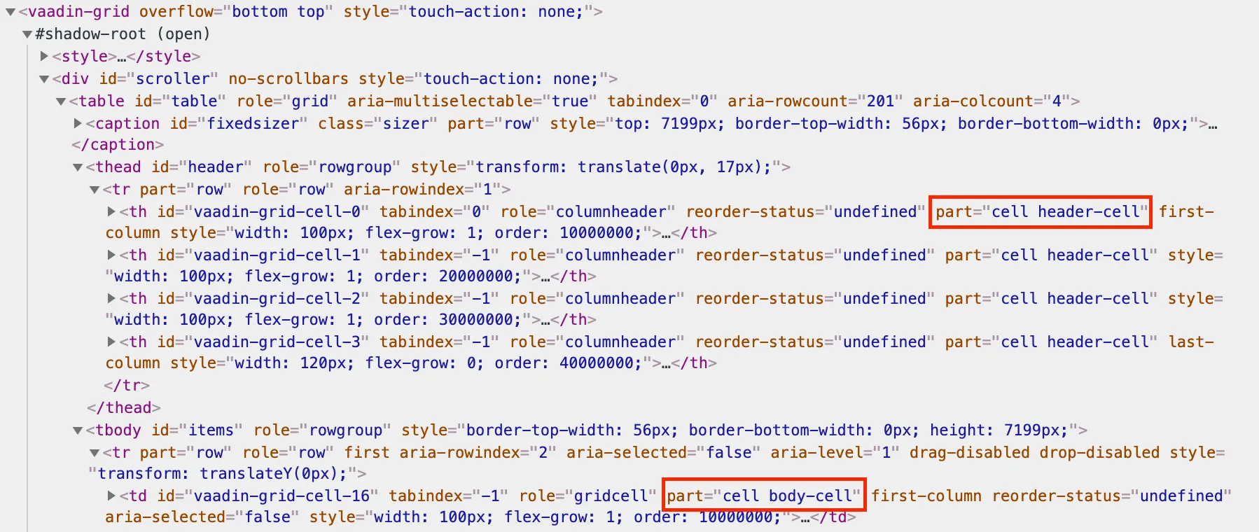
part~="…"to match a part which might have multiple names. For example, the cells inside a<vaadin-grid>have multiple part names like"cell"and"body-cell". The effective DOM of the <vaadin-grid> element
Source code
Styles included into the local scope of <vaadin-grid>[part~="cell"] { /* Styles that affect all grid cells, including header, body and footer cells */ } [part~="body-cell"] { /* Styles that only affect all body cells */ }You can use this kind of attribute selector in all cases, if you want to be safe. It will work for parts with only one name as well.
Read more about attribute selectors on MDN.
- ::before and ::after
-
The
::beforeand::afterpseudo-element selectors can be used in combination with the:hostand[part]selectors. The built-in themes can also use the pseudo-elements, so be aware of potential collisions.Source code
Styles included into the local scope of <vaadin-text-field>:host::before { ... } [part="input-field"]::after { content: ""; ... } - ::slotted()
-
The
::slotted()pseudo-element selector represents any element that has been placed into a slot inside an HTML template. It always expects a simple selector as an argument.Source code
Styles included into the local scope of <vaadin-app-layout>[part="drawer"] ::slotted(*) { /* Styles for any element which is in the light DOM of <vaadin-app-layout> and has the slot="drawer" attribute */ }Read more about the ::slotted() selector on MDN.
Example
Let’s look at a concrete example how these selectors work. We’ll use the Tabs, Tab, and Icon components to build the following composition:

The DOM hierarchy of the above component structure is the following:
Source code
HTML
<vaadin-tabs>
  <vaadin-tab>
    <iron-icon icon="lumo:user"></iron-icon>
    <span>Tab one</span>
  </vaadin-tab>
  <vaadin-tab>
    <iron-icon icon="lumo:cog"></iron-icon>
    <span>Tab two</span>
  </vaadin-tab>
  <vaadin-tab>
    <iron-icon icon="lumo:bell"></iron-icon>
    <span>Tab three</span>
  </vaadin-tab>
</vaadin-tabs>
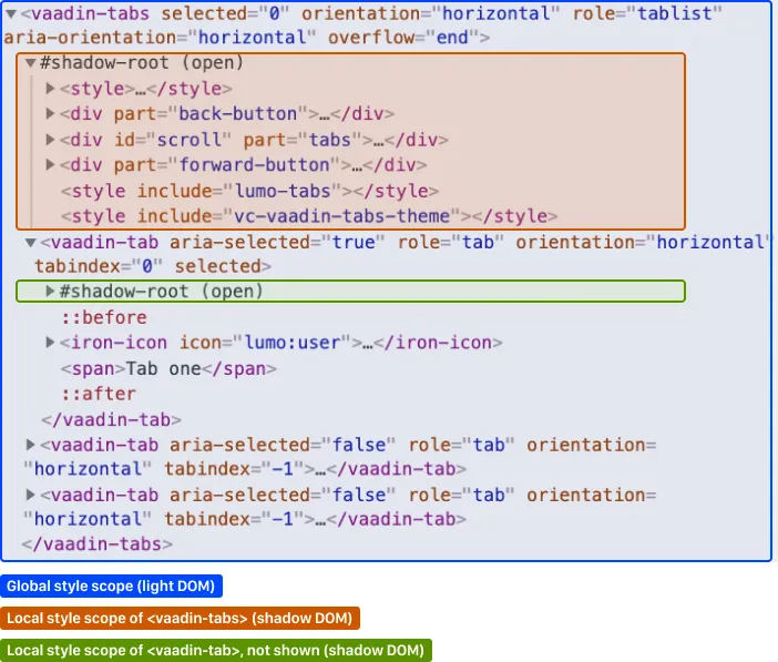
The resulting effective DOM, when the components are rendered, including shadow DOM, is the following:

Elements in the global style scope are outlined in blue.
The local style scope of the <vaadin-tabs> element is outlined in orange, and the local style scope of the first <vaadin-tab> element (not expanded) is outlined in green.
To select the <vaadin-tabs> element we could, for example, use the following selectors in the global style scope:
Source code
CSS
/* All tabs containers */
vaadin-tabs {
  ...
}

/* Only the horizontal tabs containers */
vaadin-tabs[orientation="horizontal"] {
  ...
}
To select the same element from its local style scope we could use the following selectors:
Source code
CSS
/* All tabs containers */
:host {
  ...
}

/* Only the horizontal tabs containers */
:host([orientation="horizontal"]) {

}
To select all or some of the <vaadin-tab> elements we could use the following selectors in the global style scope:
Source code
Styles included into the global scope
Styles included into the global scope/* All tabs */
vaadin-tab {
...
}
/* Only the selected tab */
vaadin-tabs[selected] {
...
}To select the same elements from the local style scope of the <vaadin-tabs> element, we could use the following selectors:
Source code
Styles included into the local scope of <vaadin-tabs>
Styles included into the local scope of <vaadin-tabs>/* All tabs */
[part="tabs"] ::slotted(vaadin-tab) {
...
}
/* Only the selected tab */
[part="tabs"] ::slotted(vaadin-tab[selected]) {
...
}We could also select the same <vaadin-tab> elements their local style scope using the following selectors:
Source code
Styles included into the local scope of <vaadin-tab>
Styles included into the local scope of <vaadin-tab>/* All tabs */
:host {
...
}
/* Only the selected tab */
:host([selected]) {
...
}To select the <iron-icon> elements we could, for example, use the following selectors in the global style scope:
Source code
Styles included into the global scope
Styles included into the global scopevaadin-tabs iron-icon {
...
}
vaadin-tab > iron-icon {
...
}We could also select the same icon elements from the local style scope of <vaadin-tab>:
Source code
Styles included into the local scope of <vaadin-tab>
Styles included into the local scope of <vaadin-tab>::slotted(iron-icon) {
...
}But we can’t select the same icon elements from the local style scope of <vaadin-tabs> because the ::slotted() selector only allows us to select the direct children of the host element. The following selectors won’t work:
Source code
Styles included into the local scope of <vaadin-tabs>
Styles included into the local scope of <vaadin-tabs>/* Doesn't select anything */
[part="tabs"] ::slotted(vaadin-tab iron-icon) {
...
}
/* Doesn't select anything */
[part="tabs"] ::slotted(vaadin-tab) iron-icon {
...
}If the DOM hierarchy would contain more deeply nested elements, for example another element inside the <iron-icon> or <span> elements, those could only be selected from the global style scope.
States
Some components expose their internal state as top-level attributes for styling purposes.
For example, we can style the text field component when it is invalid, using the [invalid] state attribute selector.
Source code
Styles included into the local scope of <vaadin-text-field>
Styles included into the local scope of <vaadin-text-field>:host([invalid]) [part="input-field"] {
box-shadow: inset 0 0 0 1px var(--lumo-error-color);
}The state attributes for each component are listed in the component’s HTML API documentation. See the Styling section in Text Field API docs for an example.
In addition to the [state] attributes, standard CSS pseudo-classes (:hover, :active, etc.) can be used for both the component host and stylable parts.
Source code
Styles included into the local scope of <vaadin-text-field>
Styles included into the local scope of <vaadin-text-field>[part="input-field"]:hover {
box-shadow: inset 0 0 0 1px var(--lumo-contrast-50pct);
}Like the host element, named internal parts can also expose state attributes for themselves, which can be used for styling. These are also listed in the element’s API documentation.
For example, you can target a selected date in a <vaadin-date-picker>:
Source code
Styles included into the local scope of <vaadin-month-calendar>
Styles included into the local scope of <vaadin-month-calendar>[part~="date"][selected] {
/* Styles for a selected date */
}Sub-components
Components can contain other components inside their shadow DOM. This creates a hierarchy of style scopes.
The customizations we did for the text field component end up affecting other components as well, which internally use text field. For example, Combo Box, Date Picker, Time Picker and Select all contain a text field, and those components will automatically "inherit" our style customizations.
In some cases it is undesirable to style all component instances and affect sub-components across multiple parent components. Sometimes you only want to target the text field inside a single Combo Box.
Theme variants (the theme attribute values) are propagated from the parent component to all of its sub-components.
They allow you to scope sub-component styles per-instance.
Theme variant propagation is not limited to the built-in variants (theme attribute values). Your custom theme variants will propagate in the same way.
Hierarchy of Vaadin components and sub-components (Click to expand)
The following components allow you to style their stylable parts in their local style scope.
Technically they extend ThemableMixin.
Nested items are sub-components, meaning the theme attribute is propagated to them from their parent component.
The overlay components are rendered directly under the <body> element and are not nested inside their parent component in the resulting DOM.
Styles are inherited when components are extended.
Accordion
-
<vaadin-accordion>-
<vaadin-accordion-panel>(extends<vaadin-details>)
-
App Layout
-
<vaadin-app-layout> -
<vaadin-drawer-toggle>(extends<vaadin-button>)
Button
-
<vaadin-button>
Checkbox
-
<vaadin-checkbox> -
<vaadin-checkbox-group>
Combo Box
-
<vaadin-combo-box>(and<vaadin-combo-box-light>)-
<vaadin-text-field>(not in<vaadin-combo-box-light>) -
<vaadin-combo-box-overlay>(extends<vaadin-overlay>)-
<vaadin-combo-box-item>(extends<vaadin-item>)
-
-
Confirm Dialog
-
<vaadin-confirm-dialog>-
<vaadin-dialog>
-
Context Menu
-
<vaadin-context-menu>-
<vaadin-context-menu-overlay>(extends<vaadin-overlay>)-
<vaadin-context-menu-list-box>(extends<vaadin-list-box>)-
<vaadin-context-menu-item>(extends<vaadin-item>)
-
-
-
CRUD
-
<vaadin-crud>-
<vaadin-crud-grid>(extends<vaadin-grid>) -
<vaadin-dialog-layout>-
<vaadin-dialog>
-
-
Custom Field
-
<vaadin-custom-field>
Date Picker
-
<vaadin-date-picker>(and<vaadin-date-picker-light>)-
<vaadin-text-field>(not in<vaadin-date-picker-light>) -
<vaadin-date-picker-overlay>(extends<vaadin-overlay>)-
<vaadin-date-picker-overlay-content>-
<vaadin-month-calendar>
-
-
-
Date-Time Picker
-
<vaadin-date-time-picker>-
<vaadin-custom-field>-
<vaadin-date-picker> -
<vaadin-time-picker>
-
-
Details
-
<vaadin-details>
Dialog
-
<vaadin-dialog>-
<vaadin-dialog-overlay>(extends<vaadin-overlay>)
-
Form Layout
-
<vaadin-form-layout> -
<vaadin-form-item>
Grid
-
<vaadin-grid> -
<vaadin-grid-sorter> -
<vaadin-grid-tree-toggle>
Grid Pro
-
<vaadin-grid-pro> -
<vaadin-grid-pro-edit-checkbox>(extends<vaadin-checkbox>) -
<vaadin-grid-pro-edit-select>(extends<vaadin-select>) -
<vaadin-grid-pro-edit-text-field>(extends<vaadin-text-field>)
Item
-
<vaadin-item>
List Box
-
<vaadin-list-box>
Login
-
<vaadin-login-overlay>-
<vaadin-login-overlay-wrapper>(extends<vaadin-overlay>)
-
-
<vaadin-login-form>-
<vaadin-login-form-wrapper>
-
Menu Bar
-
<vaadin-menu-bar>-
<vaadin-menu-bar-button> -
<vaadin-menu-bar-submenu>(extends<vaadin-context-menu>)
-
Notification
-
<vaadin-notification>-
<vaadin-notification-card>
-
Ordered Layout
-
<vaadin-horizontal-layout> -
<vaadin-vertical-layout>
Progress Bar
-
<vaadin-progress-bar>
Radio Button
-
<vaadin-radio-button> -
<vaadin-radio-group>
Rich Text Editor
-
<vaadin-rich-text-editor>
Select
-
<vaadin-select>-
<vaadin-select-text-field>(extends<vaadin-text-field>) -
<vaadin-select-overlay>(extends<vaadin-overlay>)
-
Split Layout
-
<vaadin-split-layout>
Tabs
-
<vaadin-tabs>-
<vaadin-tab>
-
Text Field
-
<vaadin-email-field>(extends<vaadin-text-field>) -
<vaadin-integer-field>(extends<vaadin-text-field>) -
<vaadin-number-field>(extends<vaadin-text-field>) -
<vaadin-password-field>(extends<vaadin-text-field>) -
<vaadin-text-area> -
<vaadin-text-field>
Time Picker
-
<vaadin-time-picker>-
<vaadin-time-picker-text-field> -
<vaadin-combo-box-overlay>(extends<vaadin-overlay>)
-
Upload
-
<vaadin-upload> -
<vaadin-upload-file>
Source code
HTML
<vaadin-combo-box theme="small"></vaadin-combo-box>
Overlays
Components such as Dialog, Notification, Combo Box, Date Picker, Time Picker, Select, Menu Bar and Context Menu internally use the Overlay component (<vaadin-overlay>).
The Overlay component allows the main components to render content on top of all other components in the application. It avoids any potential clipping stacking context issues where the overlay would be partially or completely hidden depending on where it is placed in the component hierarchy. One example of a such situation are Grid cells, which create a clipping stacking context.
All components that have an overlay sub-component have their own extension of the base Overlay component, for example “Dialog Overlay” (<vaadin-dialog-overlay>) and “Date Picker Overlay” (<vaadin-date-picker-overlay>). As an overlay is considered as a sub-component of the main component, sub-component variants apply to them as well.
See Sub-components for the component hierarchy reference.
In some cases the parent component can be completely hidden, as in the dialog component for example, whereas sometimes both the parent component and its overlay component can contain content, as for example in the date picker component.
Stylable Parts of Overlay
The <vaadin-overlay> component, including and all components extending it, contains the following stylable parts:
overlay-
The visual container of the overlay. It is typically also a scrolling container so you should avoid setting padding to it.
content-
The content area inside the
overlay. You can apply padding to this part. backdrop-
The optional modality curtain that covers the whole viewport and is visually behind the
overlaypart.
Scoping Component Styles
A style sheet imported into a component’s local scope (see Importing Style Sheets and Style Scopes) affects all the instances of the component. But what if you only want to target a single instance of a component with custom styles?
There are two ways to scope styles to specific component instances:
-
Expose new custom properties This is the recommended first option for simple situations. If you end up exposing more than a handful of properties, you should consider the second option.
-
Use scoping selectors This approach is used by the built-in variations in Vaadin themes (Lumo and Material), which are scoped using the
themeattribute. The downside of this approach is that you end up adding the selectors and properties to all instances, even though only some instances will need those styles (they won’t apply unless the scoping selector is used on the host element).
Source code
Styles included into the local scope of <vaadin-text-field>
Styles included into the local scope of <vaadin-text-field>[part="input-field"] {
background-color: var(--input-field-background-color, #fff);
}Source code
Another style sheet in your app
Another style sheet in your app/* Use the new custom property */
.some-part-of-my-app vaadin-text-field {
--input-field-background-color: #eee;
}Source code
Styles included into the local scope of <vaadin-text-field>
Styles included into the local scope of <vaadin-text-field>:host(.special-field) [part="input-field"] {
background-color: #000;
color: #fff;
border: 2px solid #fff;
border-radius: 9px;
}Source code
HTML
<!-- Use the new scoping selector anywhere in your application -->
<vaadin-text-field class="special-field"></vaadin-text-field>
You can also use the theme attribute (see custom component variants) as a scoping selector for your style overrides, as shown in the example below.
The theme attribute has the benefit of propagating through the sub-components (other attributes do not propagate).
Source code
Styles included into the local scope of <vaadin-text-field>
Styles included into the local scope of <vaadin-text-field>:host([theme~="special-field"]) [part="input-field"] {
background-color: #000;
color: #fff;
border: 2px solid #fff;
border-radius: 9px;
}Source code
HTML
<!-- Apply the theme attribute to any text-field in your application -->
<vaadin-text-field theme="special-field"></vaadin-text-field>
12B5A21A-9B84-476A-98F2-EA8F31C670F4