Overview
Vaadin uses themes to separate the user interface’s appearance from its logic. Themes make applications look and feel consistent to end users. They offer a shared visual language which you can apply to your application-specific styling.
Prerequisites
To style components and theme your application you should be comfortable writing CSS and willing to learn a few lines of Java or JavaScript.
Themes and application-specific styles are implemented using Cascading Style Sheets (CSS).
Style sheets are authored as .css files.
If you are including style sheets in client-side code they can also be authored as .js files (JavaScript modules).
The CSS tutorials on MDN are a great way to learn the basics of CSS. It is also important to understand Style Scopes and CSS Custom Properties and Variables are especially important topics to understand.
Concepts
- Custom Theme
-
A custom theme is the easiest way to provide a custom look and feel for your entire application. Available starting from platform versions 14.6 and 19
Learn more about Custom Theme, Theme Configuration and Packaging a Theme
- Theme
-
A theme is a collection of style sheets which are loaded when the application starts. It defines global font styles and text and background colors, among other shared visual aspects.
A theme defines all component styles but can also affect component behaviour. For example, the position of the date picker’s overlay on small viewports is determined by the theme.
Learn more about Using Themes and Theme Variants.
- Theming
-
The term “theming” is used for styles that apply across all style scopes, and in general affect the shared visual aspects of an application.
For example, you could choose the primary color or font to be used for all components. You could also apply a certain background color for all buttons across the application.
- Styling
-
The term “styling” is used for styles that apply to particular views or instances of components. For example, you could style an individual button in one view to have a different background color than all the other buttons in the app, or increase the cell padding of a data grid in one view.
The techniques used for theming and styling are mostly the same. The main difference is how you scope the CSS: for all instances of a certain component, to certain theme variants, or only to specific component instances.
Learn more about Styling Components and Styling Applications.
Built-in Themes
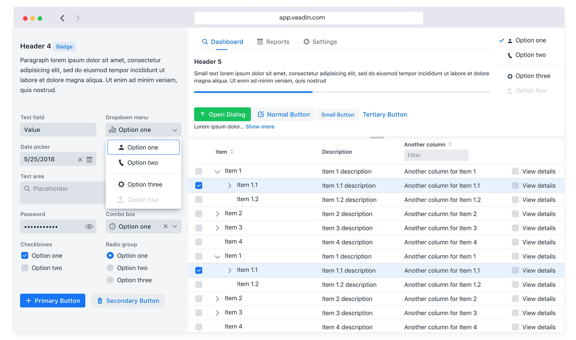
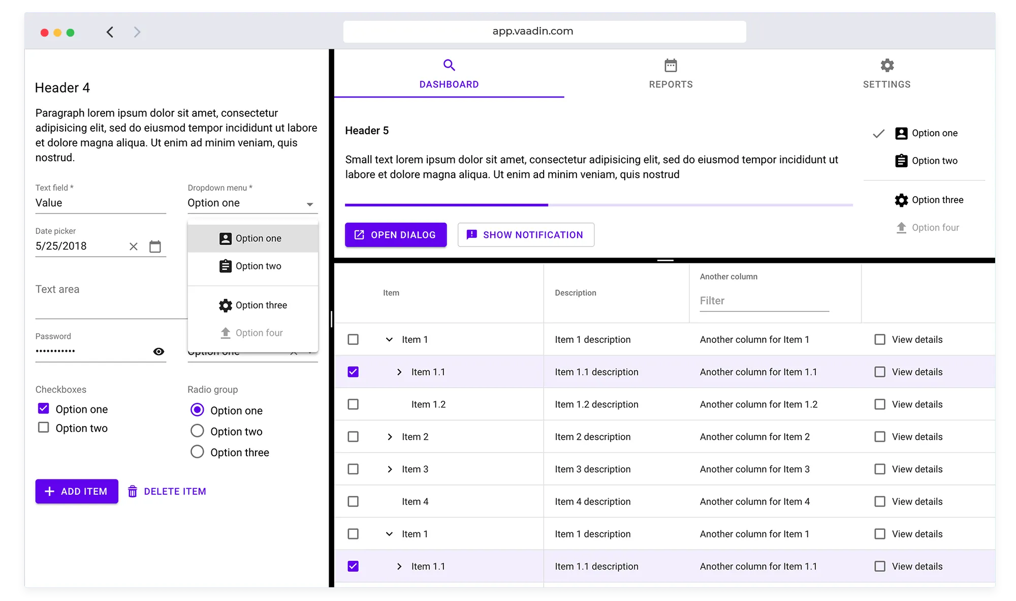
Vaadin comes with two built-in themes you can use as-is or as the basis for your own customization.
Lumo

All Vaadin components implement the Lumo theme by default, which gives your application a coherent and polished look out-of-the-box. In addition to light and dark modes Lumo has a built-in compact variant. It reduces the space between elements and is useful when you need to fit a lot of data onto one screen at the same time.
See Lumo for more details.
Material

The Material theme is an implementation of Google’s Material Design guidelines, and comes with both light and dark modes (color palette variants). The guidelines are followed whenever possible. However, some features aren’t in the guidelines and in those situations we take inspiration from Material Design and try to fit them in seamlessly.
See Material for more details.
849F08CE-1A29-413B-AD31-8B8A5AB1CF63