The Loading Indicator
To inform the user that loading is in progress and that the UI is currently unresponsive, a loading indicator is displayed. A longer loading time might be due to e.g. bad network conditions. The framework automatically displays a loading indicator after a configurable delay when a server request starts, and hides it after the response processing has ended.
By default, the loading indicator is shown at the top of the viewport after a delay.
You can turn the indicator off, change delays or customize the looks of the indicator. The theming targets the <div class="v-loading-indicator"></div>
element located inside the <body> element. You need to also need to toggle the default theming off.
Source code
HTML
<body>
  <!-- application root level element omitted -->
  <!-- "the framework removes "display: none" when indicator shown -->
  <div class="v-loading-indicator first"
       style="display: none;">
  </div>
</body>
The loading indicator can be configured from Java by accessing the configuration object from UI.
The easiest way to do this is with the PageConfigurator (see bootstrap page docs for more information)
and the changes are applied already on the initial response.
Source code
Java
public class MainLayout extends Composite<Div> implements PageConfigurator, RouterLayout {

    // other implementation omitted
    @Override
    public void configurePage(InitialPageSettings settings) {
        LoadingIndicatorConfiguration conf = settings.getLoadingIndicatorConfiguration();

        // disable default theme -> loading indicator will not be shown
        conf.setApplyDefaultTheme(false);
    }
}
The configuration object can be used for configuring the delays after which the indicator changes "stages".
The indicator is shown after a delay of 300ms by default and a class name first is set to it. There are two additional delays which you can configure.
After the delays, class names second and third are set and can be used to change the style of the loading
indicator after certain time has passed.
Source code
Java
public class MainLayout extends Composite<Div> implements PageConfigurator, RouterLayout {

    @Override
    public void configurePage(InitialPageSettings settings) {
        LoadingIndicatorConfiguration conf = settings.getLoadingIndicatorConfiguration();

        /*
         * Delay for showing the indicator and setting the 'first' class name.
         */
        conf.setFirstDelay(300); // 300ms is the default

        /* Delay for setting the 'second' class name */
        conf.setSecondDelay(1500); // 1500ms is the default

        /* Delay for setting the 'third' class name */
        conf.setThirdDelay(5000); // 5000ms is the default
    }
}
Displaying a Modal Curtain
To show an alternative for the default loading indicator theme, this examples demonstrates how to show a loading indicator that simply darkens the UI. The darkening is animated, so that it does not flash the screen. The darkening starts after the server side round-trip takes over 0.5 seconds (300ms delay configured in java + 200ms animation delay).
|
Note
| In addition to the css, the default theme should be explicitly disabled via Java, as shown in the previous chapter. |
Source code
CSS
.v-loading-indicator {
position: fixed; /* Occupy whole screen even if scrolled */
top: 0;
left: 0;
right: 0;
bottom: 0;
/* Eat mouse events when visible, doesn't prevent scrolling */
pointer-events: auto;
/* Animated with delay to prevent flashing */
animation: fadein 0.3s ease-out 0.2s normal 1 both;
z-index: 2147483647;
}
@keyframes fadein {
0% {
background: rgba(0,0,0,0);
}
100% {
background: rgba(0,0,0,.5); /* Darkens the UI */
}
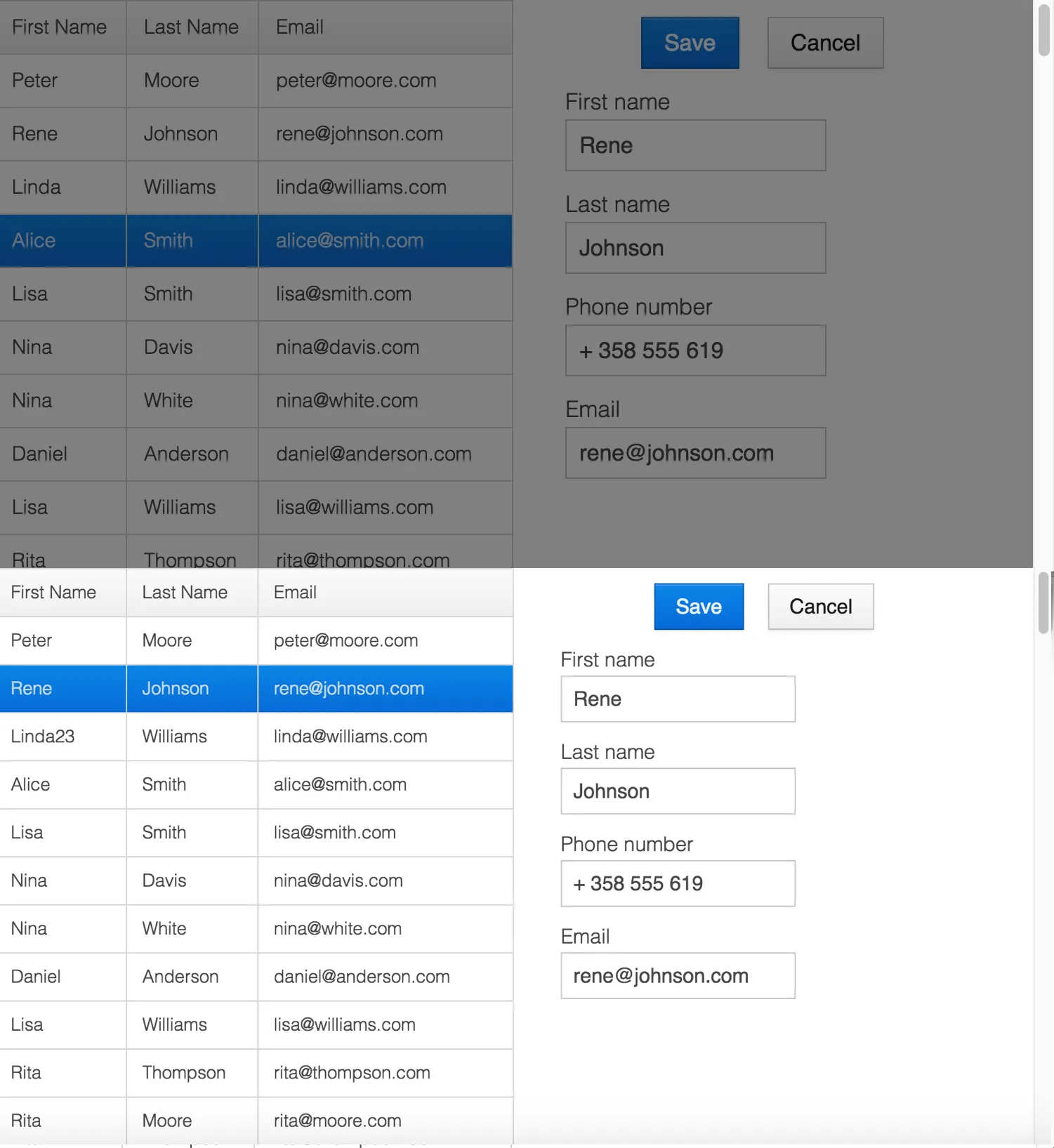
}The next image illustrates an application with the modal curtain visible during loading (above) compared to the normal state (below).
Displaying a Changing Loading Indicator
Once the loading indicator is displayed, it gets the class name first. After
the second and third configurable delays, it gets the second and the third
class names respectively. You can use those class names in your styling to let
the look reflect how long time the user has been waiting.
The following style snippet demonstrates how to create an animation that changes color as the user is waiting.
|
Note
| In addition to the css, the default theme should be explicitly disabled via Java. |
Source code
CSS
.v-loading-indicator {
  position: fixed;
  top: 0;
  left: 0;
  right: 0;
  bottom: 0;
  pointer-events: auto;
  z-index: 2147483647;
}
.v-loading-indicator:before {
  width: 76px;
  height: 76px;

  position: absolute;
  top: 50%;
  left: 50%;

  margin: -38px 0 0 -38px;

  border-radius: 100%;
  animation: bouncedelay 1.2s infinite 0.4s ease-in-out both;
  content: "";
}

.v-loading-indicator.first:before {
  background-color: skyblue;
}

.v-loading-indicator.second:before {
  background-color: salmon;
}

.v-loading-indicator.third:before {
  background-color: red;
}

@keyframes bouncedelay {
  0%, 80%, 100% {
    transform: scale(0);
  } 40% {
    transform: scale(1.0);
  }
}
42CD9A8F-BBFD-4D79-84FF-1015D09534D0