Web Components Wednesday (WCW) blog series is created for two purposes: introducing easy-to-use components and educating people on the concept of Web Components. All the WCW blogs can be found here.
 The Wired Elements collection, from the team wiredjs, has a big reputation amongst web component UI groups. They consist of 14 different elements, which mutually share a peculiar, avant-garde hand-drawn look.
Each week we will publish an article featuring a part of this set. This first week, these four components get the spotlight: wired-button, wired-card, wired-checkbox & wired-combo. Let's check them out.
Wired-button
The button comes in 2 forms (active & disabled) with the ability to configure its elevation using a number. The elevation adds some highlighting by increasing the sketchy high, with 5 being the highest elevation. The clicking animation is subtle and smooth.
Wired-checkbox
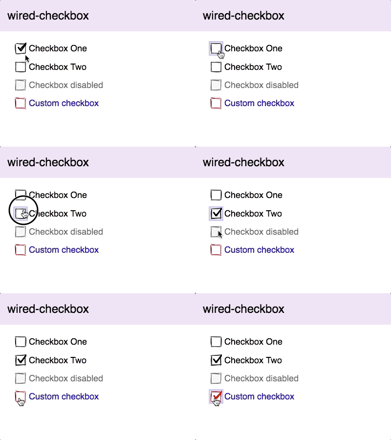
Wired-checkbox has a property named checked, which you can use to pre-select the box, and another called text, for setting the title of the checkbox. Apart from that, there are some CSS custom properties, as well, to set the colors of various parts.
Wired-combo

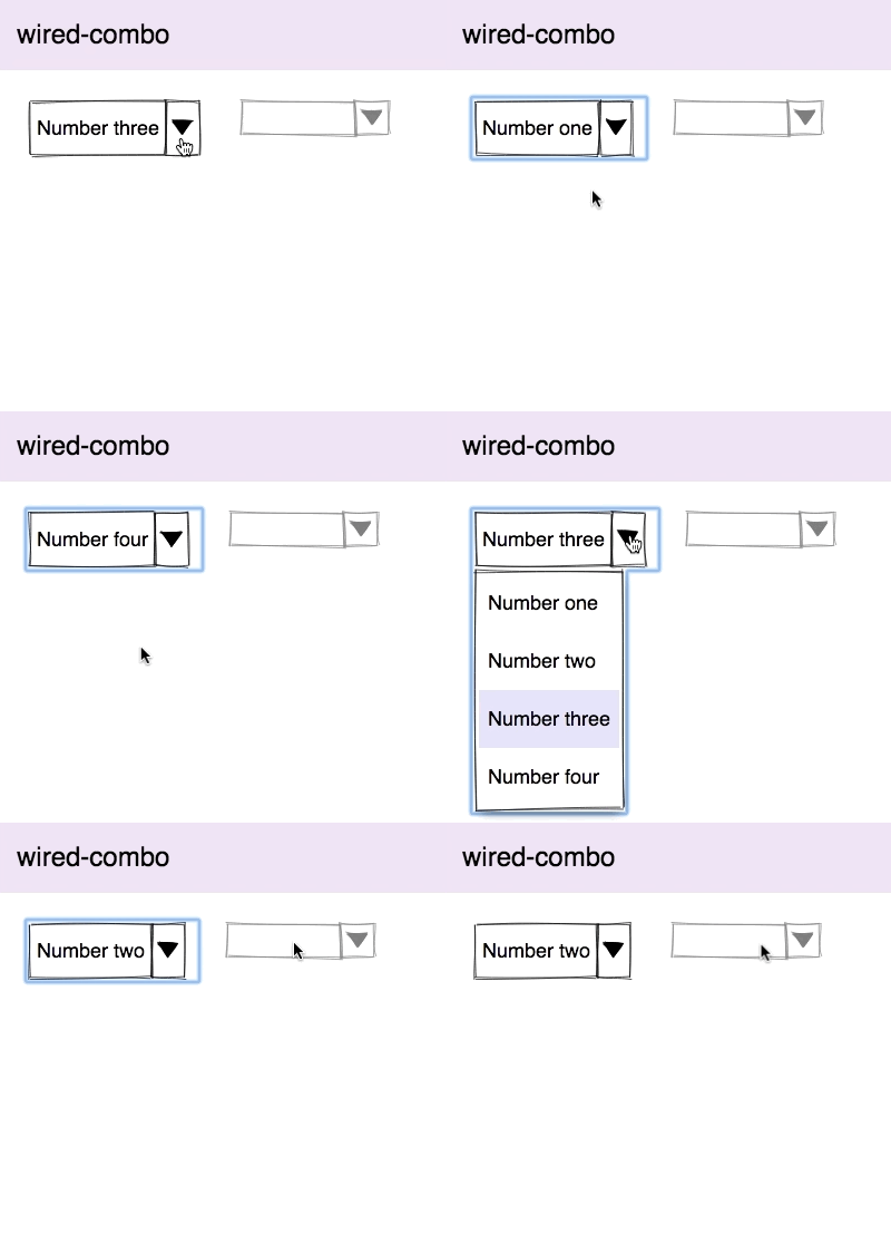
Next, we have wired-combo, which behaves exactly like a native browser select element, the only difference being the hand-drawn style. To input the selection, you need to use wired-item and give it a value, as well as a displayed text. As an option, the value can also be pre-selected.
Wired-card

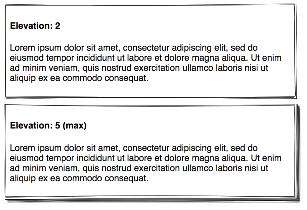
The great thing about wired-card is that it allows you to display and style the HTML structure inside it. We are talking about tags like <p>, <span>, <heading>, <form> and many more. For example, the card above has an <h4> and a <p> tag, with some styling for the margin and font. Additionally, wired-card also allows elevation.
Compatibility table
The table below will shortly summarize the components’ info and compatibility on multiple platforms.
| Component |
Library |
Mobile |
Browsers |
| wired-button |
lit-element^0.5.2 |
✔ |
C,S,O,F,E,I |
| wired-checkbox |
lit-element^0.5.2 |
✔ |
C,S,O,F,E |
| wired-combo |
lit-element^0.5.2 |
✔ |
C,S,O,F,E |
| wired-card |
lit-element^0.5.2 |
✔ |
C,S,O,F,E,I |
Final words
This collection immensely amuses us, and we hope you are fascinated by it, as well. One interesting thing about this set is that, just like hand-drawn shapes, no two renderings of a single component will ever look the same, due to the randomness in drawing it. Part 2 will be published next Wednesday featuring the icon-button, input, listbox, and progress. Stay tuned!
Click here for more awesome web components

