Web Components Wednesday (WCW) blog series is created for two purposes: introducing easy-to-use components and educating people on the concept of Web Components. All the WCW blogs can be found here.
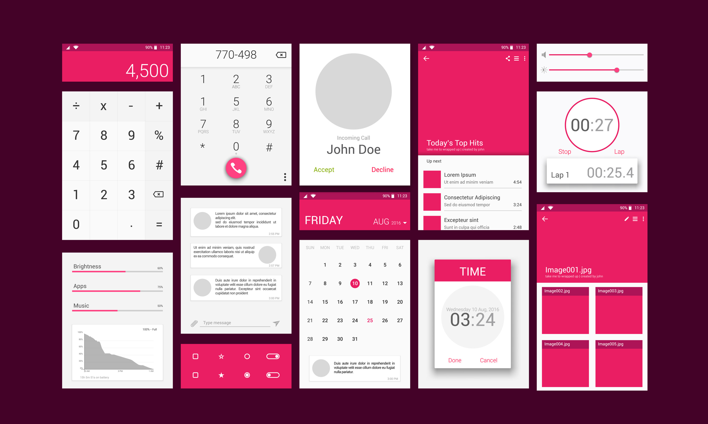
 We see these dialogs prompting every day, asking us to take action or merely to inform an error message. The dialog is a vital part of an app because they are simple to use and easily recyclable.
For this week's Web Components Wednesday, we will introduce top 5 dialog web components using Material Design.
Salte-dialog by salte-io
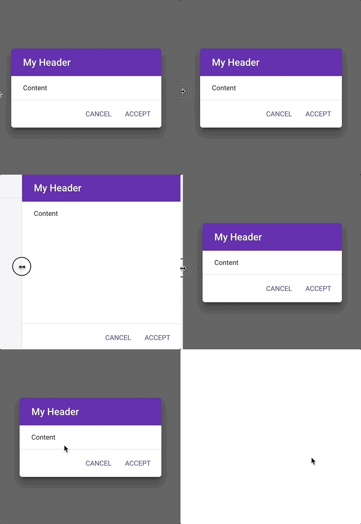
Salte-dialog has the option to configure custom animations by using the attributes entry-animation and exit-animation. The list of animations can be found here. By inserting the appropriate tags into salte-dialog, they will convert to the corresponding part of a dialog. For example, you use h2 for setting the title, span for setting the description, and you wrap the paper-button in a div with class buttons. Three-way confirmation is possible with this component.
Paper-alert-dialog by Collaborne
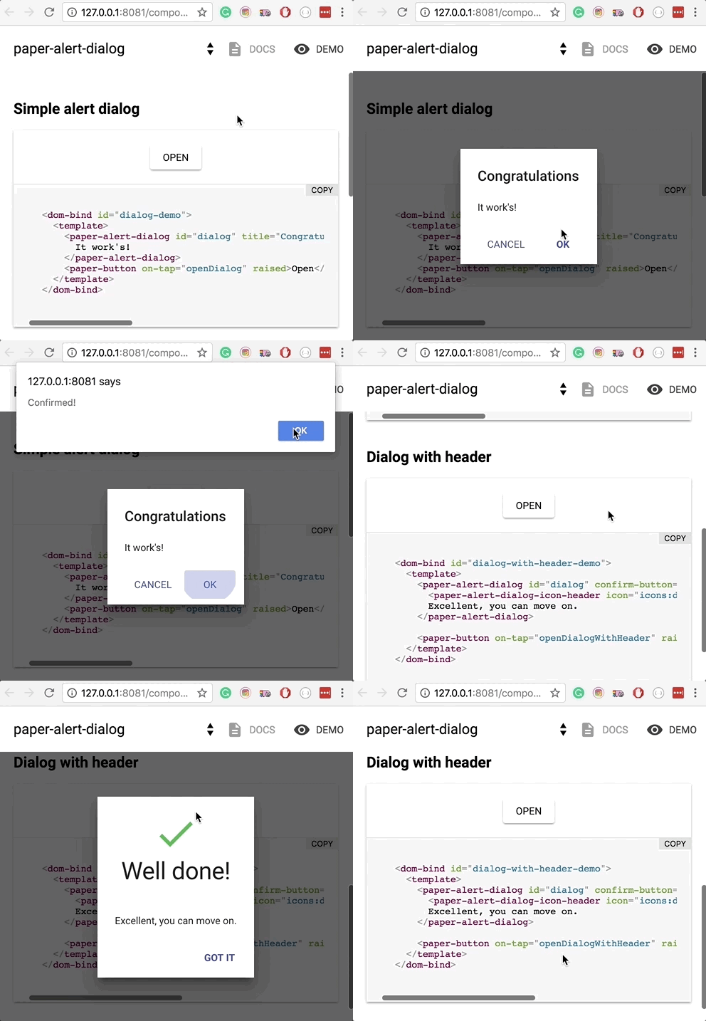
Paper-alert-dialog‘s primary purpose is to alert the users. Hence it has only the elemental attributes for setting the title and the text of the buttons. For a better-looking dialog, users can use the iron-icons set to choose a header icon with the element paper-alert-dialog-icon-header. Three-way confirmation is not available.
Dialog-el by jshcrowthe
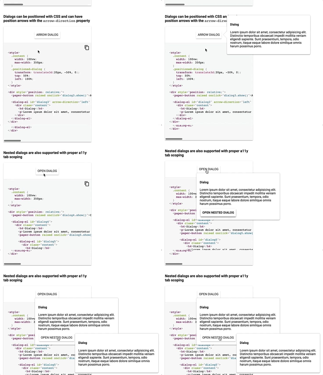
Dialog-el provides many types of dialogs for users to choose, for example modal dialog, arrow dialog, or nested dialog. For your information, an arrow dialog does not work with a modal attribute. If you click outside the dialog area, it will close the box. Users may have as many buttons as they like, so three-way confirmation is achievable.
M2-Dialog (part of metaui) by isuwang
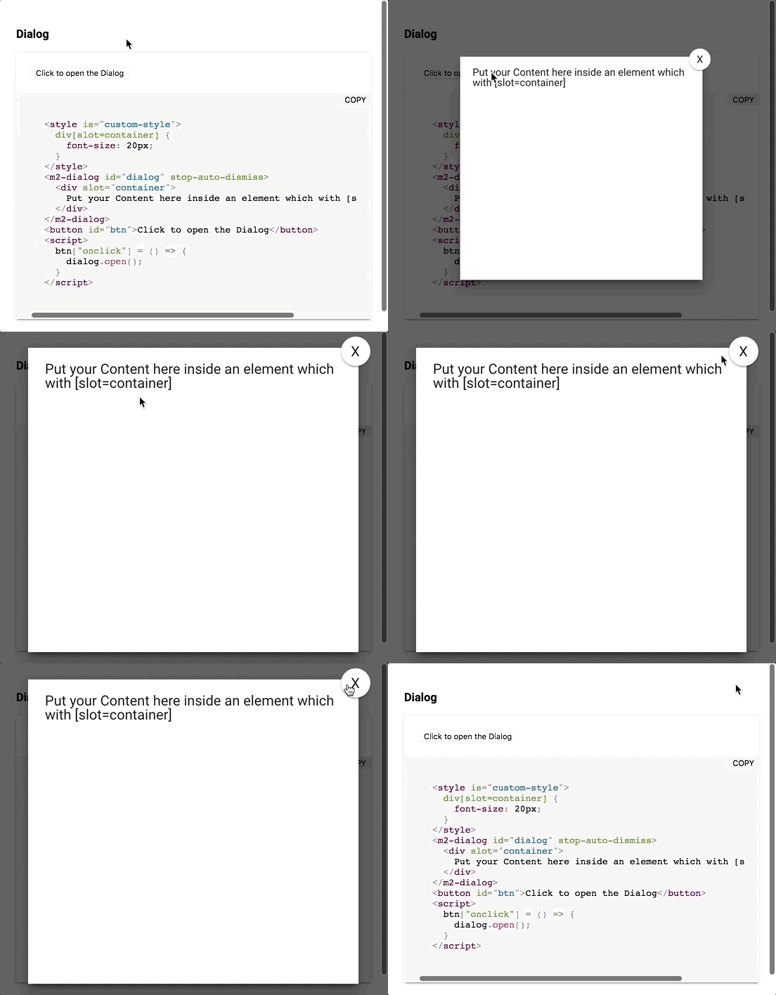
M2-dialog belongs to the metaui framework. It is a versatile dialog, since it can display anything you put inside a div with the attribute slot=container. With this ability, users can be as creative as they want with the dialog (showing information, two-way confirmation, three-way confirmation, inputting data).
Nuxeo-dialog (part of nuxeo-ui-elements) by nuxeo
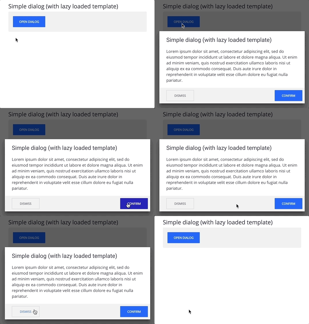
Nuxeo-dialog is a part of nuxeo-ui-elements, a library full of UI web components. Users may customize the header, the description, and the buttons. The animation for the buttons is charming and eye-catching. Three-way confirmation is not available.
Compatibility table
The table below will shortly summarize the component’s info and compatibility on multiple platforms. Browsers include Chrome Canary, Safari Tech Preview, Opera, Firefox Nightly, Edge and Internet Explorer 11.
| Component |
Mobile |
Arrow keys |
Library |
Browsers |
| salte-dialog |
✔ |
✘ |
Polymer 1.9 - 2 |
C,S,O,F,E |
| paper-alert-dialog |
✔ |
✘ |
Polymer^1.0.0 || ^2.0.0 |
C,S,O,F,E,I |
| dialog-el |
✘ |
✘ |
VanillaJS |
C,S,O,F,E |
| m2-dialog |
✘ |
✘ |
Polymer^2.0.2 |
C,S,O,F |
| nuxeo-dialog |
✘ |
✘ |
Polymer^2.0.0 |
C,S,O,F |
Click here for more awesome web components