Business App Starter
Business App Starter is a commercial Vaadin starter for building responsive business web apps. It contains a collection of components, view templates, theming utilities and best practises that can help teams save more than a week of development time at the start of a new project. It makes use of Vaadin’s free and open source framework and components, as well as commercial components and tools like Charts and TestBench.
Features
-
Application header with avatar & tab support
-
Customisable styles
-
Installable on desktop & mobile
-
Responsive navigation sidebar
-
Templates for CRUD, dashboard & drilldown views
-
100% Java-based templates
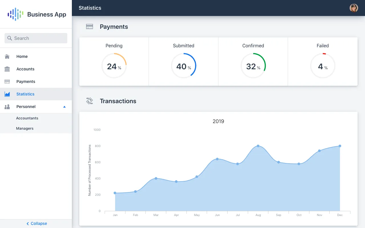
Structure
The Business App Starter’s structure is comprised of several slots designed to help implement any layout.
Header & Footer Slots
These slots are intended for application-wide navigation, actions and branding. When using both the outer and inner elements, ensure the content hierarchy is clear and that they don’t take up too much vertical space.
Navigation Slot
The navigation slot is reserved for the NaviDrawer: a responsive and collapsible navigation sidebar that houses searchable and hierarchical navigation items. It consists of a header intended for branding & account switching, a list of navigation items, and a footer which by default houses the collapse button.
View Slot
The intended slot for views. Place views in this slot by setting the @Route annotation’s layout parameter to MainLayout.class.
Source code
Java
@Route(value = "my-view", layout = MainLayout.class)
@PageTitle("My View")
public class MyView extends ViewFrame {Layout Examples
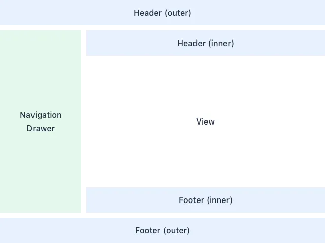
Here are a few examples of common layouts used in business applications.

An often-used composition where the outer header is the most prominent element. The view itself sports a header for showing the title.
Used slots:
-
Header (outer)
-
Navigation drawer
-
View with header

This layout puts more focus on the navigation drawer. Suitable for complex hierarchical navigation structures. The view footer houses view-specific actions.
Used slots:
-
Navigation drawer
-
Header (inner)
-
View with footer

The navigation is placed in the outer header. The view area is maximised but the navigation has to be simple. The view’s sidebar is used to display additional details.
Used slots:
-
Header (outer)
-
View with sidebar
Custom Components
The Business App Starter comes with the following custom components:
-
AppBar & TabBar
-
Badge
-
DetailsDrawer
-
FlexBoxLayout
-
ListItem
-
NaviDrawer
-
NaviTabs (closable)
AppBar & TabBar
AppBar consists of a main menu icon, contextual navigation icon, title, tabs, action items and avatar. All building blocks are optional.

TabBar is a simpler version of AppBar that discards the contextual navigation icon and title.
Badge
Server-side component for Lumo badges.
DetailsDrawer
Mainly intended for usage in master-detail views. Composed of a header, (scrollable) content and footer.
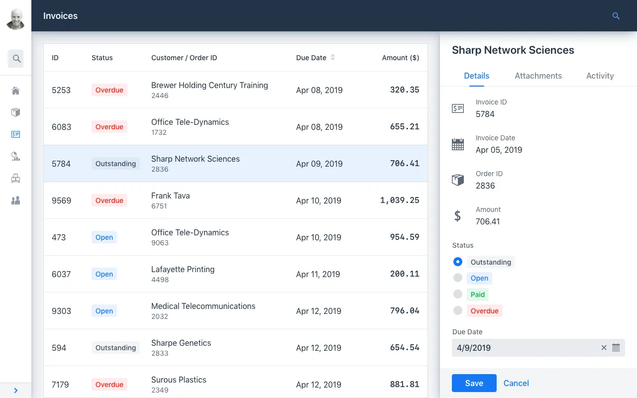
DetailsDrawer shown on the far right.FlexBoxLayout
FlexBoxLayout is a server-side implementation of CSS Flexible Box Layout. It extends FlexLayout and contains convenience methods for setting flex, flex-basis, flex-direction, flex-shrink and flex-wrap. It also supports setting background-color, margin, overflow, padding, shadow, spacing and theme.
