
Web Components Wednesday (WCW) blog series is created for two purposes: introducing easy-to-use components and educating people on the concept of Web Components. All the WCW blogs can be found here.
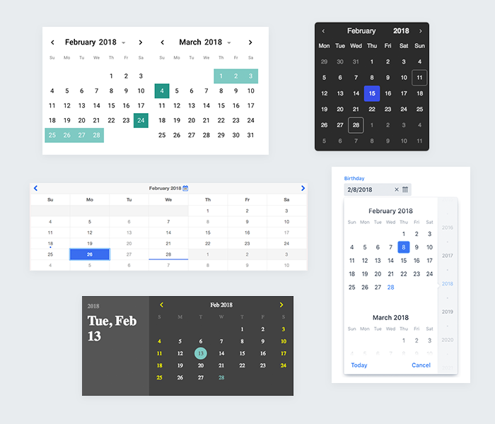 Choosing a date is a very common task in any UI. Making that intuitive and easy for users can be hard. There are many web components out there, which were designed specifically for this purpose. In this blog post, we’ll introduce five free date selectors to you, which will suit any of your needs.
calendar-element by fooloomanzoo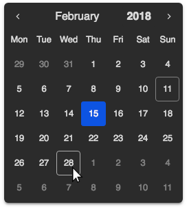
calendar-element is a sub-element of datetime-picker.
Imbued with a dark theme, calendar-element default styling really stands out with a mysterious look. Transitions, as well as animation effects, feel really smooth. The calendar makes sure that you always know the current day by giving a white border on it.
There are plenty of options for changing the date: using the previous/next button, editing the year or clicking the month to display a dropdown list.
You can customize your own theme as well, choosing your own colors for the calendar’s background, text, selected date, etc.
This is an excellent date picker. If you have a soft spot for a dark chroma, then you should definitely go for this one.
| Mobile-friendly |
I18n |
Arrow keys support |
Library |
Working |
| ✔ |
✔ |
✔ |
Polymer#2 |
C, S, O, F, E, I |
range-datepicker by RoXuS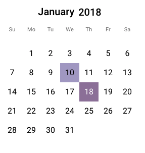
The borderless style gives us the impression of a fresh and clean calendar. range-datepicker is indeed a versatile element. It can serve both as a usual date-picker, or a range selector.
It is possible to display 2 adjacent months side by side. The month and year editing can be disabled and enabled by giving the specific property.
You can change the basic color of the hovered date, selected date and selected range of dates.
Out of 5 elements, only this one provides a range selector to date. So, if a date range is something you need, use this component.
| Mobile-friendly |
I18n |
Arrow keys support |
Library |
Working |
| ✔ |
✔ |
✘ |
Polymer#^2.0.0 |
C, S, O |
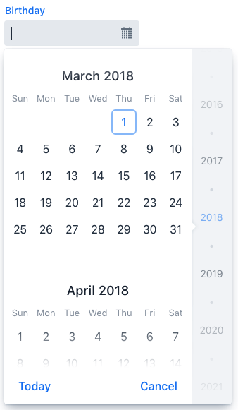
app-datepicker by motss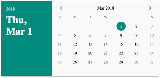
If you are into a classic paper calendar, then this component is designed for you. The color combination, in general, is eye-catching, there are different colors for the current date, weekend and selected date.
The customization options for app-datepicker are abundant, from the color of the background, date, selected date to disabled date, ink color, etc.
One downside of this element is that the year range is restricted between 1900 - 2100. While it’s not practical to have those outside of that range, it certainly limits the potential of the element.
| Mobile-friendly |
I18n |
Arrow keys support |
Library |
Working |
| ✘ |
✔ |
✘ |
Polymer#1.9 - 2 |
C, S, O, F, E, I |
vaadin-date-picker by Vaadin
Finns are not typically bragging about their work. Nonetheless, we can safely say here that vaadin-date-picker is one of the best date components out there.
The component provides a date selection field with scrollable month calendar. Two superb things about this element are its responsive design and its color palette.
The beautiful Lumo theme is used as the default for all vaadin-core elements, including this one. It is very customizable and consistent.
Lumo theme by default has a very minimal and generic visual appearance, as recommended in The Gold Standard Checklist for Web Components.
| Mobile-friendly |
I18n |
Arrow keys support |
Library |
Working |
| ✔ |
✔ |
✔ |
Polymer#^2.0 |
C, S, O, F, E, I |
mp-calendar by mpachnis
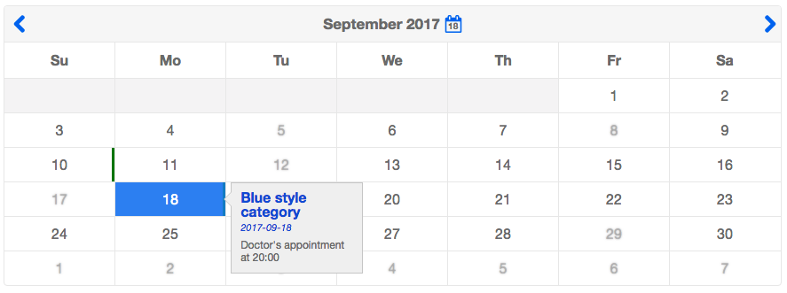
Deepened in blue and white, mp-calendar surely delivers a classy and elegant appearance to the viewers. This element’s specialty lies in the property events-file. By giving the property a JSON file which contains events, the calendar will show all the events listed in the file. The syntax for writing the events is absolutely simple, as well.
The blue calendar icon in the top bar might seem like a normal icon, but it’s actually an undercover button to get to the current date. The animation time feels somewhat slow.
One special thing about this element is that it possesses a lot of properties related to disabling dates. It can be as simple as disabling the previous day, or a specific week, etc. As a result, this component is extremely good for your own timetable and event schedule.
| Mobile-friendly |
I18n |
Arrow keys support |
Library |
Working |
| ✔ |
✔ |
✘ |
Polymer#^2.0.0 |
C, S, O, F, E |
Final thoughts
In summary, all the datepicker components are distinct in their own way. None of these five are bad choices, as it usually comes down to personal preference. You can even use multiple of them in one project as none shall interfere with each other, all thanks to the style encapsulation of Shadow DOM.
Click here for more awesome web components