Web Components Wednesday (WCW) blog series is created for two purposes: introducing easy-to-use components and educating people on the concept of Web Components. All the WCW blogs can be found here.
 The dropdown menu is a wonderful UI element. It allows us to compact a massive number of choices in a single box. There are plenty of good drop-down UI web components out there, and those I will cover in another blog post. In this article, let’s have a look at those drop-downs that already have data in them.
Usa-state-list by biztek
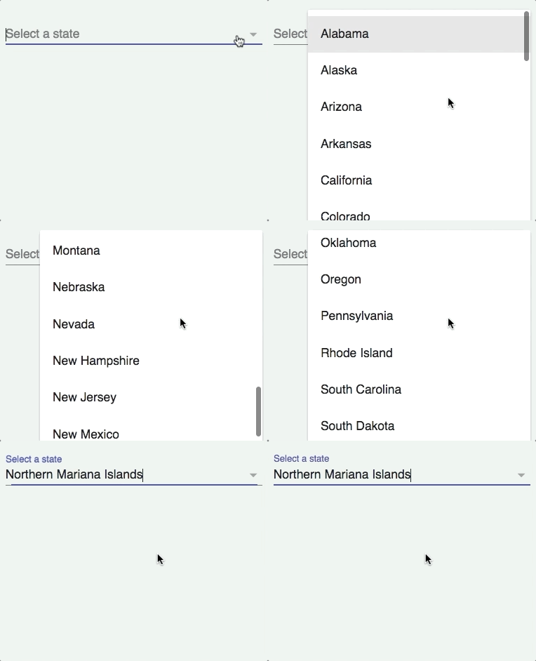
A select component for all the USA states, usa-state-list uses the USPS state abbreviation for the return attribute value, which means it’s suitable for any form that needs a legal address (example: a birth registration form, passport form, social security form). You can easily set the label, title, and placeholder. For data binding/fetching, the attribute value will return the choice the user makes.
Country-select by Protoss78
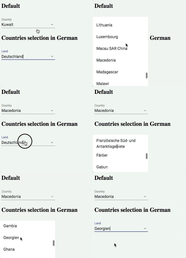
A simple country selector that supports localized country names for an impressive number of 253 languages. To set the language, apply the locale code (BCP 47) to the attribute language. As an option, you can pre-select a country with the attribute selected-country, but note its value must align with ISO 3166 alpha-2. Country-select is extremely handy, if your website must support the multilanguage feature. For a full list of localized names, head to umpirsky/country-list.
Paper-countries by bluewatertracks
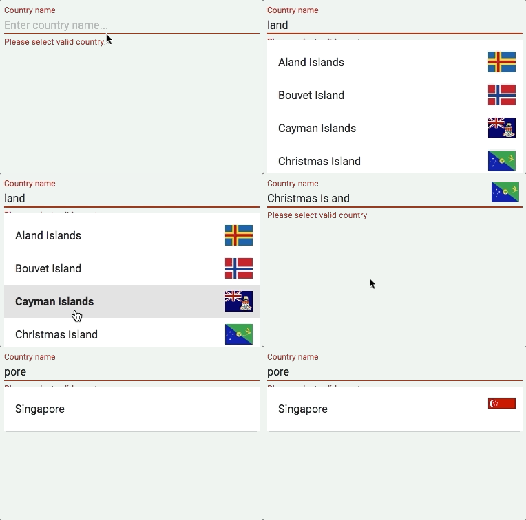
This component is an ideal element for any shipping or tracking website. Paper-countries strikes with its excellent features, like typeahead, sub-string matching, and of course, showing the country flag. You may set the limit of suggestions shown on display, as well as get both the country code and name from the property object country. Paper-countries will guarantee a fun time for your users whenever they use it.
Paper-autocomplete by ellipticaljs
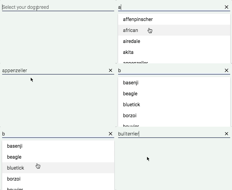
The best thing about paper-autocomplete is that you can input your own set of autocomplete suggestions, either by applying the HTML attribute source, or setting it in the script. The source format is {“text”: “”, “value”: “”}. Additionally, the source can be remote as well, if so, use remote-source. If you want to implement autocomplete suggestions with your input component, you may try the sub-component paper-autocomplete-suggestion and apply data binding.
Bonus: pokemon-selector by samiheikki
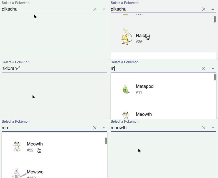
A special delivery for all the Pokemon lovers out there, this is a combo box selector for Pokemon, which you can either select from the dropdown list, or search for any substring. Pokemon-selector provides a nice picture of the Pokemon with its according number based on the National Pokedex number. It is possible to search based on the Pokemon's original region with the attribute region, check here for a list of values.
Compatibility table
The table below will shortly summarize the component’s info and compatibility on multiple platforms. Browsers include Chrome Canary, Safari Tech Preview, Opera, Firefox Nightly, Edge and Internet Explorer 11.
| Component |
Library |
Mobile |
Browsers |
| usa-state-list |
Polymer^1.7.0 |
✔ |
C,S,O,F,E,I |
| country-select |
Polymer^2.0.0 |
✔ |
C,S,O,F,E,I |
| paper-countries |
Polymer 1 - 2 |
✔ |
C,S,O,F,E,I |
| paper-autocomplete |
Polymer#1.9 - 2 |
✔ |
C,S,O,F,E,I |
| pokemon-selector |
Polymer^1.4.0 |
✔ |
C,S,O,F |
Final words
With lots of drop-down components out there, you can quickly and easily make your own version of selectors with your desired content. These components are proof of how customized and compact a component can be.
Click here for more awesome web components